


With the whole day available for painting today, I've finally completed a watercolour in the…
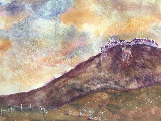
Stirling Castle
I was flicking through the Tony Smibert book this morning looking for inspiration for two forthcoming eye on the other side of the glass paintings. You don’t know what that means? Just wait a few more days. Anyway, there were some paintings in the book where Tony and/or Turner had gone to town on the sky and land and left a white castle shape on the top of a hill. I thought I’d have a go at something similar and, after a bit of googling, came up with Stirling Castle as a suitable subject. All I’ve used from the source photo is the silhouette of the castle shape and the rough shape of the hill it’s on. Everything else is made up, including the colours.
For the colour scheme I went for French ultramarine, quinacridone magenta and raw sienna as I wanted colours that could lift out easily if I wanted to lighten areas. So this is in the key of purple cool which, according to my notes, is good for chilly looking days with the heating turned on indoors. This key is also good for orange/purple contrasts, so I’d already devised that there would be a big purple hill against an orange sky.
I also did a rough value plan today. The castle was going to be the lightest area, and the biggest hill the darkest, so that the biggest value contrast was around the centre of interest. The hill in the bottom left was also to be dark, with the hill on the right and the sky being somewhere in between. After studying my value plan for a couple of minutes, I decided that I needed to include some light fenceposts in the bottom left for a bit of balance.
I started with a bit of masking fluid, protecting the castle’s shape and the fenceposts in the bottom left. I also masked out some white chalky bits in the cliff side, which turned out to be a bad move, and spattered a little bit of masking fluid over the hills, which turned out OK.
And then the colours went down, from back to front as usual. The sky was mainly made of oranges and yellows with the odd bit of blue thrown in. Increased some texture with salt and with screwed up kitchen paper. It came lay well, even looking bit fare I say Turneresque. Skies are going really well for me right now and if I was in a world championship of watercolour and it was rained off after thirty minutes with only the skies down I’m confident I’d win on Duckworth—Lewis.
Then it was on to the hills. I’d already put on a bit of orangeyness with an underpainting while putting on the sky and added several more layers on top, trying to charge reds, blues and yellows into each layer to create a bit of variegation. At times I tried lifting off some paint to create fog but never with any success. To be honest, I think I put on too many layers and things are starting to border on muddy.
Then it was on to finishing touches. I added some shadows on and beneath the fenceposts, something I normally forget to do. And the white castle wasn’t looking right, so I added some purple shapes for the darkest areas. Even then I wasn’t satisfied, so added a watery purple glaze over the top. The white areas on the chalk face were looking even worse, so I glazed some more colour over them and the surrounding hillside. And that was me done.
I think this one just about qualifies for the shop window, thanks to that amazing sky, the orange/purple contrasts and the fenceposts and hill colour in the bottom left. In other words, this looks great from a distance. The thing I’m not happy with is those lighter bits on the hillside, making it look as if the castle has overflowed or vomited. No, this one’s not going in the shop window.
I tell you what, though, I do need a break from castles.

Leave a Reply