


The artwork's slowed down this week as I've not quite been tickety. But I was…
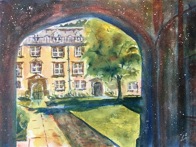
Stepping Into Second Court
So, after reading that Peter Cronin book. I was keen to put his ideas into practice. I picked this view from Christ’s College, Cambridge because of the interesting shapes and the chance to paint some interesting light on the path. The main colours today were French ultramarine, rose dore, transparent yellow and raw sienna. Both yellows are cool, so this is in the key of triadic right. Why this key? Well I wanted transparent yellow for the grass and raw sienna for the Fellows’ Building at the back. I didn’t want the green to be overpowering, so picked French ultramarine, a warm blue. And I didn’t want the top floor of the Fellows’ Building to be too purple, so picked rose dore, a warm red. Cadmium red, cambium yellow and, in particular, titanium white also made cameo appearances.
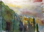
The first stage of the painting was to draw a pencil outline, reserve some white highlights and put down a watery underpainting. Here’s what I ended up with:

I guess this looks quite like some of the stuff I’ve seen Peter start with in his first stage paintings but it’s far from perfect:
– the little bit of sky showing between the Fellows” Building and the arch is too dirty: not blue enough
– the Fellows’ Building has been coloured too literally, with mainly raw sienna: some blue and red in there would have made for a far more interesting painting
– to be honest, using raw sienna as well as transparent yellow wasn’t really necessary: the transparent yellow could have replaced the raw sienna everywhere
– the shadow on the right of the lawn was added too late and it’s cauliflowered
– some reds on the path haven’t diffused into the yellow as much as I’d have liked
But let’s see how we go.
Stage two is where I needed to start adding some hard edged shapes. Ideally just for the bigger shapes and not for little bits of detail. Here’s how things looked after I thought I’d finished stage two.

Things were starting to come together but stage two isn’t finished:
– the tree shadow isn’t there yet
– more glazes are needed on the archway to darken it
There’s also a minor problem in that the stones in concrete between the path and the lawn are a bit too dark for my liking.
The last photo I took is the final one, after completion of stages two and three. For stage two, I just added the shadows and glazed over the whole archway twice with the blue and the the darker bits in the archway with the red. I also added the blue shadow, which I tried unsuccessfully to combine with the shadowy colours in the archway.
Stage three was about adding detail. Here I added
– window details
– white highlights (the reserved whites didn’t really work)
– opaque reds, yellows and blues in the flower bed (dabbed in rather than spattered)
– some dry blue brushstrokes in the lawn, which I wet and spread out a little bit in places
– some white spattering in the archway to add some magic – a spattering of masking fluid would have been better
I also added a little bit of the red to the Fellows’ Building. This was more of a stage one correction than part of stage two or three.
So let’s talk about the final painting. The three things that bug me most about this one are:
– how the shadow on the lawn hasn’t merged properly with the dark archway shape
– the bit to the right of the path being too dark
– the windows in the Fellows’ Building looking too loose and shaky
What I do like, though, is:
– the composition, looking through the archway
– the contrast between dark and light values
– the variety of shapes
– the colours in the archway, including the spattering
– the light that I’ve caught on the path
Although not perfect in my self-critical eyes, this painting does feel like a return to form. It’s up for sale. To see the price, click here.

Leave a Reply