


After John Paul Jones came out so well a couple of weeks ago, I wanted…
Stephen Mangan
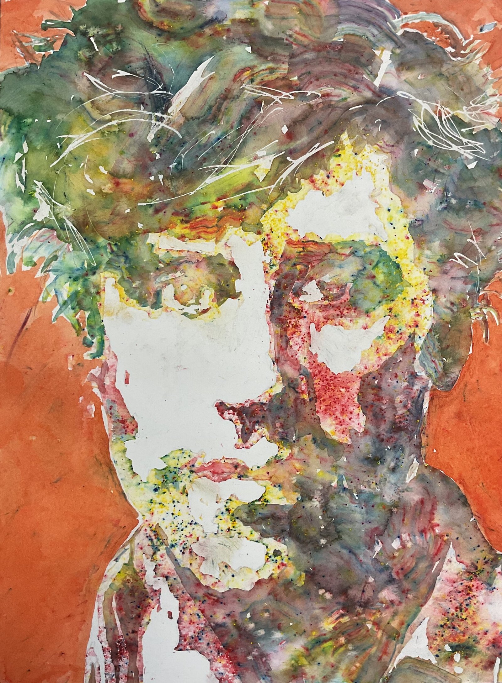
Yesterday’s watercolour painting was a huge success and I’ve learned through experience that the best way to follow up a win like that is not to try to build on it but to do something completely different. So no watercolours today and no landscape. It’s time for another portrait in crystalline watercolour. There was some banter on LAOTY recently about how difficult it would be to paint the programme’s presenter Stephen Mangan. So I thought I’d give the Mangster a go today.
As is normal for me with the crystalline watercolours, I came up with a three value plan, put down pencil outlines and masked out most of the highlights. I didn’t mask out the highlights around the top of the head because I wanted to drag Stephen’s stray hairs out into the white areas. And I decided for economic reasons to not mask out the rest of the background, instead masking out about 5mm around Stephen’s cheeks and shoulders and drawing in some crosses with masking fluid to remind me to leave these areas white. Then I sprinkled watercolour crystals over all the dark areas and used a brush to wet all the darks, being careful to mix the colours as little as possible. And when this was dry, I sprinkled crystals over all the remaining areas, yellow in the forehead, red over the cheeks, green over the chin and purple over the shirt. To keep things random looking, I sprinkled another green in a few places. Then I sprayed water over these crystals, left them for a couple of seconds to soak up water and stain the paper, then pressed down hard on them with kitchen paper to remove most of the pigment and leave lighter valued areas.
Once I removed the masking fluid, I realised that I’d made a terrible mistake. Some crystals had strayed into the white background and left stains after being sprayed. The 5mm white band around Stephen’s cheeks and shoulders was clearly visible, as were a couple of the crosses I’d put down with masking fluid. So I decided I needed to cover the background in opaque watercolour. I went for a yellowy orange mix of cadmium yellow and cadmium red so that it would contrast sharply against the greens in the portrait. And that was me done.
I rate this one as successful and it’s up for sale with the price to be found here. You need to stand back a long way but the likeness and the personality (I can confirm that he’s a good guy in real life) are both there. The orange background contrasts so sharply against the portrait that it looks as if a low definition portrait has been cut out of a newspaper and stuck on an orange board. And the brushstrokes in the hair worked exceptionally well. They’re as neatly coiffured as the real thing.
For any PAOTY or LAOTY judges looking in, I hope you enjoy seeing this one. My plan, though, is still to go with conventional watercolour for PAOTY and soft pastels for LAOTY, just as you’ll have seen in my submissions.


Leave a Reply