I’ve had a busy day dashing and splashing around the village. I just woke I…

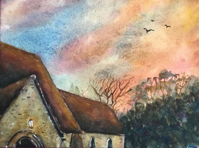
Sky Above Hartlip Church
I’m back on to watercolours today and onto my proper palette rather than following any Schmincke supergranulator cheat codes, much as a love painting with those colours. I picked out a photo of our local church that someone had shared either on Facebook or on the local WhatsApp group. The amazing thing about the photo was the sky, blue up in the top left but with orange stripes running down diagonally from top right to bottom middle.
For colours, I started by considering using Indian yellow and a warm red to get the orange in the sky. But then what to use as the blue? Winsor blue green shade would make everything too green, Mayan blue genuine would be too “bitty” for the sky and cerulean too pale for the darkish blue that I could see in the sky in the photo. So that left only French ultramarine. But that would have left me with warm versions of all three primaries and a very warm feeling painting. In the end I decided to change my red to quinacridone magenta, which still created decent oranges. This left me in the key of purple warm which, according to my extensive notes, can give the feeling of it being cold outside but warm inside buildings. Which sounded good to me. I decided to also include hematite violet and titanium white to create some texture, while still leaving the painting in the same key.
I started by wetting all the paper and dropping in all three primaries. This was a mistake that I never really recovered from. I should have mixed up an orange for the sky in the palette and dropped this in rather than expecting the reds and yellows to mix tobte right colour on the paper. A pretty dumb mistake to be honest. The sky ended up interesting enough but it’s nothing like what was in the source photo.
I then worked from back to front, so the trees were next. I didn’t think too much about these to be honest, apart from not wanting them to be green. For the branches I started painting them in with the point of the brush I was already using but then switched to a rigger brush and was amazed at how much thinner a line I could get. Lesson learned.
And then the church itself. The plan was to buildup colours in multiple layers and I guess I did do this, even if the colours on the rooves are a bit thick and opaque looking. There are probably too many layers there, including two titanium white trick layers, where I outbound a watery white and then dab it off before it dries. And two layers of a brown mix where I charged in all three primaries to make things interesting. The church walls have fewer layers and are less opaque. My attempt to add a yellow glow around the lantern didn’t really come off. But the individual bricks that I put in worked out OK. At one point I added lots of white highlights. Too many in fact and I had to hide most of them under more layers of paint.
Right at the end I added in the birds and a couple of coniferous treetops behind the church that I dabbed out most of, leaving just a couple of faint shapes.
As you can probably guess I’m not feeling that proud of how I painted this one, making far too many mistakes. On the other hand, though, the painting seems to have come out OK. The sky is interesting, as it should be, and the church roof and walls and even the trees have little bits of the primaries showing up in places. This one’s going up for sale, a decision not entirely down to my experience of church paintings tending to sell quickly. To see the price, click here.
<This is one of a number of local paintings that have been lent to the Rose & Crown in Hartlip to display on their walls. It remains up for sale whether via me or via the R&C. There’s no price difference.>


Leave a Reply