


And here are the YouTube six in their full glory. Somehow Lee's ugly arms and…
Six Ways To Look At The Moon
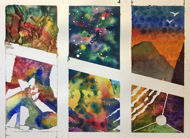
I’m a bit short of ideas for watercolours at the moment. Maybe I need to wander around the village again but only if I’m prepared to put in some effort and prepare value plans for all the resulting paintings. Anyway, that’s not for today. Today is an abstract day. I’m going to do a painting made up of six subpaintings and in those six, I’m going to show off lots of exciting colours and textures. I’ve used lots of colours from my 24 half-pan palette.
I started by masking out the borders of the six paintings with masking tape. It was all done very accurately, with enough white margin round the edge for a little bit to so how once framed and three equally sized columns. Even the diagonal stripe goes from 1/3rd of the way down the left to 2/3rds of the way down the right. Now let’s go through the six in order.
First up was bottom left. I randomly tore up and stuck down the masking tape that resulted in those white shapes. I then thoroughly wet the paper and painted on French ultramarine, permanent alizarin crimson (or was it permanent rose?) and Winsor yellow. Because the Winsor yellow wasn’t producing great greens and was lacking a bit of oomph, I went over it with transparent yellow in places. I watched it dry, scattering on salt when I thought it was at the right state of dryness. Finally, off came the tape.
Next it was the painting in bottom right. I painted in some random stripes, a circle and three thin lines connecting the circle to the edges in masking fluid. Then the bottom triangle was painted with sap green and olive green, the right triangle with Winsor violet and the rest mainly in Winsor orange but with a bit of Winsor yellow in top left and permanent alizarin crimson (or, again, was it permanent rose?) in the bottom right. I dropped some of the neighbouring colour in places to keep things interesting and added a bit of salt. I removed the masking fluid at the end.
Middle top was a variant in an old idea. I spattered on masking fluid to start with (and removed it from any other subpaintings it had trespassed on to). Then I thoroughly wet the area and painted in some bits of Winsor yellow, French ultramarine and one of the reds (it’s looking like Winsor red). While it was still wet, I dabbed Winsor blue (green shade) into any white gaps, then dabbed Payne’s grey on top of the Winsor blue and inside any coloured shapes that we’re looking too big and needing breaking up. No salt on this one; once it was dry I just rubbed off the masking fluid.
The fourth subpainting was the one in the top left. Because the one beneath it was already pretty colourful, I started with a neutral underpainting mixed from Winsor red, Prussian blue and transparent yellow. I dropped in those same three colours in places looking for some interesting variegation, making it quite thick in places so that, as a final step, I could do some scraping with a credit card to make it look rocky. I also scraped out some grassy looking things with a sharp corner that I’d cut into the card with a pair of scissors.
Next, top right. I wanted to create a sunset with French ultramarine, permanent rose and Winsor yellow but the red and yellow, being transparent colours, kept running into each other. So I dabbed it all dry, then repeated the exercise but with (opaque) cadmiums for the red and yellow. At the same time, I also darkened the sky at the top with Payne’s grey. This didn’t work either – maybe the paper doesn’t need to be Bridget Woods wet for sunsets. Anyway, with the sky turning into a two-tone blue and orange, I reached for the distraction of special effects and taped some bubble wrap down on it. After it was left to dry, I just needed to add some foreground, so I put in the violet triangle to link it to the subpainting below and added a hill, mainly in Winsor blue (green shade) but also with a little violet in it. Finally, I added some birds using titanium white, almost straight from the tube.
And then the last subpainting was the bottom middle. I was running out if ideas at this point, to be honest, so I started by connecting it to neighbouring paintings. The Payne’s grey and Winsor blue (green shade) triangle in the top left reproduces the colours above it and connects to the line representing one side of the mountain in the top right. Then there were continuations of the masking fluid lines from the painting on the right and I started this subpainting by continuing the “roots of the tree”, for want of a better term, from the subpainting on the left. Then it felt right to add a Winsor yellow (trunk) going from middle top to bottom right. After that, I just filled in all the gaps with Winsor yellow, Winsor orange, permanent rose, Winsor violet andFrench ultramarine. As a finishing touch, I dabbed in some spots with Winsor blue (green shade) just when everything was at the state of dryness where the spots would go fuzzy but not spread too far.
And that’s when I stopped and removed any remaining masking tape or fluid. What to make of it? Let’s start top left and go clockwise.
– the rocky one is just about OK. The grasses came out really well and are what makes this subpainting.
– the spacey one is great. Because the biggest white spots are nearest the edge, it looks like it’s exploding.
– the sunset over the hills is pretty good. The contrast between blue and orange is good. The birds definitely add something. And the bubble wrap pattern just raises so many questions.
– bottom right is one of the weaker subpaintings. It’s like a starry background with no stars. The colours don’t vibrate enough and the Winsor orange seems to have had the life kicked out of it.
– bottom middle is just about OK. It does the difficult job of bringing everything together but gets no credit for it, instead being repeatedly compared to other subpaintings and coming second most of the time.
– finally, there’s bottom left. When I drop down random primaries and leave them to get on with things while I take a lunch break, this is what I want to see when I get back. All those greens, purples, oranges. It’s great. And the masking tape has left some mysterious shapes.
As a whole, I think this one works. As well as the odd line connecting subpaintings together, there are just enough colours that neighbouring shapes have in commons or them to look like a single team but also still as six individuals. It was snapped up quickly by a Scottish collector.
The title of the painting is the trickiest part. I couldn’t find any Algernon Blackwood stories with six in the name, so googled around for anything starting “six ways to…” and found at least two pages talking about six ways to look at the moon. That seemed to suit the painting. But if anyone asks me what one of the individual paintings has to do with the moon, I won’t have a clue. Whichever of the six they’re pointing at.


Leave a Reply