


Wednesday 3rd February, 8pm, Sky Arts. That's when I'll be appearing as a wildcard. Best…
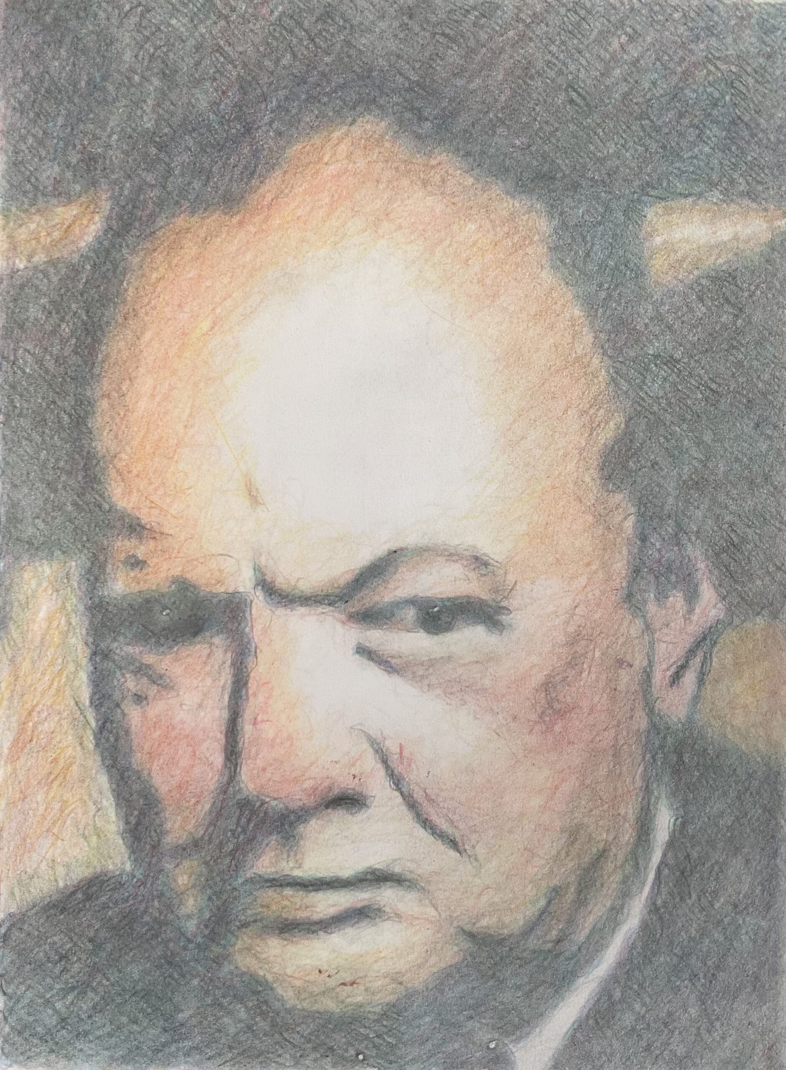
Sir Winston Churchill
Time for a long, drawn out coloured pencil painting. I started this one on the Thursday, left it for a day, and finished on the Saturday. The best coloured pencil paintings are the ones that I take a long time over. I’m sure the subject needs no introduction.
I started this one by creating a three value plan on the Notanizer app. I marked out the plan on the paper and filled out the dark and midtone areas with a very thin layer of pigment to give me something off which to hang everything else. I even took a photo and shared it in Facebook and LinkedIn:

After getting this framework down, I worked separately on the dark and midtone areas. Most of the dark was a series of thin layers of my usual four colour mix: helio blue reddish, dark pthalo green, dark red and delft blue. Towards the end, I started doing some other colours, fairly randomly, jamming around the page. As final touches, I added a layer of pine green, then black all over the suit and some sort of blue on the parts of Sir Winston’s head that were dark, just to get the head to stand out very slightly against the background.
For the midtones, I used flesh colours, a little brown and some blues, reds, greens and yellows. Those blues, reds, greens and yellows are wry subtle, added in the colour zones suggested by James Gurney and blended into the surrounding darks. I tried to create graduates blues, dark adjacent to the dark values and light adjacent to the highlights. Some of the time I was laying down big areas of colour; at other times I was jamming all over the face, adding random marks everywhere. My coloured areas had extended into the original highlights but that was fine: the original value plan was only a starting point.
When I’d reached the point at which the paper under the darks was saturated with colour and where I didn’t feel that any more midtones would improve things, I put the pencils down. I smoothed out all the colours and softened all the edges with a paper stump and that was me done.
There’s lots to like about this one. The left eye, the protruding lower lip, the jowls the weird feeling that everything’s concentrated in the bottom half of the painting. What holds it back from being perfect is that right eye. It’s meant to be in shadow but looks as if it did it start out that way. Maybe I should have put more of that side of the face in shadow. Oh well, maybe next time. This one’s up for sale, with the price to be found here.

Leave a Reply