


Next up is joint tournament leader Ian Nepomniachtchi, generally referred to as Nepo, although I…
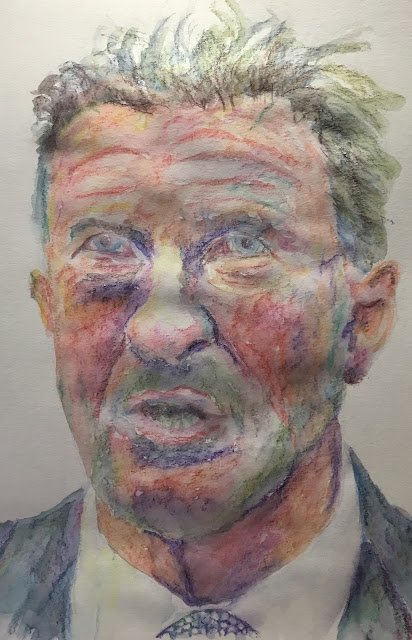
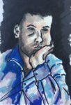
Sir Ian Botham
I’ve been watching more Liz Chaderton videos on YouTube. She’s been busy with portraits throughout November and there was one yesterday where she did her initial drawing upside down. This is something I’ve tried as an exercise while reading the Betty Edwards book but not something I’ve ever tried for a proper painting, so I thought I’d give it a go today.
I picked out Beefy as a subject as I do enjoy painting cricketers and for the medium I went for inktense pencils because I was in a loose mood.
For the initial drawing, I worked upside down but still used a grid of squares. I think I got a decent likeness in my initial drawing that I’d never have managed working the right way up. On the other hand, I do need to try out upside down painting without the grid at some point.
For the colour, I used sun yellow, tangerine, poppy red, chilli red, fuchsia, shiraz, violet, deep indigo, iris blue, teal green, leaf green, baked earth, willow and bark. That’s a lot of colours but that’s the kind of mood I was in today. I worked with the paper the right way up during this stage. After reading up on coloured pencil and adopting a layering technique, I found myself doing something similar with the inktense pencils. The suit jacket and the cheeks, in particular have multiple layers. For the darker areas, I found myself layering up blue and red before switching to indigo, bark and purple later.
I did the wetting in stages. I started in areas where I needed the most detail, so that was the eyes and mouth, followed by the ear and tie. I found myself moving next onto the hair and wrinkles. For the wrinkles at the top of the cheek, I was careful to follow the lines I’d put down that bent to mark the top of the cheek bones – something I might not have noticed had I drawn this one the right way up After this, I moved on to the rest of the face and the jacket and shirt, one big shape at a time and allowing the inks to mix on the paper.
There’s lots to like about how this one ended up. The ear, the shirt, the colours in the jacket, all the different colours in the face. On the other hand, I’ve lost the likeness at some point. The bottom half of the face is great but the eyes look like they belong to Bradley Walsh. The shape of the forehead may have something to do with this, as may the colour of the hair which is too dark.
The loss of the likeness means this one won’t be going in the shop window but there’s a lot here to be happy about.

Leave a Reply