


Sorry everybody. I screwed up today. Rather than doing a fourth portrait in a row…
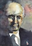
Sir Geoff Hurst
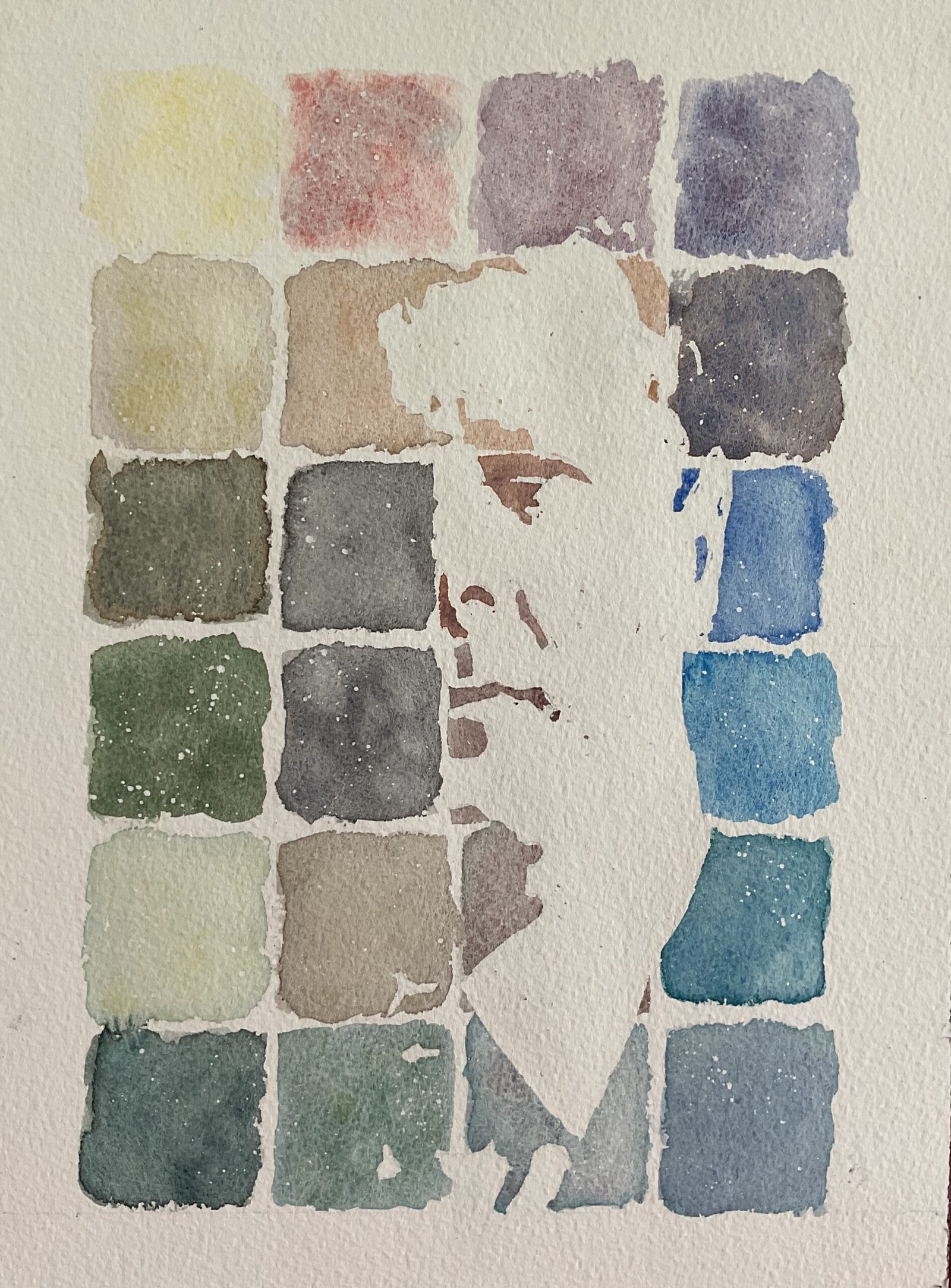
I had to order a load of paints and paper from Jackson’s the other day and was delighted to see another dot card thrown in as. Free extra. This time the dotcard had 24 of the Schmincke supergranulators. There are four of the desert colours, two tundra and three each from six other sets. I think that’s eight of the nine sets currently available, with only the urban set not represented. I’m sure someone will correct me if I’m wrong.
As usual, rather than simply swatching the colours, I turned the swatches into a portrait. Today’s subject is Sir Geoff Hurst, the only surviving member of England’s 1966 World Cup winning XI and the first player to score a hat trick in a World Cup final. A few years back, one of my sons had a medal presented to him by Sir Geoff at a weekend football tournament, which I hope is something he’ll tell his kids about. I picked out Sir Geoff today because I had the perfect photo of him for this exercise, photographed in the dark with just half his face lit up, so not needing much of the page to be left white.
I marked out some squares on the paper and drew in the outlines of the highlighted areas using the resulting grid. I covered all the highlights in masking fluid, to make things easier for me at the painting stage, and threw on some masking fluid spatters. When the masking fluid was dry, I painted in all the squares, trying to tease out the granulation effects by dropping in more water and wet paint after I’d put down a first layer. The colours on the dot card seemed to be in some sort of sensible order and I followed this order in the painting but worked in a spiral, along the top, down the right, along the bottom, up the left, along row two, down column three and up colour two. I did this because the last few colours looked like they might be dark, so I wanted to use them in the middle to have the biggest value contrasts around the centre of interest. Once the paint was dry, I removed all the masking fluid and rubbed out any pencil marks and that was me done.
Before I consider the merits of the resulting painting (and, to be honest, I’m writing this up before removing the masking fluid) I should list and comment on all the colours that I used. So here we go. I’m going through row by row, left to right in each row.
- Top left is volcano yellow. Really disappointing, lacking any tinting strength. I can barely tell it’s there. It’s a single pigment colour too, and turns out to be the lemon yellow deep that’s included in all five Shire colours and four of the desert colours. Not a colour I’d ever buy.
- Next is volcano red. Another single pigment colour and another with low tinting strength. Given that the one pigment in it is the pigment in cadmium red, I’d have expected it to have more oomph than this. If you can see a little grey or blue in there, it’s from dirty water, not from the volcano red.
- Tundra pink is next, an existing favourite. The tinting strength on the dot card seems weaker than what I’m used to in tubes, so maybe all the dots on the card will be a bit weak.
- Galaxy violet, like tundra pink is made up from potters’ pink and French ultramarine, two colours on my regular palette. It looks really good, so I may end up mixing my own in a future painting.
- Second row now, starting on the left with Shire yellow. A colour I already have and one that I know has low pigmenting strength, so no surprises here.
- Desert brown is another colour I already use. It’s normally more intense than what I managed to get today.
- The desert orange next to it looks really similar and exactly like the colour I was expecting, so I’m wondering whether the desert brown on the card might actually be desert orange.
- Then there’s tundra violet, an existing favourite. Looks good.
- Next row starts with forest grey. Interesting colour but not one that grabs me.
- Then glacier black, black with a bit of Winsor blue in it. Another interesting one.
- Then there’s galaxy brown. It’s made up of a violet and a brown and looks better on the card where it has more room to separate than it does in the confined space on this painting.
- Glacier blue looks good but all I can see is the French ultramarine; there’s a green in there too but I can’t see it.
- Row four starts with forest green. I like this. Looks like an interesting alternative to green apatite genuine or forest brown for adding some much needed dark greens to the shire set.
- Deep sea black is another interesting one. I prefer this black to the glacier black above it.
- Only a little bit of volcano brown on display. Interesting colour, a mix of potters’ pink with a black. Potters’ pink can do no wrong in my book.
- Galaxy blue has the same two pigments in it as the glacier blue above it. And again I can’t see the green.
- Row five. We have Shire green, a colour I already have and that I know has low tinting strength. No surprises here.
- Then desert grey, another colour I already use. The tinting strength of the tubes is much higher than what we can see here.
- Deep sea green looks OK I guess. Not a colour that excites me, although it does remind me of sea blue in the Inktense pencils.
- Bottom row. We’re getting there. Forest blue first. I like this one. A blue and a black, making a greay shadowy forest colour.
- Then Shire blue. A colour I already use. It looks good here: the dot card has done it justice.
- Glacier green. Wow! What’s in that? Ah, potters’ pink and a turquoise colour. Ok. That makes sense.
- And finally deep sea indigo, a mix of a violet with that turquoise colour. Interesting but it has a big underwater feel to it, though, so it’s not a colour I can see myself ever using in a realistic painting.
And if I’m to think about the five sets of supergranulators represented here that I don’t already use:
- the volcano set doesn’t look great
- the galaxy set might be interesting
- the glacier set is definitely interesting: there’s a definite chilly feeling to those three colours
- the deep sea colours have a deep sea feeling, but I don’t see how I can use that in a painting
- the forest colours are the ones tempt me the most; they’d work well with the Shire colours
And I should mention that the dots on my card are pretty well exhausted. There’s not enough there to create another painting.
As for the final painting, I’m looking at it now and I’m feeling happy. The likeness is there if you stand back. And the face is made up of just a small number of simple shapes. There’s also a Turin schroudiness to it, as if Sir Geoff’s image has appeared on a slice of toast. This one’s up for sale.

Leave a Reply