


I wasn’t very good at painting and not that committed to improving. I would have…
Shirley
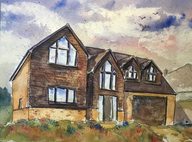
Another house in the village but this time I’ve not been approached by the owners to paint it. This one’s a housewarming gift. The guy that’s had this dream house built was horrified at the slow internet speeds in the village so got everyone in the village to sign up to receive some sort of credits that meant that the infrastructure could be put in place for fiber internet all over. It took a lot of energy on his part and the rest of us were too apathetic to get anything done, so he’s definitely earned this painting and I’m hoping that once everyone knows who he is (they only moved in about a week ago) that he’ll not have to buy his own drinks in the pub for a while.
This one started off as a drawing with the fineliners. It doesn’t count as a dash & splash, though, as I didn’t do the drawing en plein air and as I picked out sensible colours rather than randomising. This was my first go at using the fineliners on cold pressed paper. It felt harsher on the pens than the hot pressed I’ve been using to date but that’s just a sacrifice I need to make if I want watercolour paints to work properly. One thing worth mentioning about the drawing is that I messed up the perspective on the nearest downstairs window, with its bottom edge sloping upwards to the right rather than downwards. I tried to cover this up in the painting stage and by adding new pen lines at the end. It’s harder to spot now.
For colours, I chose Winsor red, French ultramarine and raw sienna. Two of them mix together to a brick red and the three of them can get to a decent black. These are the two main colours of the house – it’s all brickwork and black wooden cladding. I ended up using some transparent yellow later in the foreground and cadmium yellow in the spatters.
The sky went on first, both in the sky itself and in the windows. Obviously I couldn’t just use the blue, so threw in the red and some raw sienna. I used hitchin paper to blot out some clouds in a way that left the rest of the sky looking good.
Then the rest of the house was all about multiple layers. All three in the roof but with a blue bias, all three in the black areas, with a mix going towards black and red and yellow in the brickwork with a tiny bit of blue. In all three cases, my washes weren’t uniform – I made different component colours stronger in different places.
I also used all three colours in the greenery but found that my red and yellow weren’t producing a bright enough green for my tastes, so I used some transparent yellow in there to brighten things up. I added some blue and red grassy tufts with the Merlin brush to keep things interesting. I couldn’t just make the grass green after not making the wooden cladding black. It’s either realistic colours everywhere for me or impressionistic everywhere. Not that I use realistic colours often.
As finishing touches, I added birds and bricks. And corrected the bottom of that window. And then I was done.
They weren’t in when I nipped round to surprise them, so I headed out to the orchards where they were walking the dog. I introduced myself and they knew straight away I was the local artist. When I handed the painting over they seemed genuinely touched. Job done and a well deserved house warming present.
Leave a Reply