


It's my birthday and the front page headline on stash news is that I’m going…
She Wore A Yellow Ribbon
After such a miserable effort yesterday, I had to go back to the oil pastels today. With the watercolours it’s still touch and go whether I can produce something to be proud of but the oil pastels seem to work every time. Was I always a master oil pasteller, or is it just all those years of experience with a more difficult medium (watercolour) that oil pastels seem so easy to use? I have no idea. Probably setting myself up for a big oil pastel fail at some point but they say that if you never fail you never learn.
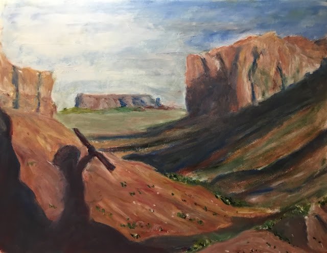
Anyway, it’s been a while since I last painted a scene from a Western, so I thought I’d get back on my horse today. I looked through a list of all the Weaterns I have on DVD and looked for stills from my favourites. Unlike with the watercolour Western paintings, I wasn’t looking for figures to be the (abstractified) stars: I wanted some rolling scenery. I ended up with this scene from She Wore A Yellow Ribbon, a 1949 John Ford / John Wayne masterpiece. There were some foreground rocks and a background butte to have gun with and lots of shadows, including a Native American silhouette, to challenge me. And it was also a scene in which I could see the deep red and delft blue playing a part.
I started with the sky as usual but then, rather than just working from the back to the front, some shapes skipped the queue. I wanted to mark out all the shadows, just to make sure I didn’t lose them. So I shaded them in gently with the sides of my star blue and red pastels. That was enough to secure their future.
And then it was just working from the back to the front. The butte, the background grass in front of the butte, cliff on the right, hill on the right, cliff on the left, hill on the left, triangle in the bottom right. Some of these shapes had shadows in them: in all cases I coloured in the shadow areas straight after the lit areas and made sure the two shared lots of colours in common for consistency.
Then there was the foreground silhouette. This was difficult. The colour ended up looking quite bland compared to the shadows on the right, so I deliberately added lots of red and blue tones to it in different places. It looks better now but still not as lively as I really wanted. It’s hard to tell the red and blue areas from the photo I took. The second problem with the silhouette was the shape of the Native American. I hadn’t managed to replicate the shape from my source shot, not that the shape there was quite right anyway. I did a lot of tinkering with my shape, both reclaiming and surrendering areas from/to the hillside. I eventually ended up with something just about acceptable but still blurred the left hand border of the shape for a bit of energy and ambiguity.
Finally, the was more tinkering, adding greenage and fiddling with the edge of the sky shape, trying to get hard edges. And then I stopped.
I’ve actually ended up with something I’m happy with. The hill and cliffside on the right are the best bit, with the shadows setting up a great atmosphere for the painting. I’ve caught this bit of the painting out of the corner of my eye a couple of times and been shocked by the realism. There’s also some vibration in there from the complementary reds and greens competing against each other. The worst bit about this one is the colour of the shadow in the bottom left. It’s a little too muddy for my taste but that’s not a big problem.
This one is up for sale. A no brainier. To see the price, click here.
Leave a Reply