


Number four in the On The Buses collection is Olive, played by Anna Karen. Recognisable…
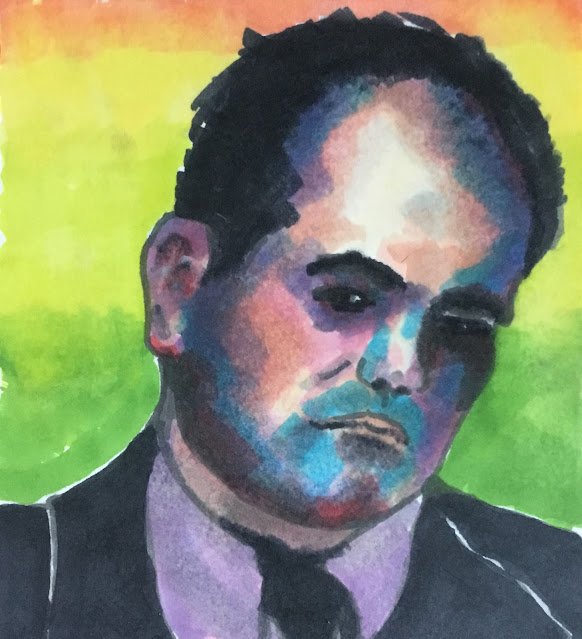
Shaun Williamson
I’ve been planning to go on a trip to the seaside for four days now and for four days I’ve been put off by either the weather or M2 closures. On the first day I went to Rochester Castle instead but then stayed at home reading books for two days. Rather than do that for three days in a row, I thought I’d better exercise some artistic muscles. Today I dug out the marker pens.
As a subject I picked out the great Shaun Williamson, the local guy who played Barry Evans in Eastenders. Shaun popped up on the telly a few weeks ago and I immediately identified him as at portrait subject. The contrast between the light features and black hair would make for a great chiaroscuro portrait and the big forehead would offer opportunities for some crazy colours. So I added Shaun to my to do list.
I have a little bit of history with the big man. Shaun played the villain in a pantomime in Chatham a good few years ago. He did a great job too. Very early in the play when he introduced himself as the villain, he told the audience that the thing he hates most of all is being called Barry. So every time he comes on stage, everyone is shouting Barry. Now, there was another scene quite early in the panto, not including Shaun, of some pantomime dame doing the laundry. It descends into a pants fight with the actor throwing loads of pairs of pants at the audience and the audience throwing them back. A pair of pants came my way but rather than throwing them back, I saved them for later. So when, about halfway through the panto, Shaun have a big monologue, finishing with an evil villainous laugh, I threw the pants at him. Better than booing and Shaun saw the funny side, saying now he knew how Tom Jones feels.
So, what with Shaun being such a good guy, I really wanted this one to work out but it didn’t. The likeness and, even worse, the character just aren’t there. I still don’t know what I’ve done wrong. I’ve compared my source photo to the drawing and nothing jumps out as being different. Very weird.
I started off with various shades of grey, then added some colour with ink, purple and blue. Then I tinkered about, switching between greys, fleshy colours and my pink/violet/blue trio for a while. The purple short and black jacket and give weren’t always that colour: they’re just a case of me cutting my losses and going for simplicity. The bright background was added at the end to contrast with the dark tones that Shaun ended up with.
Not a success, this one, and it’s not going in the shop window. I’m a bit gutted.

Leave a Reply