


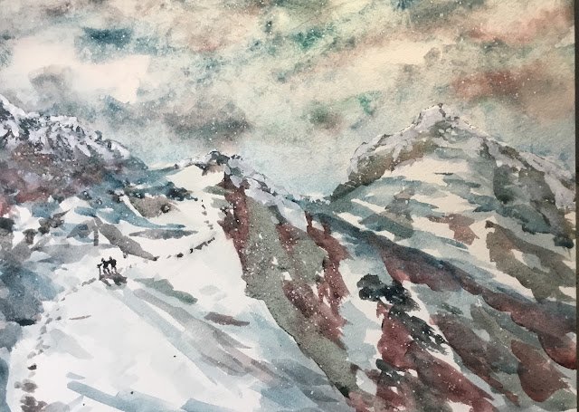
Sgurr A’Fionn Choire And Baruch Na Frithe
The distracting FIDE Candidates Tournament is over and I need to get back to painting and make up for lost time. But the test match was on this morning and looking like finishing soon after lunch so there was no morning painting. And I wasn’t ready to go back on the road and my iPad was charging. That left two choices: something random or something from a book. I had a search around the bookshelves for some suitable material and found a book on walks on the Isle of Skye. I quite fancied painting snowy mountains so decided to go for this one, showing the walk home from Baruch now Frithe (the hill on the right).
Despite only having cold pressed paper in my supplies (no rough) I thought I’d give the granulating mixes a go again. The main three colours today were viridian, Mayan blue genuine and rose dore. I guess this counts as being in the key of green warm if you think of the viridian as a really cool yellow. Also appearing were cerulean blue, hematite violet genuine and titanium white.
I didn’t start with a pencil outline today but just went freestyle with the paint. I started by carefully painting the sky with just water so that I could get my skyline roughly right. This feels like an important first step in freestyle painting. Then I painted in the sky, most of it in Mayan blue but with the creamier cerulean blue at the bottom and some white spaces for clouds. Then I added in some viridian and rose dore, trying to get them to mix with each other and with the blues and not showing up as individual colours, something I didn’t achieve but that’s not a problem. I dabbed the sky dry with kitchen paper as usual, trying also to remove paint where it had spilled over into the mountains. Despite there being no hematite violet in the sky, it has that dirty, granulating black look to it: this presumably all came from the crystals in the Mayan blue.
Next I moved on to the dark shapes on the mountains. In terms of shapes, I tried to roughly follow my source photo but for colours I was more unrestrained. I created three colour mixes, mixing each of the rose dore, the Mayan blue and the viridian separately with the hematite violet genuine. I then painted all the dark shapes in with these three mixes, switching randomly between the three mixes, often within the same shape. I also sprinkled on some salt in a couple of places.
The third of my three planned steps was to add a shadowy glaze over the top. This was mainly Mayan blue but with a tiny bit of hematite violet mixed in: it was a blue colour rather than the granulating grey that these two colours produced in the second step. It was also much more watery than the dark colours in the mountain. This glaze went over parts of both the dark shapes and the white areas.
Finally, there were three, no, four bits of fiddling at the end which (touch wood) didn’t worsen what I already had down on paper:
– I added a second glaze of the dark colours in places where I thought the painting needed it. In particular, I added the diagonal line of reds down the right hand side of the nearest mountain, trying to balance the green/grey gash down the middle of the painting.
– I added the hikers and the footprints on the left where the large white area was looking a bit boring.
– I added some white to the tops of the hills, on top of both dark colours and whites. Somehow contaminated titanium white looks snowier than empty white paper. And the hills, which didn’t have snow on their peaks in the source photo, looked like they needed it.
– It’s hard to see but I spattered on some titanium white at the end to make it look like there was some snow in the air.
And that was it. I like this one. For once there’s nothing that bugs me about the painting. I only have positive thoughts about it. Using the same colours in the sky and hills (apart from the hematite violet, which is more like a special effect medium, and the cerulean blue) makes it all hang harmoniously together. And yet the sky and the hills are clearly separated by their completely different textures. The red, blue and green greys in the hills make things more interesting than exact replications of the original colours would have done. The figures create scale. And everything feels cold. This one’s up for sale.
Leave a Reply