


It's been a while now since my last painting but I decided earlier in the…
Seven Local Landscapes
It’s the new year. Welcome to 2026. My year end hiatus is officially over and I’m back into action. As usual, I needed to rattle out a no pressure painting to clear up the cobwebs. Today I pinched an idea from YouTuber Niaz Hannan that I thought might be worth trying out.
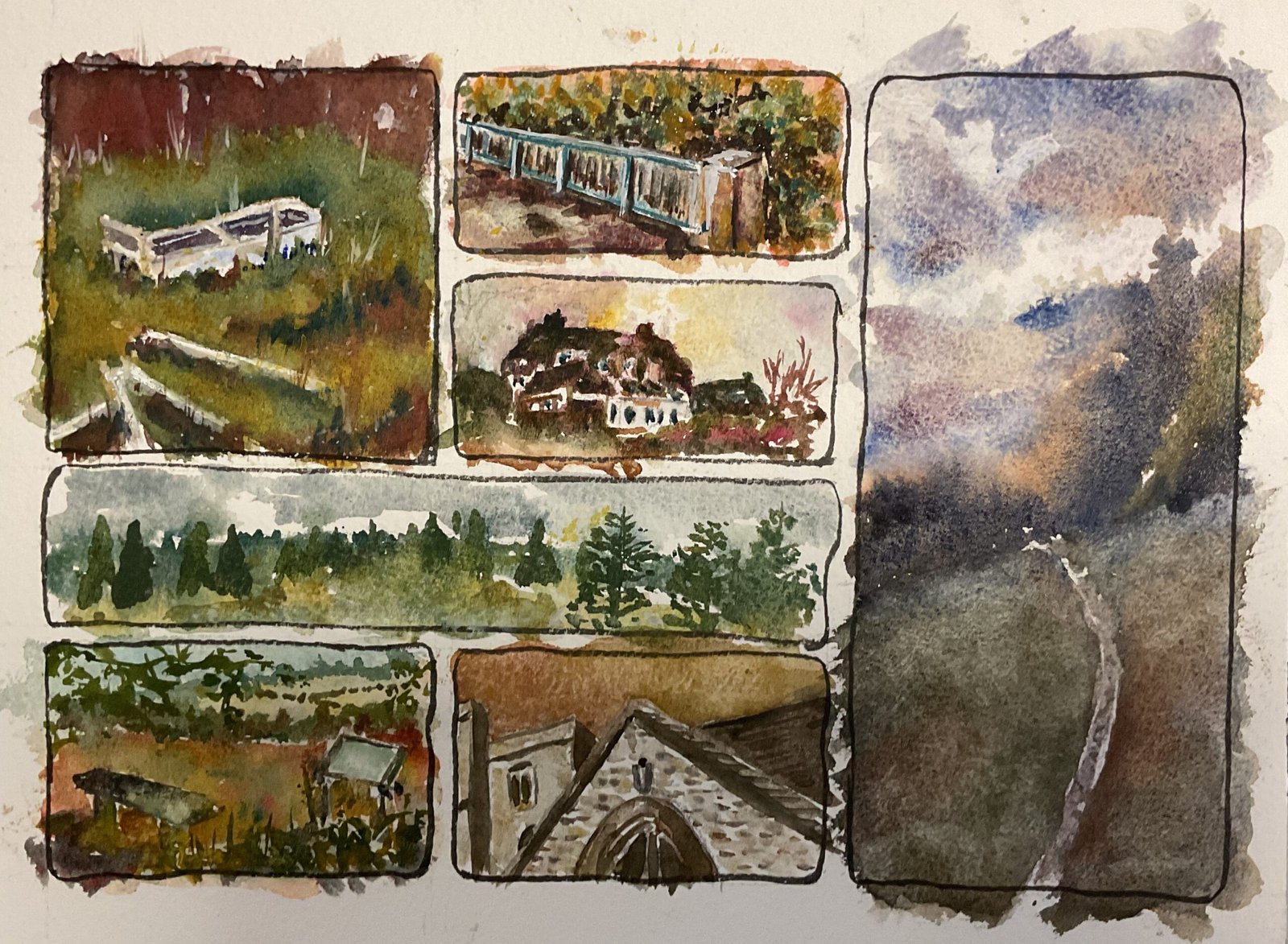
I divided my paper up into seven differently sized and shaped rectangles. And I marked these out with the brush pen from my fineliners rather than separating them with masking tape. Masking tape is neater but the fineliners encouraged me to paint looser, letting paint go over the edges. And I need to loosen up after two weeks on the bench. I decided on seven colour schemes for the subpaintings that would allow me to use most of my colours (final count was 31!) and seven local landscapes or local mini landscapes to paint. Let’s go through them in order:
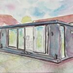
Top left is a water trough out on Queendown Warren. I painted this in the key of triadic right, using French ultramarine, Winsor red and transparent yellow. And I spattered in a little cadmium yellow and white gouache at the end. It’s not a great start to be honest. I like the colours in the grass and the loose planks and pipes in the foreground but the perspective is a little off and the brown at the back is too uniform and too muddy.
Next in the middle at the top is a detail from a bridge over the M2. It’s in the key of green warm, using cerulean blue, rose dore and raw sienna. I had real difficulty getting these three colours to work together. I ended up having to use white gouache for highlights and sepia for darks and titanium white to create texture. This subpainting was a disaster.
Just below that one is the Rose & Crown. This is in the key of triadic left, using Mayan blue genuine, quinacrinone magenta and Indian yellow. The intention was for the pub to be mainly in silhouette with a big bright area in the sky above it and a couple of sunbeams visible on the roof. The sky has some interesting colours in it but the light effect I was after isn’t there and everything is too loose: it really needed a hard, detailed edge along the top of the building. Another flop but maybe the merits of the set of seven will exceed the sum of the merits of the parts. Let’s keep going.
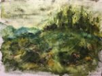
The panoramic landscape subpainting is from a Christmas tree plantation a little to the West of the village, a field I walk through on those days when I feel like upgrading my four mile walk to 5.6 miles. It was painted using the Shire supergranulators. I used all five Shire colours plus green apatite genuine and forest brown for dark greens and burnt sienna to reduce saturation levels. This is the best subpainting so far. I didn’t use cerulean blue with the Shire colours for once, so the sky is Shire grey and Shire blue and looks pretty good. There’s no real detail agin, but the panoramic shape isn’t one that needs a focal point, so that’s fine.
Then in bottom left, we have Lula’s spot on Queendown Warren. This is in the key of orange cool, using Winsor blue (green shade), rose dore and Indian yellow. I guess the orangey foreground is ok, but the neutral colours all look a bit too muddy to me. In this painting and in the first three, I was trying to channel my inner Lirion Yankonsky and use a mix of all three primaries everywhere, biasing it in favour of whatever primary or secondary I wanted to see. As opposed to just using primaries or mixing secondaries. So everywhere something looks blue in these four paintings, I’ve mixed red and yellow into the blue. But this hasn’t been working and I’ve been producing mud. Maybe I’ve been too fast. Or too loose. Or fast and loose.
Then in middle bottom we have the village church in desert colours. This is ok. I like how I made the sky darker above the tower and lighter above the roof to create value contrasts. And how I created three dimensions by darkening two faces on the tower that were well lit in my source photo.
And finally, the big subpainting on the right is a view in Queendown Warren, painted using the tundra supergranulators. It’s hard to go wrong with these colours: this is about as bad as they can get and it’s almost passable. I like the ambiguity. Are those trees on the right or background hills? And to the left of them, is that sky or background hills?
At the end of all that, I feel not just that my mental cobwebs have been blown away but also that I’ve loosened up physically, ready to get back into the swing of things. Today’s painting is a reject. This isn’t one of those where the whole exceeds the sum of the parts. Obviously a worthwhile exercise though, for aforementioned reasons. And if there’s a pattern to these seven subpaintings, it’s that the three with the supergranulators are superior to those in colour keys with my conventional palette. Which is great because I’m expecting my next painting to be a landscape using the tundra colours.
Leave a Reply