I’ve had a busy day dashing and splashing around the village. I just woke I…

Secret Door Into Hartlip Church
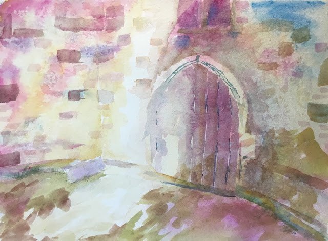
The Euros start today, so my paintings might slow right down over the next few weeks unless I can start getting out of bed earlier. There’s only the one game today, so plenty of time to dash out this painting. After too many clunkers lately, I thought I’d go back to Hartlip Church to boost my confidence – these paintings tend to sell in a couple of hours. This is a door in the side of the church that I often see while out walking the dog.
I’m trying out the Jean Haines style again today. Watery, loose, not painting everything, Venetian technique. The colours today are cerulean blue, raw sienna and quinacridone magenta. Only three colours and in the key of green cool. The cerulean and raw sienna are no brainiers for old buildings like this and, looking at my swatches, I thought quinacridone magenta made for a better triad than rose dore.
I started by drawing the subject. Not something that Jean recommends but I do need something to guide the brush. There was no masking fluid used today. Instead I went straight for a watery underpainting. I started with the raw sienna then dropped in the blue and red wherever I wanted things to be a bit darker or for bricks to show. I used Jean’s Venetian technique on the stonework in the underpainting, sprinkling on salt, laying on French stick wrapper, crinkling it and weighing it down. I left this a few minutes to dry, rather than leaving it overnight the way I do with my random abstracts.
After that, well it was about painting over the top. Painting the door and the bricks was a joy. The ledges, window and “skirting stones” not too bad either. I also did a bit of negative painting around the door. I must have has two or three runs at adding these extra layers.
Finally, as finishing touches, I added the tree shadows and some very watery raw sienna to soften the edges of the sunny streak.
Result? A success. The best bits are the colours in the door, the variation in the bricks, the Venetian textures and the underpainting (I like the patch of blue in the top right). If there’s one thing wrong with it, it’s that the door looks a bit too squat and square compared to its real life counterpart.
My sister picked this one out when I offered her a freebie.


Leave a Reply