


Today's painting is a long overdue subject and a less overdue experiment. The subject is…
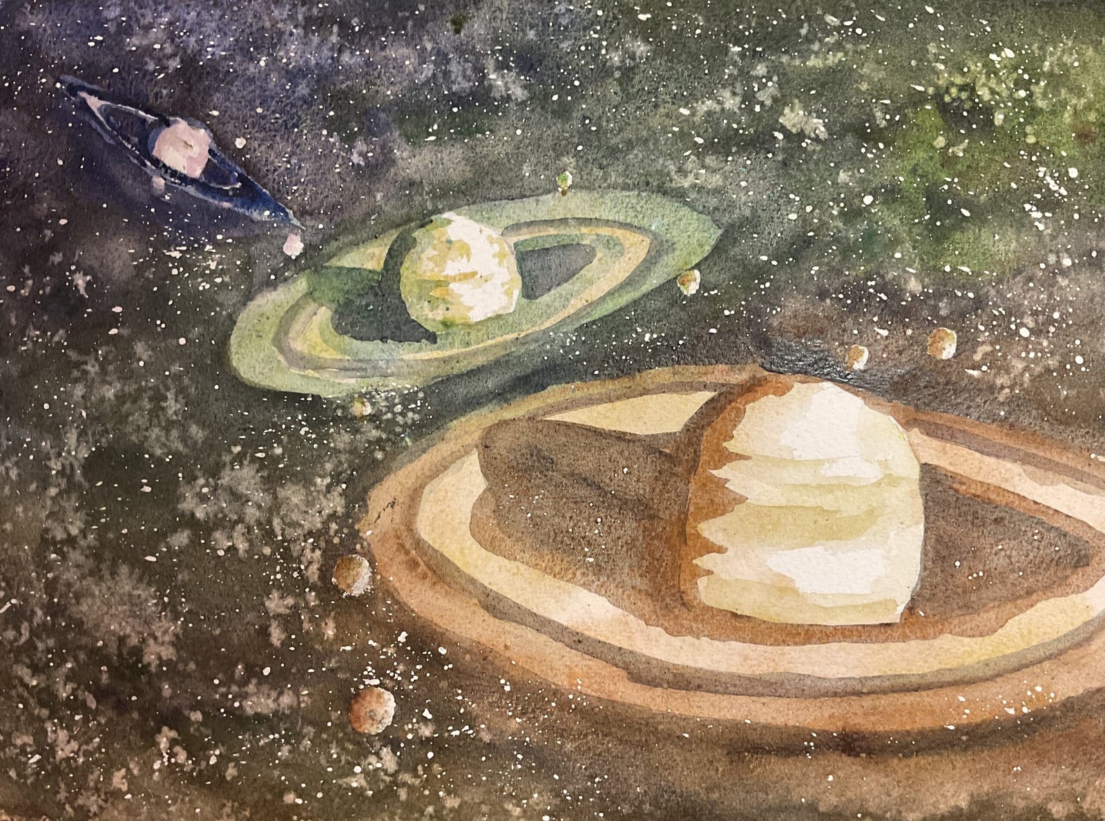
Saturn
I really do need to finish my collection of planet paintings at some point so I’m back on the case today with Saturn. For a while my plan had been to just paint Saturn with no special frills – it’s already a work of art as it is. But on my walk today I hit upon the idea of three triple glazed paintings of different sizes all together on one sheet of paper. It worked the other day for Pigpen, so why not? This time, though, I used supergranulation paints and filled up all the paper rather than leaving a big white space on the bottom left.
I started by putting down three pencil outlines. I deliberately put the planet at different angles to get a bit of energy going and made sure any shadows on the rings implied similar light sources. I spattered on some masking fluid for stars and reserved a few small circles for moons, let it all dry and then rubbed off any spatters that I could see over planets or rings.
For the colour scheme, I took advice from the Artist Assist App again but wasn’t a slave to it, adding some extra light colour in bands across the planets to emphasise their spherical shapes. I’ll not be a slave to a tool. I decided to use tundra colours for the furthest planet away, desert for the closest and Shire in between. And rather than restricting myself to my favourite triads, I kept things interesting ny using multiple colours and allowing neighbouring triads to interact. So:
– the first layer was Tundra pink in top left, desert orange and desert yellow in bottom right and Shire yellow and Shire olive in between
– the second layer was tundra blue in top left, desert brown in bottom right and Shire blue and Shire green in between. The borders between adjacent colour schemes were in differentgplaces in the second layer to the first as I didn’t want abrupt changes. And I charged some Shire colours. Into the desert and tundra areas and vibe versa.
– the third layer was tundra violet in top left, desert grey and desert green in bottom right and forest grey, green apatite genuine and Shire grey in between. Again, I put the borders between schemes in different places to those in the underlying layers and charged in colours from adjacent colour schemes. I put in a little bit of salt as the paint was drying.
After removing all the masking fluid, I added some first and second layer colours to all the moons to bring them to life. And that was me done.
I guess this is OK. The colours definitely work, especially the green apatite genuine in the top right – I forget just how good that colour is. Where this one suffers, though, is in the draftmanship. It looks a bit slapdash in places. But I guess that’s part of my style. You want craftsmanship, talk to an architect; you want interesting colours, come to me.
I’ve now done seven planets, bringing me up level with Gustav Holst. I still have one more to go though.

Leave a Reply