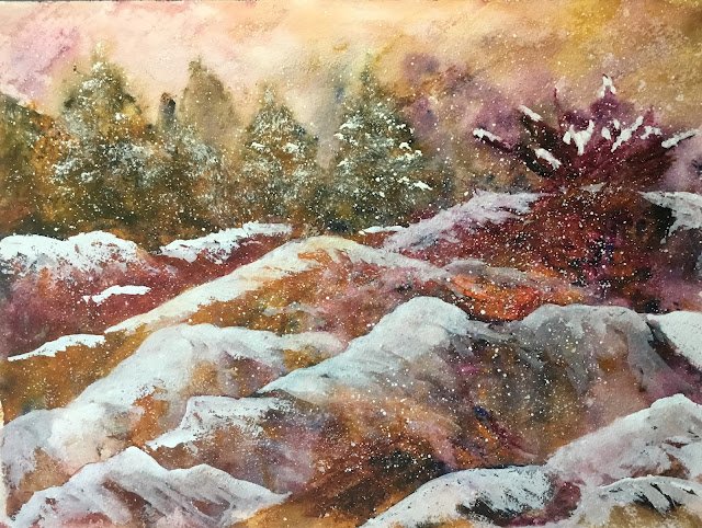
There’s a long story behind this one. I didn’t have much time to paint today but thought I’d been away from the brushes for too long so that I’d do something quick and easy that didn’t need much planning. I decided to have a go at repeating the technique I used for Still Raining, Still Dreaming a few weeks ago. But rather than using it as an excuse to use up some of the redundant looking tubes in my box of spares, thought I’d try out three of my regular colours. I wanted to steer away from staining colours which restricted me to quinacridone magenta and a choice of two yellows and two blues. In the end I decided to go for Indian yellow and French ultramarine which put me in the key of purple warm. Obviously titanium white made an appearance later on though.
So I sprayed the paper and squeezed a peaful of each of the primaries onto my porcelain palette. Then I sprayed the paper randomly and used a palette knife to put the paint straight onto a horizon line through the middle of the paper with no water added. I sprayed the paint again and tipped it around a bit to see what happened. I say to see what happened – the real objective was to work out which half of the paper would be the sky and which half the foreground. After a while I worked this out, then started pushing some of the paint around in an attempt to create a bit of foliage. I ended up with that purple thing in the top right.
At this point I probably should have wet a brush and pulled the existing paint around into interesting shapes. But I made the mistake of adding more paint instead – some for the trees in the top left and lots of it filling out the foreground. I sprayed on more water and pulled the paint around, trying to get some interesting foreground shapes but the damage had already been done and I was starting to create mud, which takes some doing, let me tell you, when you’re only using three transparent colours. I threw on some salt but it only had any effect in the top right of the sky.
So it was time for a rethink and a rescue plan. This was a job for titanium white. l’m starting to really like this colour. It will never end up taking a slot on my palette because I use it straight from the tube a lot of the time. And I did indeed start with the paint almost neat and added fallen snow in appropriate places, which meant on the trees, on the purple plant (and in the nooks between leaves in particular) and along the tops of little hillocks in the foreground. It took a couple of coats to get the white as opaque as I needed it in the more important places. And on some places, the snow picked up a little colour from what was underneath, which I didn’t mind a bit. Then I watered the white down a little and spattered it everywhere. After standing back and looking at the painting, I added a little bit more snow in one spot to make it all easier on the eye.
And then I stopped. I’m glad I didn’t stop earlier because the titanium white ended up doing an amazing rescue job. Where, before, there were muddy colours in the trees and foreground, those areas have somehow become colourful again, with all three primaries shining separately and working well together. I don’t know how this happened. But something else weird has happened too. Those snowy banks have ended up looking more like choppy water waves, with that plant in the top right looking like a wave breaking in some rocks. It’s an ambiguous painting. Is it snow? Is it waves? I’m just going to call it Sastrugi. Sastrugi are snow waves, which seems appropriate. Algernon and Jimi couldn’t come up with any better names today.
And overall, whisper it but this looks OK to me. I like the ambiguity, the colours within the waves, the dirty whites and all those colours in the sky. This one was donated a raffle prize on a quiz evening at the Rose & Crown to raise cash for CoppaFeel! And Breast Cancer Awareness.


Leave a Reply