


It's just too hot outside to paint this week, so I'll be having a run…
Sarah Ann
After a few weeks away following the loss of my father, I’m back to the artwork. And I’m glad I am. It was great to spend an hour and a half away from everything.
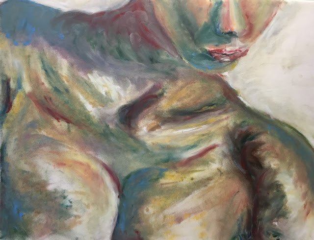
I thought I’d start by going back to the oil pastels. It felt like there was unfinished business after my first attempt at figure drawing using oil pastels. I couldn’t just stop there: I needed to have another go just to see whether this might be an interesting new direction. So I picked out a pose by Sarah Ann (making her debut) and got to work. I thought this close up pose might be better suited to the pastels, where my finger smudging sculpting might have a comparative advantage over inktense pencils. That doesn’t mean that the oil pastels will be better than the inktenses at close up poses: it just means that if I had to divide up the work between the two, I’d be giving the closeups to the oil pastels and the full shots to the inktenses. The inktense sculpting with the water brush feels more controlled, so better suited to more complicated subject matter with arms, legs and all sorts.
My method for this one was just to put down a faint pencil outline and then charge in with the oil pastels. As usual I dabbed in the oil pastels with lots of spots, then sculpted/smoothed them out with a finger and with a rubber tool on a stick where a fingertip was too big. After smoothing, I’d add on more colour if I wanted to change things. I did a lot of this: fiddling is a very bad habit with watercolours but great with the oil pastels. I started with blues, reds, ochres, a very bright yellow and white but it wasn’t until I added some sap and pine greens that the painting started to come to life. I have no idea why this was but I’m loving these greens. My oil pastel set was put together for landscapes but is great for figure drawing.
I put some white over the background fingerprints because there was one place (at the back of the neck) where I’d coloured outside my pencil outlines and ruined the shapes. I think this correction worked. As a very last step, I added some bright blues, yellows and reds in places because I wanted these colours to be visible in the final painting rather than just contributing to mixtures. I think this was a really smart move.
The impressionistic colours in the final version remind me of the cover to Contemporary Figures In Watercolour by Crane and Butler, a book currently flying high in my wishlist. The more I look at it, the more I like it. I rate it a success and am putting it up for sale. To see the price, click here.
Leave a Reply