


It's Tuesday and Sky Portrait Artist Of The Year is on later, so I was…
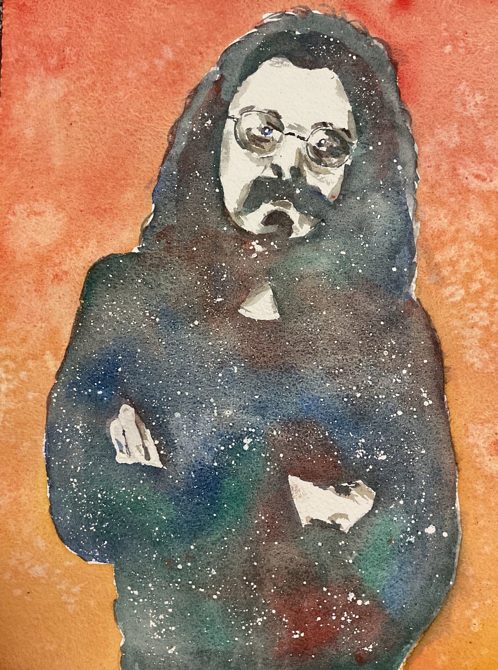
Roy Wood
With one page left in my rough watercolourpaper block and that page starting to come away at the edges, I wanted to do another watercolour today just to get to a good place.
With December starting tomorrow, I went for a Chriatmassy personality in Roy Wood, founder member of Wizzard. Because I was using paper with a rough surface, I picked out granulating colours in the form of French ultramarine, raw sienna, viridian and cadmium red. If I can count the viridian as a second cool yellow, I can claim this to be in the key of triadic right. But what will be most shocking for regular readers of this blog is the starring role played by cadmium red. This red is an opaque colour, so I only normally use it for garnishing. It’s been years since I used this colour in a starring role. So how did it get on?
I’m sure everyone can guess that I started with a pencil outline using a grid. With Roy wearing glasses, I was careful to measure out important turning points within the squares: glasses can be unforgiving if just drawn freehand within a square. And I spattered masking fluid overall the dark areas, looking to create a little magic. I didn’t use much masking fluid to cover the light areas but did put down some highlights and a few lines down where I wanted sharp edges between dark and light areas. These edges don’t look any sharper than non–masked areas, so I don’t why I bothered really.
The first colour to go down was in the dark shapes. I put down a layer of the blue, red and green, allowing them to mix a little bit on the paper to create some interesting darks. One thing I probably got wrong was separating the hair into a dark shape closer to the head and a lighter shade further out. After I added mid–tones, I could see that the contour dividing the two hair tones was much too sharp. I corrected this by mixing the green and red into a dark neutral colour and putting this all over all the dark areas and the outside of the hair in a unifying wash. I quite like how this turned out: Roy’s looking better in black with hints of blue, green and red than he did in blue, green and red.
My original plan had been to add some mid-tones to the flesh using a mix of raw sienna and cadmium red but Roy was looking so good that I instead mixed a watery colour from the blue, green and red and used this to add a few shadows and improve the likeness.
With the most important stuff complete, I stopped to think about what sort of background I could add. I didn’t want to leave it white and wanted some bright colours to offset Roy’s darks, so just used watery washes of the red at the top and raw sienna at the bottom and encouraged them to mix into a graduated orange background. I sprinkled on a tiny bit of salt in an attempt to suggest snow and to create a second hint of magic (along with the masking fluid spatters).
And after leaving the painting to dry and removing any remaining masking fluid, that was me done.
And I rate this one a success. There’s a likeness, some attitude in the pose, the magic in the salt and the masking fluid, the simplicity of the composition, the contrast between subject and background and some amazing colours and granulation in Roy’s silhouette. This was a good day at the office. Roy’s up for sale. To see the price, click here.
Leave a Reply