


I wasn’t very good at painting and not that committed to improving. I would have…

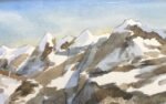
Roughtor, Dartmoor
Tempting though it is to keep painting portraits and figures, I do need to keep up the landscapes, ready for LAOTY of I make into a pod or the wildcards. I thought I’d get back into the swing of things with a pile of rocks on Bodmin Moor. I liked the look of the two hills in the left, so went for a huge sky so that I could fit them in.
With such a huge sky to fill, my mind went straight to sunsets, so I picked Winsor red as my red. For the yellow I picked raw sienna as I wanted some earthiness in the rocks. The blue was a close call, I went for French ultramarine, wanting some granulation but not being in the mood for the grittiness or Mayan blue genuine and wanting better greens than those that cerulean blue tends to give. Before getting started I checked out my swatch book and tried out the three colours on scrap paper to check that they could give me the colours I was looking for. White gouache was also used near the end.
The sky was the obvious place to start. After doing some tests on scrap paper, I decided that my sky would work in bands from top to bottom of blue, violet, red, orange and yellow. I thought that yellow in the lower sky behind the rocks would enable them to stand out. So I started by putting down that basic banded sky. It worked but looked a bit boring. So I mixed a neutral colour and used it to add some wet into wet clouds. The clouds didn’t look good, so I variegated them by dropping in blue and red hints. But that made things worse than ever, so I quickly sprayed on some water, tilted the paper around and dabbed out the puddles with kitchen paper. I threw on some salt in an attempt to create some magic in the sky rather than to create textures. And that’s how I ended up with what you see here.
My plan at this point is normally to work from back to front but I’ve developed a new habit while portrait painting, which is to start with the darkest shapes so that I have something there for everything else to hang off. So my next step was to paint in the shadows between the rocks. When I was left with just the sky, those shadows and the pencil lines, things were looking really good and I thought long and hard about whether to make this one a snow painting. In the end, I decided not to and moved onwards.
After that I just worked from front to back as usual. One think I didn’t do today was to replace my water or wash out my palette when they got dirty. Instead I went into Liron Yankowsky and worked like a pig in shit, managing to come up with some interesting unsaturated colours. Everything still looks colourful but not as colourful as usual.
I’ve not much to say about the first layers of paint: the tinkering is more worthy of discussion today. The hills on the left needed to stand out gibst what was behind them and the ricks and foreground needed to come forward even more than that. Mist of my tinkering was in the form of extra layers of paint to bring those shapes forward. Sometimes, when only a slight adjustment was needed, I’d glaze over a really thin watery layer of paint. I dabbed out some paint with kitchen paper on the right between the hills and t( foreground to create a cool mist and push the hills back a bit. To farken the foreground, I painted over mist of it by flicking in grasses with the Merlin brush, using all three of my primaries. At one point I tried adding stones in white gouache but this didn’t really work, so I added white grassy flicks with the Merlin and spattered over some magical white spots while keeping the rest of the painting covered. And I added the odd white spot to the rocks.
Finally I added some birds to create some interest in the sky. Maybe I should have added them on the left to balance the rocks but that idea felt a bit too diagonalised to me. Instead, putting them on the right emphasises the hills on the left more and maybe even the light patch in the top left of the sky. Anyway, that was me done.
And, yes, I’m happy with this one. The hills, the rocks and the foreground are all distinct from each other and from the background and all three are interesting in their own way. It’t the sky that’s the star though. There are some gorgeous purple tones in there and the yellow at the bottom complements the purple while pushing forward the hills and stones in front of it. The salt marks in the sky add something too but I don’t know whether it’s something positive, let alone whether it’s adding magic or a chill. This started off as a painting of a real place from a source photo but the more time went on, the more I painted stuff from my imagination. Surely that’s got to be a good thing? This one’s up for sale.
Leave a Reply