


It's my birthday and the front page headline on stash news is that I’m going…
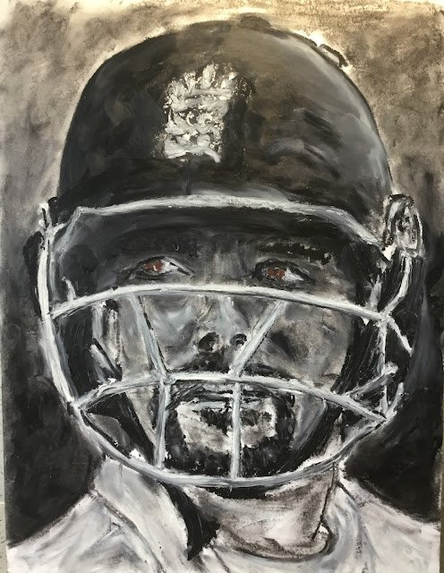
Rory Burns
I noticed the other day that I’d still not used my black oil pastel. With watercolours, black’s a pretty boring colour and a bad mixer. I can only ever imagine using black in a monotone painting or, even better, in a chiaroscuro painting with only black and white. Anyway, I thought I’d give the black oil pastel a go today.
I picked out Rory Burns as my subject. Black and white makes me think of chess, Newcastle United and cricket. After thinking a bit, I decided Rory might make a decent subject for a black and white painting. For anyone that doesn’t know, Rory’s an opening batsman for Surrey. He had a long run opening the batting for England but was dropped for the forthcoming series in the West Indies after having a bad Ashes tour. I hope he’ll be back soon.
Most if the painting uses only two pastels: black and white. Just as with my chiaroscuro paintings and drawings, I started from the darkest areas rather than the lightest. It’s an unorthodox technique but it works for me. I also added a brown in the eyes just to add a bit of character and interest – I think it was burnt sienna. The background is deliberately graduated from light values at the top to stand out against the helmet to dark values at the bottom to stand out against the whites.
I found this to be quite a messy experience and that I don’t really like using black. Maybe I’ve become used to mixing three different colours everywhere and feel too constrained just using just black and white. If I ever end up using all of the black pastel (and that’s a big if, even though that pastel took quite a pounding today), I don’t see myself replacing it. Maybe I’d bring in an orange or a violet.
There were some good things about this painting:
– the rough England badge on the helmet works
– the clothes work again, with the energetic sweep of the neck of the t-shirt looking especially good
– there’s a look of regret in Rory’s eyes and mouth that reflect the torrid time he had in Australia
On the other hand, the likeness isn’t really right and black doesn’t really make for an attractive painting. Which is why I’ve never really seen the point of charcoal drawings. But Rory’s grown on me since I first put up this post. He’s up for sale. To see the price, click here.
Leave a Reply