I discovered something new today, thanks to Liron Yankonsky's YouTube channel. It's the Artist Assist…

Ron “Pigpen” McKernan
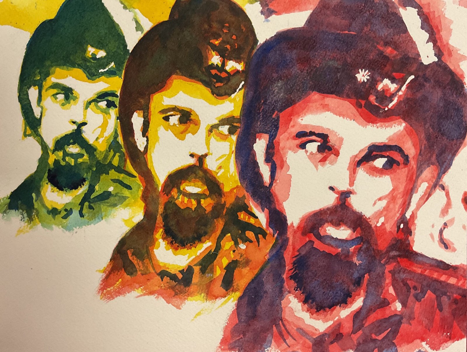
My year end painting hiatus is over and I’m back in the studio. After thing breaks I tend to work my way back in slowly with low pressure works like abstract landscapes but today I was in the mood to push boundaries. I’ve talked about wanting to do triptychs of triple glazed portraits but wasn’t feeling in the mood for that so I thought I’d have a go at doing three triple glazed portraits within the same painting.
Today’s subject is the late Ron “Pigpen, McKernan of the Grateful Dead. He could be found at various times on vocals, harmonica or keyboards. A great example of his vocals (unfortunately without video) can be found at https://youtu.be/DzYu3a0HJmk?si=eMB7dyE8Dprtye1T. It’s hard to listen to that while looking at this painting but I’m getting ahead of myself.
A lot of work was involved in getting the original pencil outline down. I’ve had to put down the same drawing three times with different sized grids. A bit of calculation was involved in working out what shape rectangles to use and how much to overlap them by. Today I put down the outlines as if I were just doing a normal portrait rather than cheating by putting down the outlines of the shapes that the Artist Assist App recommended. And after putting down the pencils I masked out some areas with masking fluid.
And then it was down to painting, using three layers of different values and shapes recommended by the Art Assist App. Five colours were used today, making up three of my favourite triple glaze combinations. For the first layer I used transparent yellow on the left and in the middle and rose dore on the right. Then it was cerulean blue in the left and Winsor red in the middle and on the right. And finally French ultramarine as the third layer in all three sub-portraits. Because there’s both a warm and a cool blue in there, I can’t classify this under a single colour key.
Otherwise there’s not much to say about how I painted this one. It was just a case of imagination, followed by careful planning followed by a process of painting over three glazes, waiting each time for the layer underneath to dry.
So we’re already on to the evaluation. Let’s get the bad stuff out of the way first. I was maybe a bit too slapdash with my glazing, often not mixing enough colour and ending up layers of paint that were thicker in some places than others. His hat could be a bit rounder on the left I guess. And maybe when putting down the initial drawing I could have left out some of the background bits like whatever’s above Ron’s hat and whatever’s to the right of his face in the biggest portrait. But that’s all by the by. Because I’m feeling really proud of this one. It shows off my imagination and Ron’s personality. And there’s something about this Art Assist App that makes everything come out looking like a photo. This one’s stunning and brings a tear to the eye.
Pigpen is up for sale. To see the price, click here.


Leave a Reply