I've had a day out at Rochester Castle today. I had plans to head out…

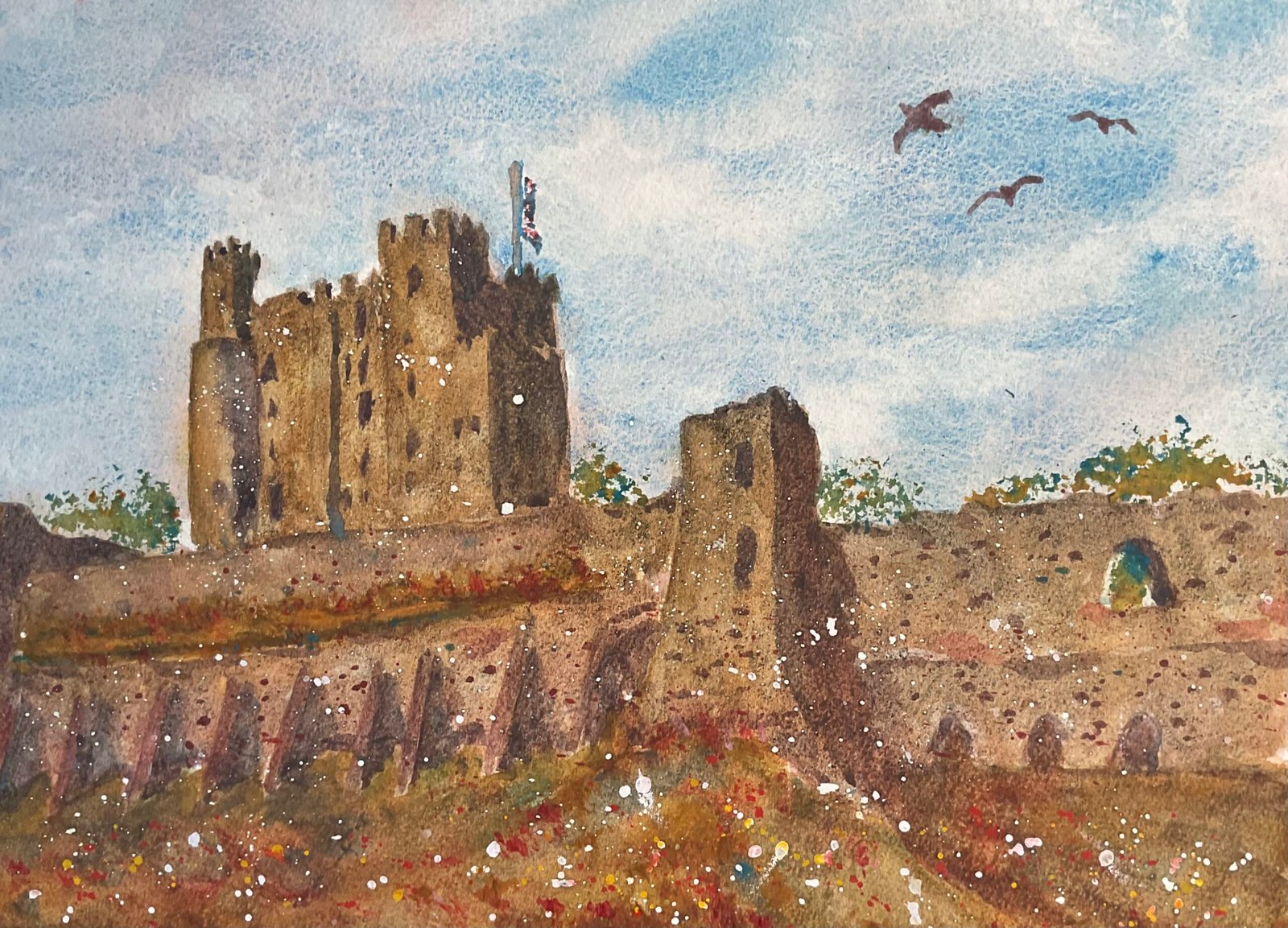
Rochester Castle From The Cathedral
For the first time in 2024, the weather forecast was warm enough and dry enough for me to venture out painting. Like a very bad penalty taker I drove down to the A2 not knowing whether I was going to go left towards Rochester or right towards the coast. At the last minute I decided to turn left, so headed into Rochester and to the castle. I have, of course, painted Rochester Castle before.
Once I was parked, I strolled round looking for a good spot to set up and view to paint. I settled on a little alcove in the well of the cathedral that would keep me out if the way of pedestrians and that had a view of the wall of the castle at the top of a grassy bank, with a mini tower in it with an interesting curved, sweepy outline and with the min tower and some trees poking over the top. Before getting started, I wandered into the High Street to grab a coffee to bring back to my painting spot. I had plenty of conversations with passing pedestrians during the day and with loads of pupils from Gad’s Hill School who were queueing up for a school trip around the cathedral.
There’s always something I forget to pack. Today I found myself wishing I’d brought along some salt and more kitchen roll than the two sheets that I’d packed. Maybe next time. I deliberately didn’t bring the iPad or a ruler, so there was no opportunity for me to sketch using a grid or to plan using the Notanizer app or by just cropping photos. There was no cheating today.
For colours, I picked a triad of cerulean blue, raw sienna and rose dore. Cerulean blue suited the sky on the day. I picked a warm red so that my blue and red would make a neutral colour rather than a purple. And looking through the swatches of my three different yellows with that blue and red, I thought the combination with raw sienna made up a palette that best suited the subject in the day. So this is in the key of green warm and, looking at previous green warm paintings, this is a pretty typical green warm painting. I also used hematite violet genuine to get a bitty texture in the walls and white gouache cadmium red and cadmium yellow for some finishing spatters.
This one was painted in a number of layers but I wouldn’t call them glazes as each layer was a mixture of colours and I wasn’t deliberately using staining colours or trying not to disturbing that was already on the paper. So, after reserving whites for the flag and flagpole, and spattering some masking fluid over the foreground, I started applying the layers:
In the first layer. I put down the sky, mainly in the blue but also with some red and a tiny bit of the yellow in places. For the rest of the painting (castle and grass) I put down fairly random colours as an underpainting, trying vaguely to make shadowy areas darker and grass greener. The sky was left unchanged after this first layer,
For the second layer, I painted hematite violet genuine over all the castle walls to get some bitty texture and whichever colours felt right for the grass. The castle walls are generally sensibly planned and the grassy shapes loose and random.
For the third layer, I wanted to start to unify all the castle wall shapes, so mixed up a neutral from my three primaries and applied this, being careful for the first time to get accurate (ish) outlines around the castle. I didn’t variegate the colour randomly everywhere, instead variegating it whenever I got to a different shape – you can see how the castle wall is a slightly different colour to the main tower. For the grass, I again applied all the primaries loosely, going for whatever colours looked right. There’s no hematite violet in the grass.
The fourth layer was the important one. Light and shadows. I added some thick, bright raw sienna to the most well lit bits of the castle and painted a neutral mix of the blue and red wherever I wanted shadows. I wet the shadow edges wherever I wanted them to be soft. Again, I added impressionistic colours to the grass – it was also at this stage that I started adding grassy marks in red and yellow with the Merlin brush.
The fifth and final layer was the finishing touches. Windows in the castle, the odd stone or brick in the walls, trees behind the wall and through the hole in the wall, spattered opaque colours in the foreground, painting in the flag and pole after removing masking fluid. And after removing all the masking fluid spatters in the foreground, that was me done and off to the Deaf Cat for a coffee and to chill out with the kindle.
I was happy with this one at the time and put it up for sale but I’ve since taken it down. I don’t like it. There are so many things that I’m wishing I’d done differently
– I found the mixes of blue and red (with or without yellow) to be a bit grey, chalky, opaque and boring. I picked a blue and red that wouldn’t make a violet and ended up regretting this decision. With quinacridone magenta as my red, I could have had much more colourful shadows, they’d have been cooler too, making the rest of the painting look warmer.
– Using white gouache to add some highlights to the castle walls would have made the scene look brighter than using thick raw sienna in the sunniest spots.
– After doing so many watercolours recently with the blues doing all the work and the colours setting the mood, I dropped back into old habits today, working with no value plan, making colours do all the work and trying too hard to replicate the colours I could see in front of me. This might be a common theme with my plein air paintings and is something l really have to work on. It’s the reason why my studio paintings are always better than my plein airs.
– In particular, the main tower is too similar in colour to the walls. If I could have made it more blue and a lighter value, the painting would have looked better.
– On a similar theme, I didn’t vary colours within shapes as much as I could have done. Those walls would have looked so much better with weird red ares in them. It would have been interesting to drop in some viridian green too.
– It’s not clear whether the main tower or the mini tower in the wall is the main subject. They’re painted in too similar a level of detail. The flag, in particular, looks too accurately painted.
The better I get at painting, the more critical I get about my results. Sometimes I wish I could just be cocky and think everything I came up with was great.


Leave a Reply