I've had a day out at Rochester Castle today. I had plans to head out…

Rochester Castle
So, after the flop that was The Wall Of Rochester Castle, I slumped off towards Rochester High Street for coffee at The Dead Cat (*recommended) hoping to spot some good paintable views on the way. I was surprised to find that the grounds of the castle were open to the general public, so decided that was where I was going to back to do my second painting of the day.
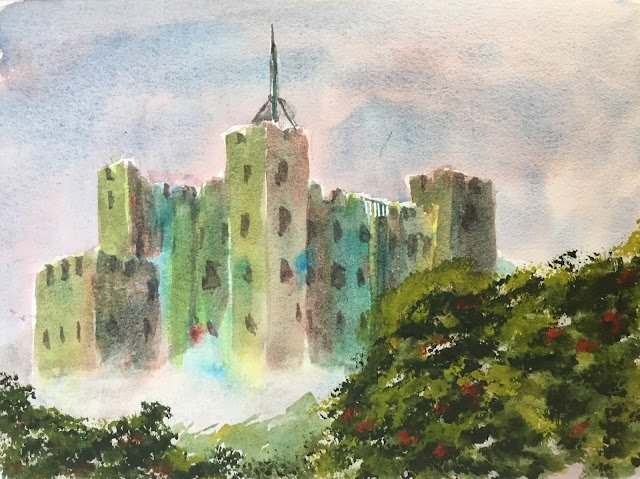
So I came back and found a spot with a good angle of the castle to draw and where there was a tree a few yards away offering some shade for later. I came up with a plan for the painting (including the value plan) before starting. The castle was going to be in the middle of the painting and full of colour. There would be a darker valued tree in the bottom right, a lighter valued sky at the top and lighter valued fog in the bottom left, in front of the castle but behind the tree. The rationale behind the fog was that I didn’t want to include modern things at the bottom like lawns and road and some steps behind a metal fence.
For my main three colours, I picked cerulean blue, rose dore and transparent yellow, so this was again in the key of green warm but with a much brighter yellow for some sunlight. Viridian was earmarked to be mixed with rose dore to create a dark neutral colour for windows. And the plan was always to use green apatite genuine for the foreground greenery. As this greenery was in a different plane to the castle, I was happy that it didn’t upset the harmony of what was almost a three-colour painting behind it.
I started with a pencil sketch, then put on some masking fluid to reserve whites for the flagpole and ropes and to negatively paint the metal barrier at the top. Once this was dry, I added a greyish sky made up of cerulean blue and rose dore. Anything else would have looked wrong with all the rolling fog in the foreground. I even dabbed at it all with a kitchen towel to make sure it would end up with a lower value than the castle.
Next, I started on the castle. I started by applying the three primaries separately, starting with big vertical sweeps for all the different shapes, generally using the yellow for the left facing surfaces. I charged different primaries into this to create some variation and interest. And at the bottom of the castle, I softened the edge and put in a foggy shape, mainly using the blue and red so that it matched the sky.
For the second coat of the castle, I mixed together all three primaries and glazed this over the top, changing the colour mix slightly for each different shape. Again, I softened the bottom edge to keep the foggy shape.
Then, for the tree shape, I started by dabbing in some dry green apatite genuine using one of those Terry Harrison foliage brushes. In some places I messed up by having the paint too wet but that wasn’t a problem – I could leave it to dry before stabbing dry paint on top and getting something more interesting. To get some brighter bits on top of the leafy shapes, I tried stabbing on transparent yellow but it’s transparency didn’t allow any hard edged yellows so I stabbed on some (opaque) cadmium yellow which seemed to work better. I wanted to calm the greens down a bit with some red but didn’t want to mix in the red and lose the hard edged textures, so instead stabbed in some cadmium red dots which, again, seemed to work.
Then I mixed up a dark colour from some quite dry rose dore and viridian green and used this to paint the sideways facing edges of battlements (creating some 3D effects) and some impressions of windows. At this point, the painting finally started looking like a castle. I also rubbed off the masking fluid and used t( edge of a flat brush and my dark mixture to put in the flagpole and ropes.
The final painting looked slightly unbalanced. In reality there was only a tree in the right obscuring part of the castle but I put a tree shape in the bottom left and a fogged out green shape in the middle bottom to bring everything together. I don’t expect anyone to complain.
One of the best things about this afternoon was the interest that the painting generated. Lots of people dropped by to chat and give positive feedback and there were lots of kids that were interested in all my tools, techniques and colours. These kids, by the way, were all polite and not annoying at all – it was good to see that curiosity and to feed it.
Of course, these interactions are always more pleasurable if the painting is one that I can be proud of and I have to say I knocked this one out of the park today. It’s my best painting for months. The colours, the values and the composition all worked. It helps that I planned things properly (including the values plan), took my time over it (waiting until previous stages were completely dry) and was always committed to painting the castle in three stages. I suspect that having people around made me more methodical and focused.
This one was sold to a local churchgoer after I was kindly asked to exhibit some paintings at a Hartlip Church Sunday Tea. So I’ll be passing part of the proceeds to the church as commission.


Leave a Reply