


Before I start talking art, a bit of news. I retired on Tuesday. Eighteen months…
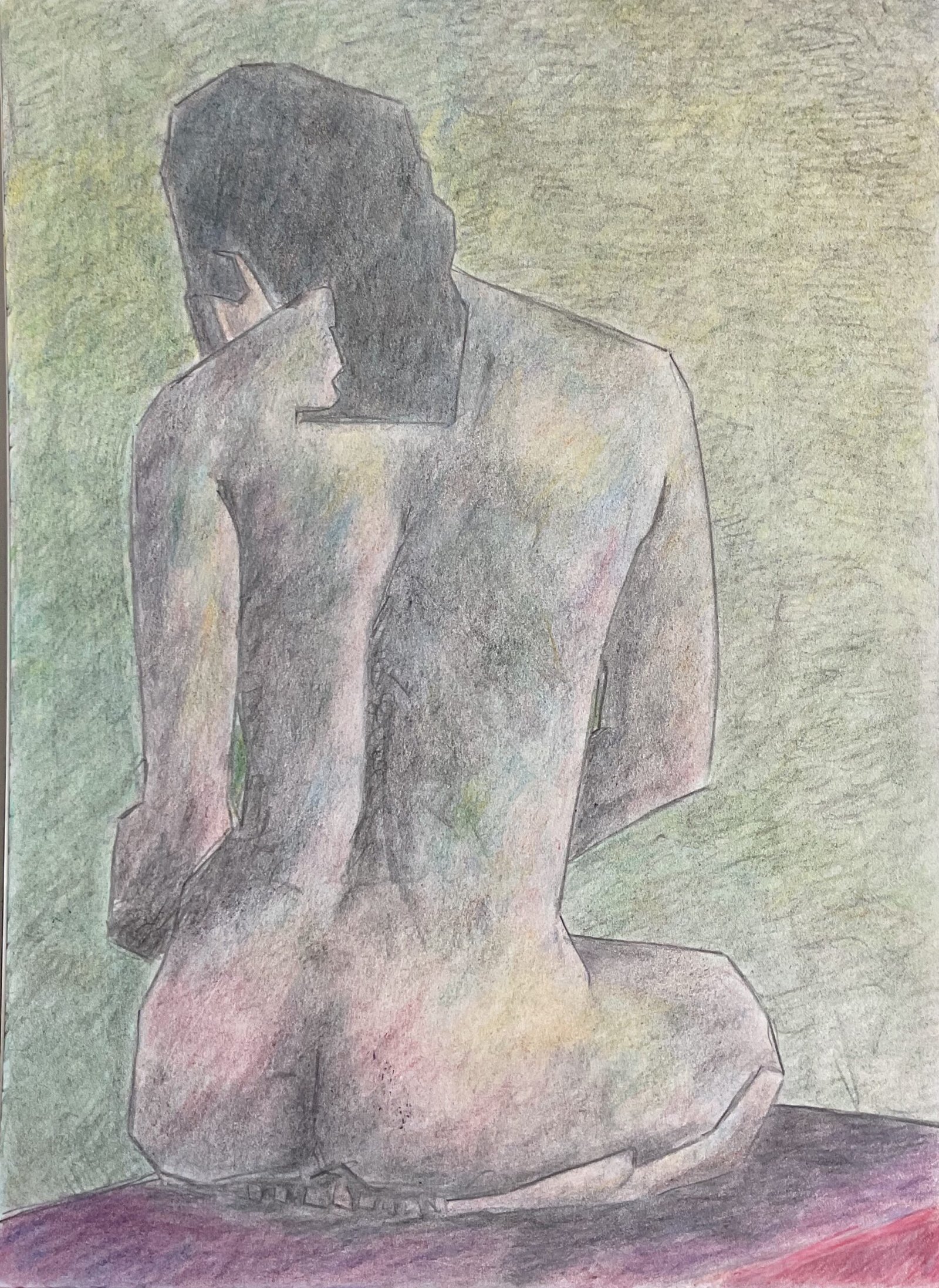
Raven S In Coloured Pencil
As expected, after Wednesday’s effort, I had to come up with a coloured pencil figure today. Today’s model is Raven S, someone who worked out well last time. But I’ve chosen a view of her back today as that better suits my coloured pencils.
I started by putting down an outline using a grid. I kept all my edges straight as I was wanting to replicate the style from my earliest coloured pencil figures. Except that rather than exactly replicating that style, I wanted to keep the straight edges and crazy colours but also introduce some variation in values to create three dimensionality. So my first layers of colours were neutral, dark colours, trying to replicate the darks and midtones that I could see in my source photo. But then, in my second layer, I started having fun by adding blues, greens, reds and the odd yellow wherever I could feel temperature variations in the source photo. After that, I added loads more layers of colour to the figure, switching between value layers and temperature layers but throwing in the odd layer of flesh colour to keep dragging things back towards reality. For the flesh and value layers, I tended to use the points of the pencils, working in small circles but for the temperature layer, I used the sides of the pencil leads, just as I did in my earliest coloured pencil paintings (and as I still do with inktense pencils).
When the figure was close to completion, I added the background. I went for green as the complement to the reds which were dominating the figure at that point. But I wanted the colour to be varied, so I added a layer of five yellows in separate rows, then one of five blues in separate columns, then five greens in diagonal stripes. And I neutralised things slightly with two layers of grey.
As finishing touches, I went over all the edges with the black pencil, then used that same pencil on its edge to darken the darks and midtones. Then I blended all the colours, using a paper stump for the background and burnishing the figure and box with the white pencil to lighten values a bit. And that was me done.
This was all very fast today, finishing after barely getting into the third of the four Grateful Dead CDs that were facilitating my colour choices. I’m wondering whether the hotpress watercolour paper I’m using (by Rhodia) fills up much more quickly than the Seawhite paper that I normally use but was out of stock the last time I looked for it. Hmmm….
Final result? Good but not perfect. There’s more three dimensionality in there than in my earliest coloured pencil figures which is what I wanted to achieve. Her right shoulder looks a bit big; it also does in the source photo but maybe I shouldn’t copy my sources so slavishly. And her left hand is hard to make out. Still, definitely worth putting up for sale. Her price can be found here.
Leave a Reply