


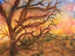
This one was inspired from a Facebook post that I saw only four hours ago…
Rainy Day, Dream Away
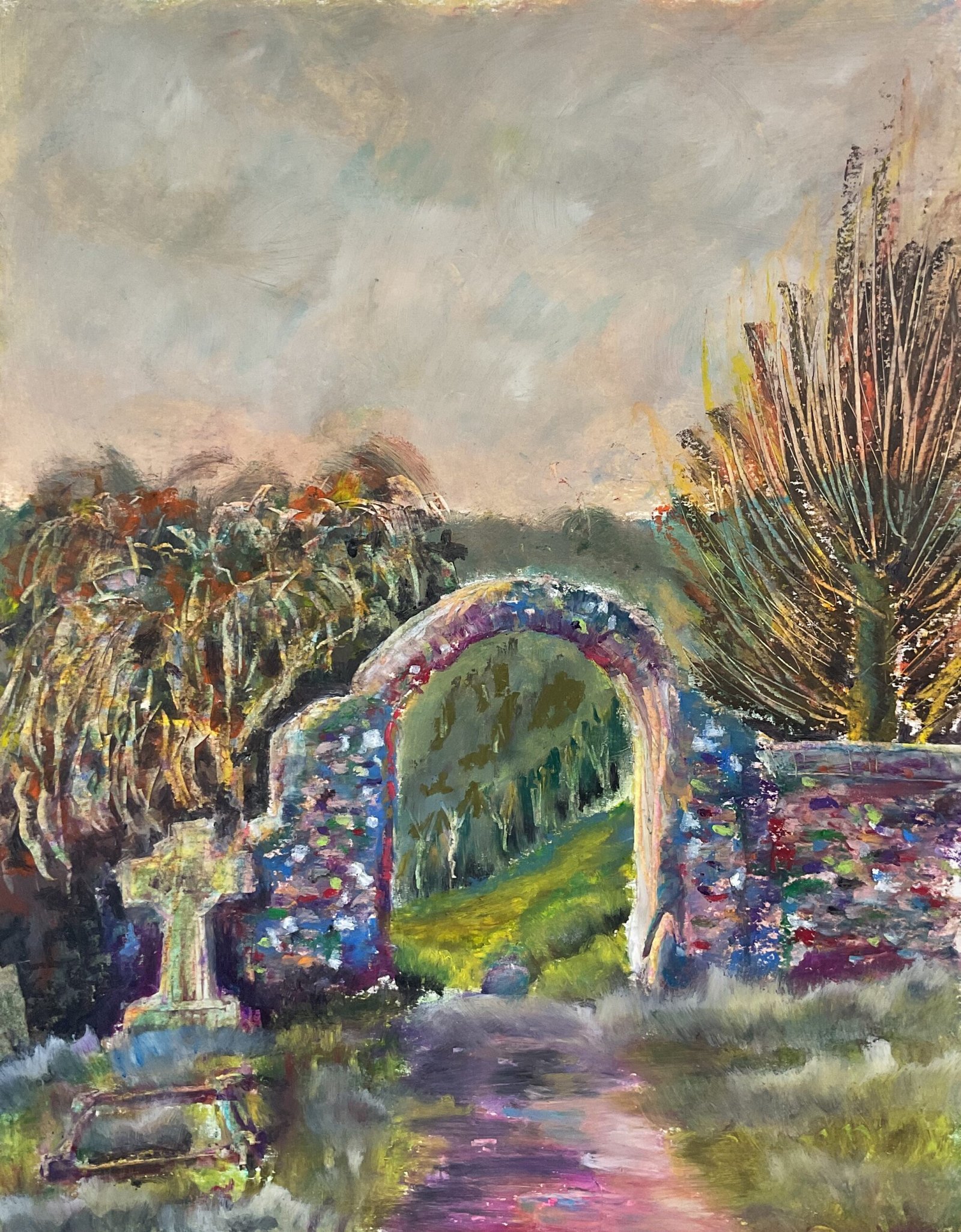
It’s another oil pastel landscape today. I found a photo online of the arch that connects Hartlip Church to the orchards behind it. It’s an arch I’ve painted a couple of times before but what drew me to this photo was the colour of the sky, a miserable red/grey. Was it something I could recreate in oil pastel? Let’s see.
I started by trying out a new technique I picked up from someone on YouTube. I put down an underpainting using the Artgraf blocks and activated it with water. The idea’s not for the underpainting to show through in the final painting but for it to act as a guide to “hang everything else off of” and to act as a constant reminder of the need to keep values under control. Did it work? The jury’s still out; I’ll have to give it another go at some point.
Once the underpainting was dry, I worked from the back of the painting to the front as usual. Let’s go through all the shapes in order. First up was the sky. I randomly scribbled on all the colours I could see, went over them all in white and blended everything with a polystyrene chip. And it came out fine, maybe a little less miserable than intended but I’ll take that.
Next was the background of trees in the orchard. Again, I used loads of colours, with more blues closer to the horizon for atmospheric perspective. I blended the colours with a polystyrene chip, up and down inside the arch, where I wanted to suggest trees, and in a swirly motion near the horizon. I suggested trees more strongly inside the arch by scraping out some trunks and adding a couple of diagonal lines suggesting rows of trees. I tried to make the path through the orchard more enticing by using some brighter greens and yellows.
Then there was the tree on the right. It was calling out for sgraffito treatment, so I painted in the trunk, then filled out the branch area with lots of interesting colours and across out all the branches. It worked.
The tree on the left gave me a lot more problems. I intended it to be a bare tree and painted this in but didn’t like it. So I tried all sorts of ways to dab in and partially blend foliage. Nothing worked and it all looked a mess. So I scraped out the tree trunk with a scalpel and then some leafy areas by lightly skipping over with the scalpel. It slightly improved things and I later improved them some more by painting some Payne’s grey into some of the gaps between leafy shapes, which also defined the edge of the arch more sharply.
For the archway and wall, I started by applying lots of interesting colours (including lighter ones for the highlights) and blending them. Then, with the shape full of colour, I dabbed in brick-like spots of interesting colours – this was always the plan, getting more detail on the arch to distinguish it from all the blended shapes around it. The bricks looked a little too hard edged and detailed, so I smudged them a little but by stamping on them with polystyrene chips. And I reinforced the highlights. The wall looked good but I wondered whether its bright colours worked against the unsaturated colours in the background.
I started the foreground with the graves but ended up building the graves, path and grass together. I took ages trying to get that cross shaped gravestone right and to get it to stand out against the darks behind it. Eventually I got fed up and moved on to other areas. I decided the dark area to its left looked too boring, so scraped out a gravestone that was in my source photo but that I’d been intending to leave out of the painting. And it worked! So I scraped out all the colours from the cross and that worked too. The grass was pretty straightforward, loads of greens and lots of upward sweeps with the polystyrene chips to give the impression of detail. And then some zigzagging lines over the top with random light or dark colours and another sweep with the chip for variety. The weird four walled grave in the bottom left was something I never got to work, using all sorts of colours and trying to score out highlights. I’d been better off leaving it out.
And, after a bit of fiddling with the edges of the arch, creating value contrasts and complementary colour contrasts (bits of red against the green background), that was me done.
I stepped back from the painting, expecting it to be a huge flop with an ugly tree on the left and colours on the wall that didn’t match the rest of the painting. But somehow it all works. The problem tree is part of the background, so doesn’t grab the viewer’s attention. And the colours in the wall don’t match the sky but the foreground colours and tree colours, being somewhere between the two extremes of arch and sky, hold everything together. The (deliberate) red/green clashes add energy and the colours in the arch and wall suggest a story. So, yeah, this one works. It’s up for sale, with the price to be found here.

Leave a Reply