


Just the one oil pastel piece today. When I was out exploring Queendown Warren the…
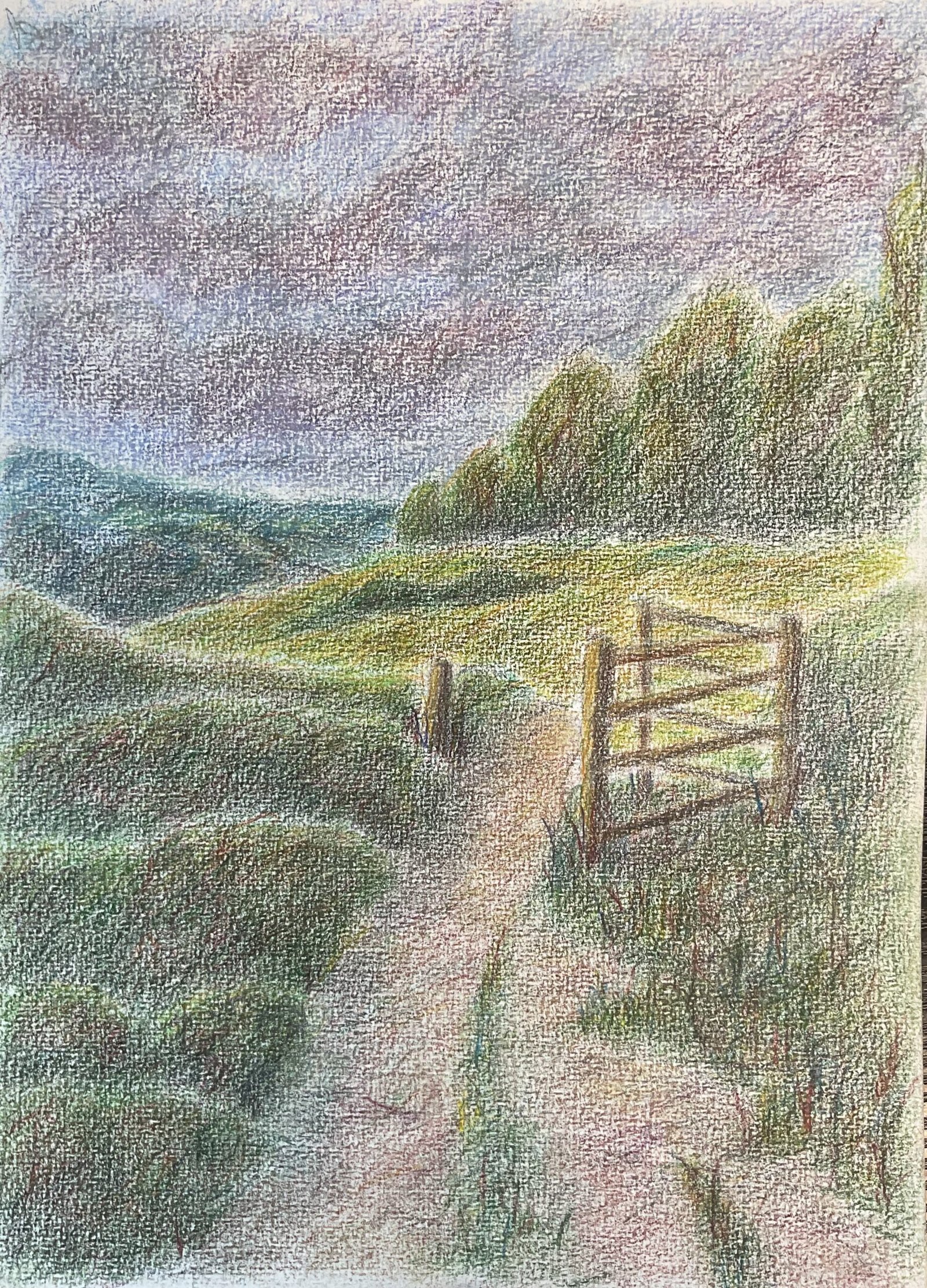
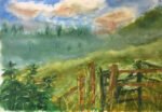
Queendown Warren: Rain On The Way
Sometimes my choice of what to paint is based on some really weird reasons. Today I looked the box of CDs I have in the studio and thought it would soon be due for switching. I have six boxes and switch once every month or two when I fancy a change. But, while it was close to being switched, I didn’t want to switch until I’d played all the Grateful Dead albums in the box, and there was a four disc concert from 1979 that hadn’t seen any action. So Grateful Dead it was, and if I was going to be playing that much Dead, I needed to take advantage of it with a coloured pencil landscape, because that’s when I just let loose and jam. So I picked a view of Queendown Warren that I see every day on my walks and got to work.
After putting down a basic pencil outline, I put down a very thin layer of colour. For the sky I used two or three blues and left some white gaps for clouds. For the background hills it was cool blues, then a yellow for the middle distance field, some dull neutrals for the path and gate. But for the background trees and all the greenery on the left and right of the foreground, my initial layer was all reds, just to get me on the right path, heading towards some interesting greens. The main aim of this initial layer, though, was to mark out all the major shapes to give me a bit of structure underneath all the jamming.
And then I jammed away all afternoon, reaching for whatever colour I fancied and dancing all over the paper. For the greenery I found myself alternating between greens and red/browns with the occasional bit of blue and yellow. A case of treading a narrow path between being too green and not green at all. I was enjoying the jamming so much that I replaced the white clouds in the sky with something more miserable looking. And in some layers, I tried to connect shapes together with unifying glazes, even connecting the sky to the hills on the horizon.
My last two coloured pencil paintings look a little less intense colour–wise than I’d really like. I remember stopping when the paper feeling like it was full and that’s what I ended up with. But today I didn’t stop when the paper felt full. I just carried on regardless and only stopped when I was happy that there was the right amount of pigment on the paper.
To finish off, I added some multicoloured grasses in the bottom right green shape. Then I burnished the sky in white and the background hill with (I think) the ivory pencil. The rest of the painting I just smoothed out with a paper stump. And that was me done.
The result? A big success. It’s an inviting composition, despite the threatening sky. Anyone could look at the colours in the green areas and instantly recognise this as my work. Except that I’ve been told this also looks like the work of Eric Ravilous. It’s going up for sale. One thing for me to be aware of, though. A lot of the green shapes have have white borders along their top edges. It’s part of the charm in this one but it’s something I need to work on going forward.
This one was on display for a while at the Rose & Crown in 2024 before being sold to a customer.
Leave a Reply