


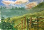
Just the one oil pastel piece today. When I was out exploring Queendown Warren the…
Queendown Warren In Three Complementary Colour Schemes
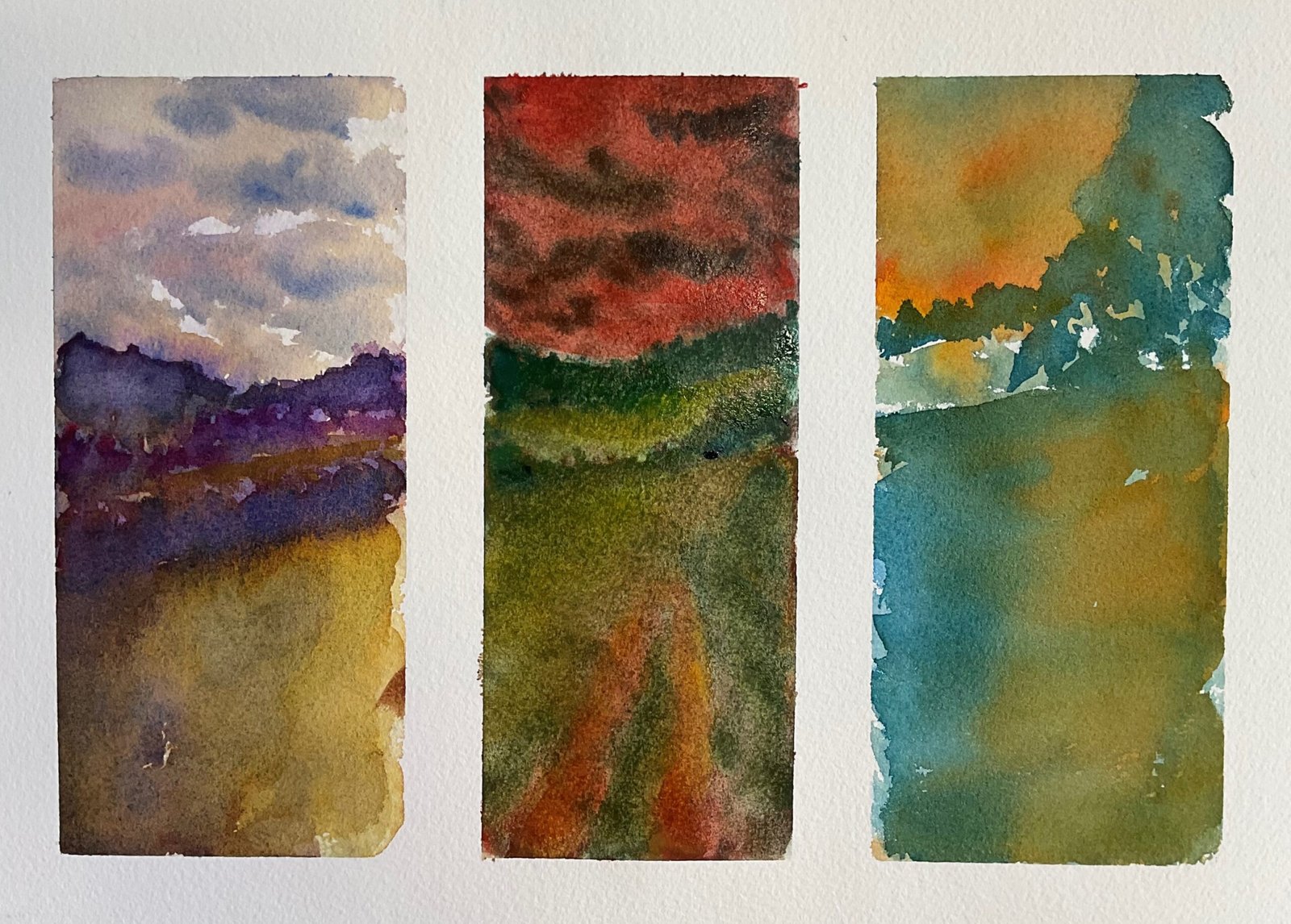
Not much time to paint again today but I do need to keep in practice. I decided to go for an experimental painting that wouldn’t take much thinking. I picked a simple scene from the North Downs and decided to paint it in three complementary colour schemes: yellow and purple, red and green, blue and orange.
I started by dividing the page up with masking tape, Leaving enough of a white margin for part of the margin to show up after it’s framed – I’ve come to the conclusion that on triptych paintings like this, the white margin around the outside is just as important as the white gaps between the subpaintings. Then, after putting down some very rough pencil guidelines I was ready to paint. Let’s take each subpainting in turn.
The painting on the left is in yellow and purple. The yellow is transparent yellow and the purple is quinacridone magenta and French ultramarine, so this one is in the key of purple cool. The sky has bits of standalone blue and red in it as well as yellow, purple and the neutral colour that I got from allowing them to mix. Most of this was done in a couple of wet into wet layers and I only hardened some of the edges at the end. This one came out well. I like the shadowy colour on the left of the foreground.
The painting on the right is in blue and orange. The blue is Winsor blue green shade and the orange is a mix of Winsor red and Indian yellow, so it’s in the key of orange cool. This one came out really well. It’s how I wanted all three paintings to look. This colour scheme is worth repeating on a full size painting.
And then there’s the painting in the middle, in green and red. I started with just two colours: viridian and rose dore. When this wasn’t really working, I introduced Mayan blue genuine and raw sienna, at first to move the viridian into bluer or yellower directions but later to create a new green to replace the viridian. There was a lot of painting and dabbing off going on and I think the sizing of the paper was starting to suffer. After I decided the new green wasn’t working either, I decided that I needed opaque colours to cover up the mess that I’d created so I replaced the rose dore with cadmium red and the raw sienna with cadmium yellow, keeping the Mayan blue in there. There was a slight improvement. To try to bring it all together I applied a thin transparent glaze of rose dore over the sky and tracks and of viridian everywhere else. And there I stopped.
After the masking tape came off, things looked slightly better. The middle one now looks like a bright moonlit nighttime painting, even if it’s still the weakest of the three. I’m going to put this one up for sale and might revisit the yellow and purple or blue and orange colour schemes at some point.
Leave a Reply