Back to the artwork after a few days off, and this is looking like an…

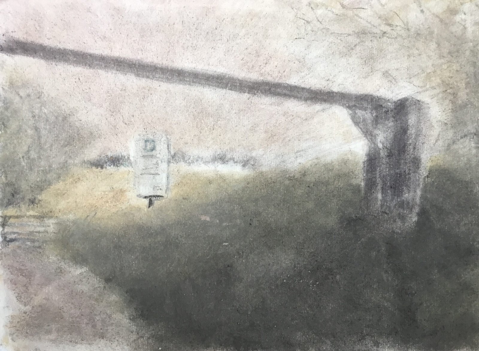
Queendown Warren Car Park
So here’s my first ever charcoal painting. It’s of the entrance to a car park in Queendown Warren, somewhere between Hartlip and Medway Services. As promised, it’s sparse, grim, dusty and brutal.
I had a few difficulties putting this one together:
– it was hard getting the paper to take in all the charcoal that I put on it, even when I tried rubbing it in with fingers, chamois, paper stumps and kitchen paper. At times I was having to Hoover up all the crumbs from the paper. Not sure what the solution is but I’ll be trying out the tinted, textured paper next time – this was the smoother, white paper.
– the sign was hard to get right. I started by not masking it out for the underpainting, planning on removing charcoal with an eraser. But the eraser was struggling to do its job, so I put white charcoal over the top and then darker charcoals on top of that for letters. But it was difficult putting letters on and the sign doesn’t stand out as well against the background as well I was hoping. Next time I’m masking the sign out when I do the underpainting.
– it took me a long time to get the big foreground shape as dark as I wanted it to be, partly as a result of the paper not wanting to take in all the charcoal dust. In the end I had to use the black XL block to darken the colour but that shouldn’t be necessary. Let’s see how I get on with more textured paper.
The colours in this one are all a bit muddy but I don’t mind that as this is going to be my Nebraska/Tom Joad medium as I said before. One thing I’m less happy about, though, is the lack of empty white paper. Not just for that parking sign but in the rest of the paper. Maybe I should have tried adding some highlights with the eraser.
There’s one thing that I really do like about this one, though, and that’s the one point perspective effect in the sky. As I tidied up at the end I picked up some kitchen paper and made one last attempt at rubbing in charcoal crumbs but wondered whether I could also blur the edges of the height restriction bar. And after doing one sweep with the kitchen paper I saw my chance to make things interesting and did a load of sweeps through the sky and trees radiating outwards from the parking sign. And the looked great. I would say I stopped there but I did plenty of tinkering in this one, trying to get everything right.
This seems ok as a first attempt with charcoal. Not good enough to go on the shop window though.


Leave a Reply