29 May 2014 Now this us more like it. It's based on a photo that…

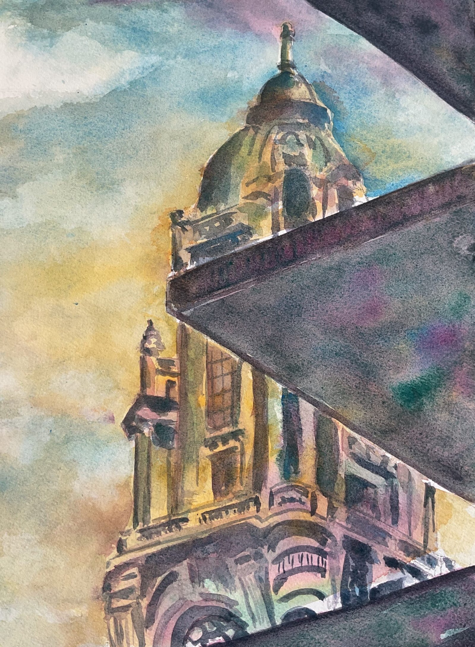
Porto City Hall Tower
Today’s painting is the second, after The Transfer, to be inspired by a photo taken by my mate Olly on his recent holiday in Portugal. Whisper it, but Olly might be a talented photographer with an eye for including jarring straight lines in well composed photos. I also took inspiration from a video on YouTube by someone who blocks my comments so will no longer be getting plugged here.
For colours, I picked Indian yellow for warmth and cerulean blue and quinacridone magenta for their coolness: cool shadows make the sunny places look even warmer. I also used viridian for a bit of pop. If viridian counts as a second cool blue, this is in the key of triadic left.
I started by putting down a sky. Blue at the top and then, in <redacted> style, yellow underneath with the yellow also being applied over the tower. It’s weird to paint a sky in blue and yellow with greens appearing in places but it works for Robert then why not give it a go? I guess if Robert uses yellow ochre as his warm yellow, though, his greens might not be that saturated.
After that, it was all a case of adding darks, alternating between the tower and the foreground shapes. In the foreground I aimed for hard, straight edges. Most of the colour was a mix of the red and the green but I dropped all four colours into it in places for some variety. For the tower I used various mixes of all four colours and tried to keep things loose, making only a suggestion of all the features. If anything I may have been a bit too true to the source. I ended up with some reds and greens near the bottom and tried to replicate this elsewhere but my attempts look a bit artificial.
As a finishing touch, I went over the sky again to cover up some places where the shadows in the tower had leaked out into the sky. As well as the blue and yellow, I dropped in the red in places this time. And that was me done.
I like what I’ve ended up with here. Not just the whole composition, the colours in the foreground shapes but the yellow in the sky and the yellow light on the building both represent a promising alternative style. This one’s going up for sale. To see the price, click here.


Leave a Reply