


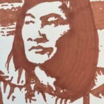
I don't normally do this but I've done a third marker painting in a day.…
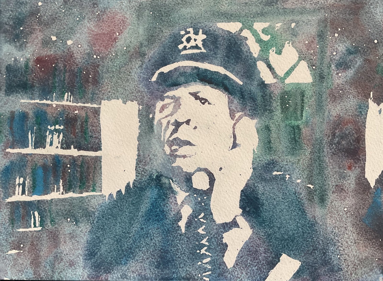
Police Chief Clancy O’Hara
My plan today was to give the potters’ pink a good workout and, in particular, to use some of the more interesting mixes it makes with some of the cooler colours in my palette. I decided to go for a simple two value posterised painting, with highlights reserved as white and the darker areas made up of potters pink mixes with viridian, Winsor blue (green shade), Mayan blue genuine, cerulean blue and French ultramarine. Potters pink and French ultramarine combine together to give tundra pink if mixed in a certain ratio but my plan was to make the mix bluer than that. Actually, in all cases, I was looking to use less potters’ pink than I’d done in my earlier tests.
As subject matter, I picked Police Chief O’Hara, played by Stafford Repp in the 1960s Batman TV series and in Batman The Movie. Some messing around with the Notanizer app convinced me the chief would work out well in two values.
So I came up with a two value plan, outlined the highlights in pencil and masked them out. I decided that I needed more indication of books on the shelves, so added more book highlights than the app was recommending. That was 90% of the work done and all of the important work. I can’t stress enough how important it is to get those highlights right in a two value painting.
The rest of the process was just having fun. I wet the paper first, then mixed up my five pink/blue and pink/green mixes. I wanted the Chief to stand out slightly from the background, so the first colour I put down was the only green/blue mix, putting this around the outside of the chief and his uniform. Then I painted in the four blue/pink mixes in random places. That’s as far as my original plan went: everything else was a reaction to what I saw in front of me. The paint I’d put down looked a bit too light valued, so I added more paint on top. I found myself at some point adding neat individual colours (including the pink) rather than mixtures and using the darker blues on the Chief’s uniform. I introduced cadmium red (another granulating colour) for more variety, mixed with the pink at first but later neat. And I put down brush marks hinting at a doorframe, door panels and books on the shelves. This was all wet into wet: I didn’t want hard edges distracting the eye from all the granulation going on. And that was me done.
There’s lots to like about this one. Obviously there’s all that granulation going on but there’s also the way the highlights have picked out the watch and the phone cord. The hints of door frame, door panels and books in the fuzzy wet into wet worked out well. There’s something not quite there with the likeness, though, and there’s a wonky middle shelf. And the dark blue hinting at the Chief’s left shoulder doesn’t match up to the highlights along the top of the shoulder. Or does that mismatch suggest movement? Anyway, this one’s good enough to go up for sale, with the price to be found here.
Could this be the first of a series of Batman themed portraits? Maybe. Not sure.

Leave a Reply