


And here it is, the first of a series of paintings based on my home…
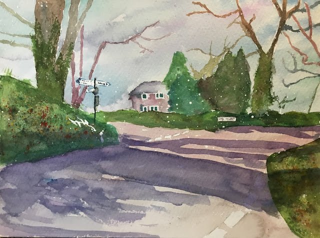
Place Meadow, Hartlip
It’s another Hartlip painting and, just like the last one, it features a house and is named after the house but the centre of interest in terms of position, focus and contrast is again a signpost.
The main three colours were Prussian blue, transparent yellow and quinacridone magenta, so this is in the key of green cool. Viridian also features in a bit of the sky and cobalt blue, cadmium yellow and cadmium red as finishing spatters.
I started by masking out whites, the edges of the sky shapes (including all the trees and branches) and some random spatters. If the spatters are too big, I tend to rub them off but there were some interesting spatters on the grass verge on the left that I decided to keep.
The values worked well on this one. I started by putting down the sky and road in a very light value. That probably helped. The sky has bits of viridian and quinacridone magenta in it because Prussian blue isn’t really a sky sort of colour. I deliberately made the sky darkest behind the signpost in an attempt to maximise contrast around the centre of interest but it dried lighter than I was expecting. For the roads I managed to get to an amazing pinky grey that went weakly well with the sky colours.
And then I removed all the masking fluid except the window frames, the spatters and the road name sign. At this stage, the sky and road were making the painting look really cold. Hardly surprising since all the colours used were cool. More on this later.
Then on went the house, signpost, trees and grass verges. I tried to get the similarly valued grass verges and trees to blend together with mixed results. I put some ivy on the tees by dabbing in the foreground tree and trying to water down some soft edges in the background tree. I’m not sure the trees just to the right of the house work – there’s not enough contrast between trees that are in front of and behind the house.
And finally the finishing touches. All the masking fluid up came off and I added some unreadable writing to the road name sign. I decided all the whites in the painting were OK and didn’t (for a change) need dulling down. To establish some unity between the two grass verges and the hedge at the back, I went over them all with a thin green glaze. That left two jobs: shadows and spattering. I thought for a long time about which to do first. In the end I spattered first and I think this was the right decision. I spatttered a lot of cadmium red, cadmium yellow and cobalt blue over the grass verges, covering up other areas of the painting. And then, still covering up other areas, a little of those opaques onto the hedge.
And then I added the shadows. I picked a purple colour to complement the greens (red would have been way over the top). And this is when the painting changed. The temperature seemed to jump twenty degrees. I was looking at a hot sunny painting. And I’ve worked out why. It’s because shadows are cool on hot days and warm on cold days. All those cool colours in the shadows have more impact than all the cool colours everywhere else. If I’m doing a painting with shadows, then cool colours will give me cool shadows and a cool day whereas warm colours will give me warm shadows and a cool day. This feels like a big discovery.
Anyway, this one’s a success and is up for sale. The shadows take it to another level. I’m just left with a nagging doubt that I’m getting too chocolate boxy and that my colours are getting a bit too literal.
This one is up for sale. To see the price, click here.
Leave a Reply