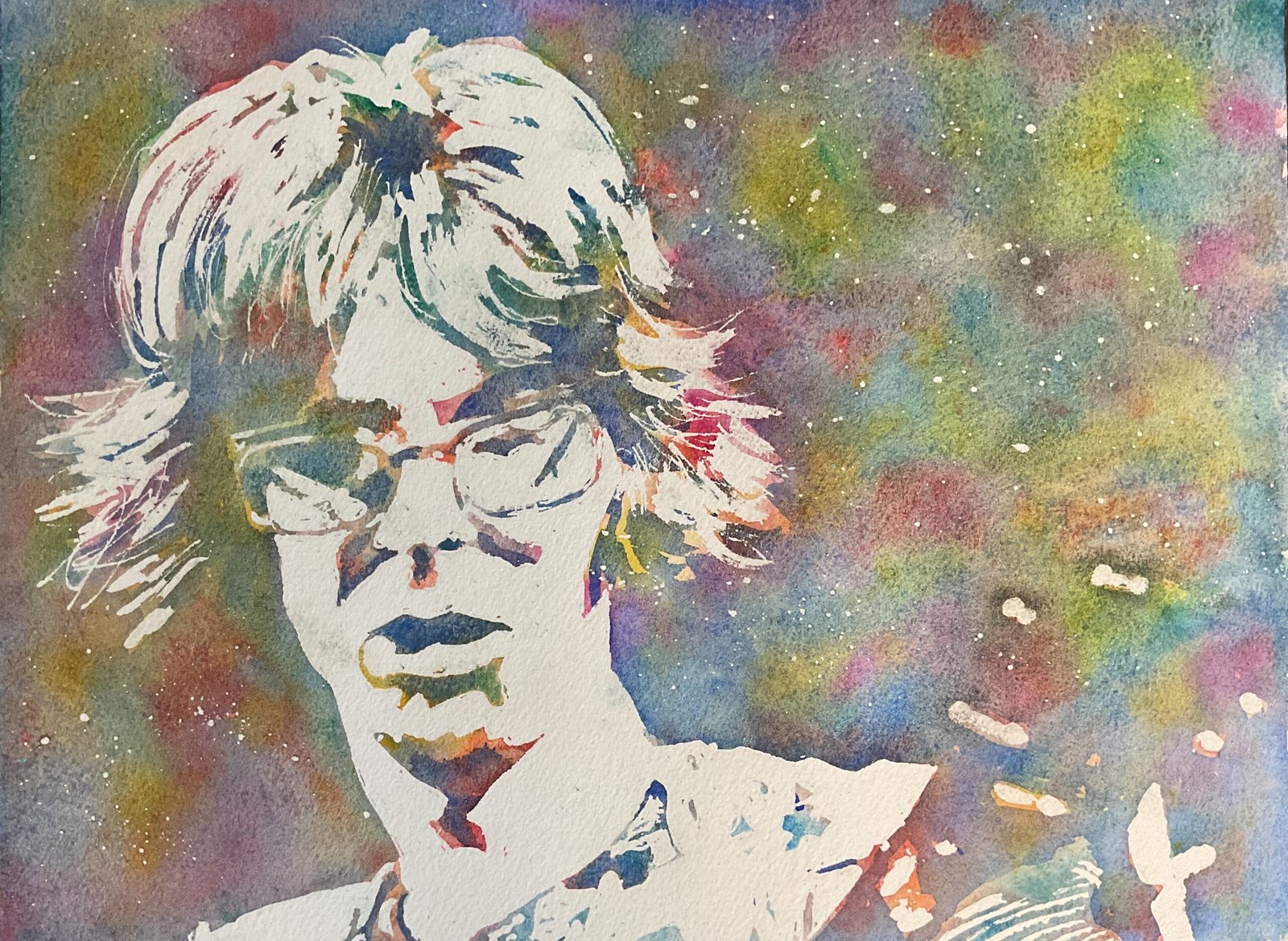
Before I head back to watercolours tomorrow, I thought I really should give the marker…

Phil Lesh
I do enjoy listening to the Grateful Dead while painting. And their music comes through in my artwork while they’re playing. I loosen up and I jam along but with paint, putting colours where I think they belong rather than where I see them, let alone where anyone else can see them. So after hearing about the sad death of their bassist Phil Lesh, I felt compelled to paint Phil as a mark of respect, and to make everything bright, colourful and trippy because we’re talking about the Grateful Dead here.
It’s another posterised painting, but with only two layers of paint, and in a colour scheme that I’ve not used before. The process was to:
- choose a source photo and create a three value plan using the Notanizer app
- put down a pencil outline showing just the borders of the highlights, not bothering to mark the borders between darks and mid tones
- mask out all the highlights and spatter on masking fluid in the background
- (once the making fluid was dry) wet the paper all over and randomly drop in Indian yellow, transparent yellow, rose dore, Winsor red, quinacridone magenta, viridian, Winsor blue (green shade) and cerulean. I also spattered on some cadmium red and cadmium yellow and used kitchen paper to dab away any wet puddles
- (once the first layer was dry) paint French ultramarine over all the dark areas in the value plan – this was done by eye as I’d not marked out these areas
- (once the second layer was dry) remove all the making fluid
And, after deciding that no extra tinkering was necessary, that was me done.
The new colour scheme seems to have been successful. All the colours in the first layer are still showing through after the blue was added on top. It’s quite hard to tell the difference between the one layer medium tones and the two layer dark tones but this image would work perfectly fine as a two tone painting, so that’s not a problem. As for the virtues of the portrait itself, the likeness is there and I like the expressive strokes I’ve made with the making fluid in the hair. I like how the guitar is indistinguishable from the background but that you can still tell what it is. Some might think there’s too much white on the painting. Others might think the white makes Phil look ghostly. I think it’s fine and any ghostliness is accidental. Whether that’s a happy accident or not is up to the individual viewer. I think I’ve done Phil justice. He’s up for sale.


Leave a Reply