


Back to the artwork after a few days off, and this is looking like an…
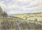
Out On Queendown Warren
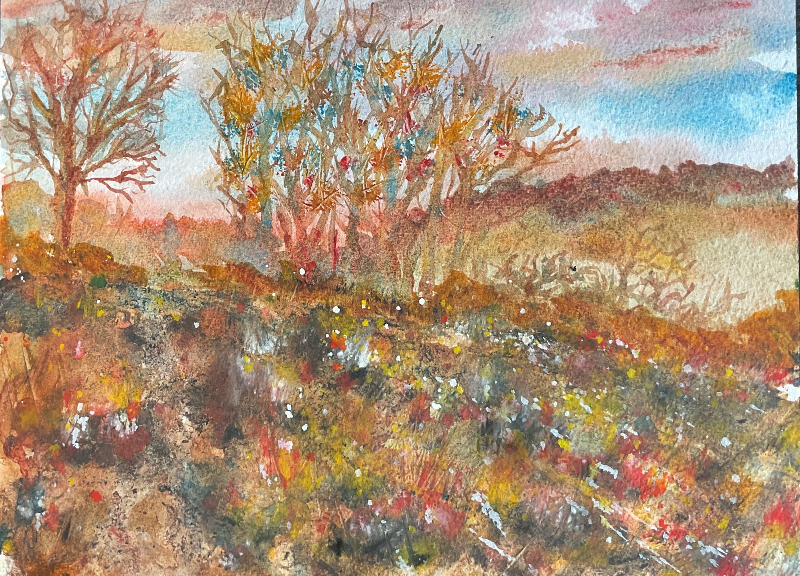
A tale of two paintings today. It wasn’t supposed to come out like this but I’ve ended up with one in the background and one on the foreground. But let’s go back to the start.
I saw an interesting understated sunset on Queendown Warren a few days ago that I’d decided to incorporate into a painting and on today’s walk I chose the scene that I’d put the sunset behind. For colours I picked cerulean blue and rose dore because I’d seen them in the sunset, Indian yellow because it was warm and wouldn’t make garish greens with the cool cerulean blue. So the painting started in the key of orange cool, a great autumnal key. I also gave burnt sienna a significant role, calming down all those bright primaries. Later, I’d also use acrylic inks and some opaque watercolours.
I started off with a great underpainting using my four colours and dropping on a bit of granulation medium in places. I went over the whole painting. Not just the sky but also the hillsides. The far hillside felt a little dark so I dabbed off some colour to create a bit of fog on the lower slopes. The nearer hill ended up quite light: its colours and values would have looked great on the further hill.
Next came the trees. I started at the bottom and started adding more, thinner branches. I used all four colours, fairly randomly and allowing them to mix on the paper. At the extreme ends of the branches I tried stabbing on paint with the Merlin brush. It didn’t look perfect but after I added lots of cross cross marks all over the tree with the sharp corner of a cut up credit card, things looked much better.
For the foreground, my plan was to drop on acrylic inks and granulation medium and let them move around and add texture. It had been a long time, though, since I used the inks and I was a bit overenthusiastic. I used a blue, a red, sepia and a couple of greens and ended up with more ink showing than watercolour. I should have only used a little bit of one or two colours: just enough for some texture. And only then after adding another layer of watercolour to my underpainting.
Oh well. For a rescue job, I first added a unifying layer of watercolour over the hill, using all my four main colours. I managed to leave an unpainted path down the left side of the painting, which was something, but I still wasn’t there. I decided I needed some tussocks of grass on the hillside and started by painting these on with my four original colours. But these were too transparent and didn’t show up. So I added more tussocks in opaque colours: cadmium yellow, cadmium red, sepia and white gouache. That was a marginal improvement but the grasses were standing out too much against the rest of the hillside. So I added some spatters to the hill in the red, yellow and white. And when this looked a little over the top I dabbed at a few of them with kitchen paper.
And that’s when I stopped. Any more tinkering and things would definitely have gotten worse.
I started off by saying this was a tale of two paintings but while I’ve been writing this painting has grown on me. It helps that the opaque red and yellow are both warm, just like the transparent red and yellow that I started with, so everything is still in the key of orange cool. Yeah, this is acceptable. I probably won’t be using the acrylic inks again in a hurry though.
This one was put on display in the restaurant at the Rose & Crown in Hartlip and sold to one of their customers.
Leave a Reply