


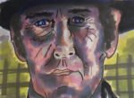
Back on the markers again and, for whatever reason, I've developed a taste for drawing…
Once Upon A Time In The West Again
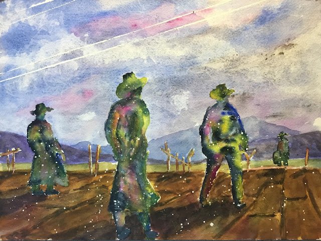
Time for a watercolour again and today was looking like a good day to be painting in the garden. After yesterday’s success with a Western and the previous failure with a local painting, I was going for a Western again. I’m back to the opening scene of Once Upon A Time In The West, a Sergio Leone spaghetti Western that worked for me once before. Let’s see how things went today.
I went for the key of purple cool today as I wanted there to be a bit of a chill going on. My warm blue was French ultramarine, my cool red quinacridone magenta and my cool yellow transparent yellow. Hematite violet genuine is the fourth headline star. Raw sienna and Payne’s grey also had roles to play (while still fitting in the purple cool key) and the red and yellow cadmiums came on for a spattering at the end.
I made some smart composition decisions today. The shot from the film was too wide, so I’ve narrowed the gap between figures two and three. I left out a tall telegraph pole on the left that would have dragged the viewer out of the painting. I removed lots of horizontal planks from the fence, leaving not much more than vertical posts – I just didn’t think I needed any more horizontal lines. I decided that the one point perspective in the platform planks/stones would point towards the most distant figure. And I added a hill in the far distance as the hills on the left and right might have looked a bit boring otherwise. The left side of the distant hill is parallel to the telegraph wires; I quite like this, although I suspect it might break some composition rules. And I should have changed the direction of the shadows so that the second figure from the left wasn’t standing in the third figure’s shadow.
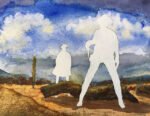
After marking everything out in pencil. I went in with the masking fluid. I protected the outlines of all four figures and all the fence posts, spattered some spots over the station platform, reserved a highlight along the edge of the platform on the right and drew in some telegraph wires with a mapping pen and a ruler.
Next up was the sky in French ultramarine with some quinacridone magenta and hematite violet there to make things interesting. Hematite violet definitely makes things interesting, with its granulation giving the a cracked but dirty appearance, as if I’ve dripped charcoal dust on the painting and tried to wipe it off. While the sky was wet, I laid down a first coat for the left and right.
Then I started on the foreground. First, I marked the edges of the planks/stones with the hematite violet. After this had dried, I covered the platform with random blues, yellows and magentas, trying to veer towards blue in shadowy areas and yellow in the sun. The third coat was made from a neutral mix of all three primaries, painting the platform stone by stone and slightly varying the mix of colours as I went along. Then I did more work on the gaps between the stones, adding yellow in places and refining the shapes of the hematite violet marks in places. Then I added some shadows in blue and hematite violet. Next I put in a single glaze of raw sienna to bring the whole platform together. Finally, I tinkered a bit by darkening the shadows and adding some random hematite violet to the stones in places.
While waiting for all these bits of work on the platform to dry, I went over my left and right hills with harder edges, added the distant hill and filled in the grassy middle ground.
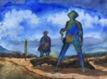
Then it was on to the fun bit. I removed the masking fluid from the people and the fence posts, then painted in the posts. Before starting in the figures, I have them a spattering of masking fluid. I had no control of the spattering, so most of it went onto the sky and the platform but that wasn’t a big deal – the spattering. Pile be removed later without damaging the painting underneath. And then it was on to the figures.
I was disappointed with the dark that I could make from my three primaries, so decided to reach into my box of spares for the Payne’s grey. Rather than outlining the figures with the grey and filling them with primaries, I adopted a new strategy, keeping things abstract but trying to add a hint of detail, so:
– the grey was used in the most shadowy areas, on the left side of the figures in particular
– the yellow was used for the sunniest bits
– I hinted at borders of shapes (arms, coat folds, bottom of coat, shoulders, bottom of hats, etc) with the Payne’s grey, painting both positive and negative shapes.
As a very last step, I spattered the red and yellow cadmiums over the figures and platforms and, once the spattering was dry, rubbed off all the masking fluid spatters.
Final verdict? This is acceptable and going up for sale. To see the price, click here. These abstractified Western paintings tend to get good feedback. The one thing that bugs me about this one is the values. That middle figure’s feet and shins are all dark, just like the shadowy boards underneath them. I should either have made the figure lighter to contrast against the boards or merged the bottom of the figure into the shadows, Charles Reid style. A bit frustrating as I see in my notes on purple cool that it’s important to not make values too dark in this key. Still, I’ve done much worse and it’s good to be able to produce an acceptable watercolour for the first time in a while.
Leave a Reply