


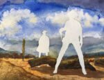
I shared a photo of today's painting on Facebook before I filled in the silhouettes.…
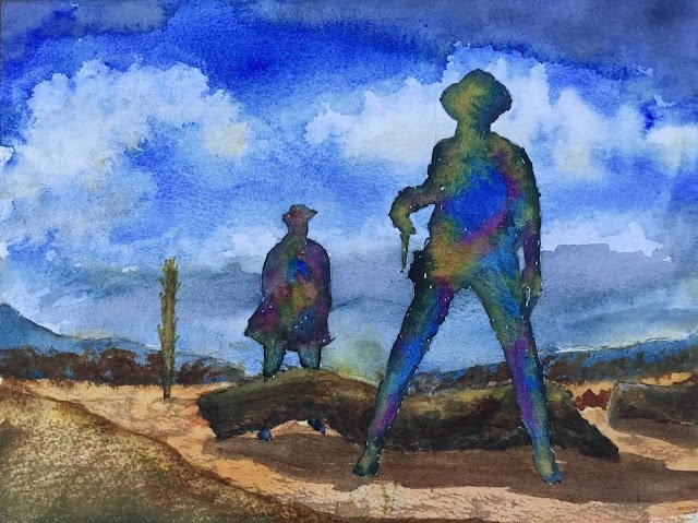
Once Upon A Time In The West
After the rubbish that I put out yesterday, I was determined to paint an ink-free watercolour again as soon as possible but to do it properly, taking my time over it. Looking through my folder of inspiring photos, I came across a still from Once Upon A Time In The West, a Sergio Leone spaghetti Western. Just like with all my Western paintings, the idea was to silhouette out the people in the shot and refill the silhouettes with abstract spacey stuff.
To kick this one off, I cheated by drawing grids on the source material and the watercolour block and copying the picture over one frame at a time. It might be cheating, but it works. The sky is mainly French ultramarine with a tiny dash of burnt sienna, with some Payne’s grey and quinacridone magenta at the top and some raw sienna at the bottom and in the bottom of clouds. The scenery obviously has a lot of light red and raw sienna but there’s also French ultramarine, transparent yellow, burnt umber and titanium white in places. In a change from my normal rules, the white was allowed to mix with other colours on the paper. It took me several attempts to get the logs looking right, applying all sorts of colours, scraping marks in it, pressing down on it with screwed up plastic,… eventually I ended up with something acceptable but I admit it’s muddy in places. The mound on the left was produced using some credit card scraping and has benefited from my decision to paint on the roughest paper – it also took a lot of attempts. The mound is an addition on my part. In the still from the film, there’s a big empty space there: Sergio Leone isn’t quite as good as John Ford at composition of cinematic shots. And finally there’s the silhouettes. I started by putting in some transparent yellow, French ultramarine and quinacridone magenta, then went around the outlines with Payne’s grey and allowed everything to run together.
So what was good and what was bad? The clouds in the sky are great (it is deliberate that there’s a white cloud around the head of the nearest guy) but the grey at the top hasn’t blended properly with the rest of the sky. The bottom of the sky could be interpreted as hillside in the far distance: that wasn’t the plan but a bit of ambiguity never hurt anybody. The figures are really great. I like how the blue bit in the chest of the nearest guy could be a pool of blood from him being shot in the back. The foreground is just a bit flat and boring though. And the cactus on the left (if that’s what it is) is a bit unnecessary. And as a whole it reminds me of the cover to Ace Of Spades by Motörhead – again unintentionaly.
On balance, I consider this one a success, with the good bits more than making up for the shortfalls. Others think so too. It sold on the day it was put up for sale, along with two other Western paintings.
Oh and in producing this painting, I masked out the figures using Pebeo masking fluid for the first time. I’d heard that this particular masking fluid was kinder to the paper, not trying to tear holes in it while it was being removed. Up to now I’ve been using Winsor & Newton masking fluid and have come close to some nasty ripping accidents. And after today I can confirm that Pebeo masking fluid knocks W&N out of the park. If using W&N is like removing a particularly nasty sticker from a CD case, using Pebeo was like tearing the skin off a bit of KFC.

Leave a Reply