Here we go then. Back on the watercolours and it's a gentle return because I'm…

Nuuk Cathedral
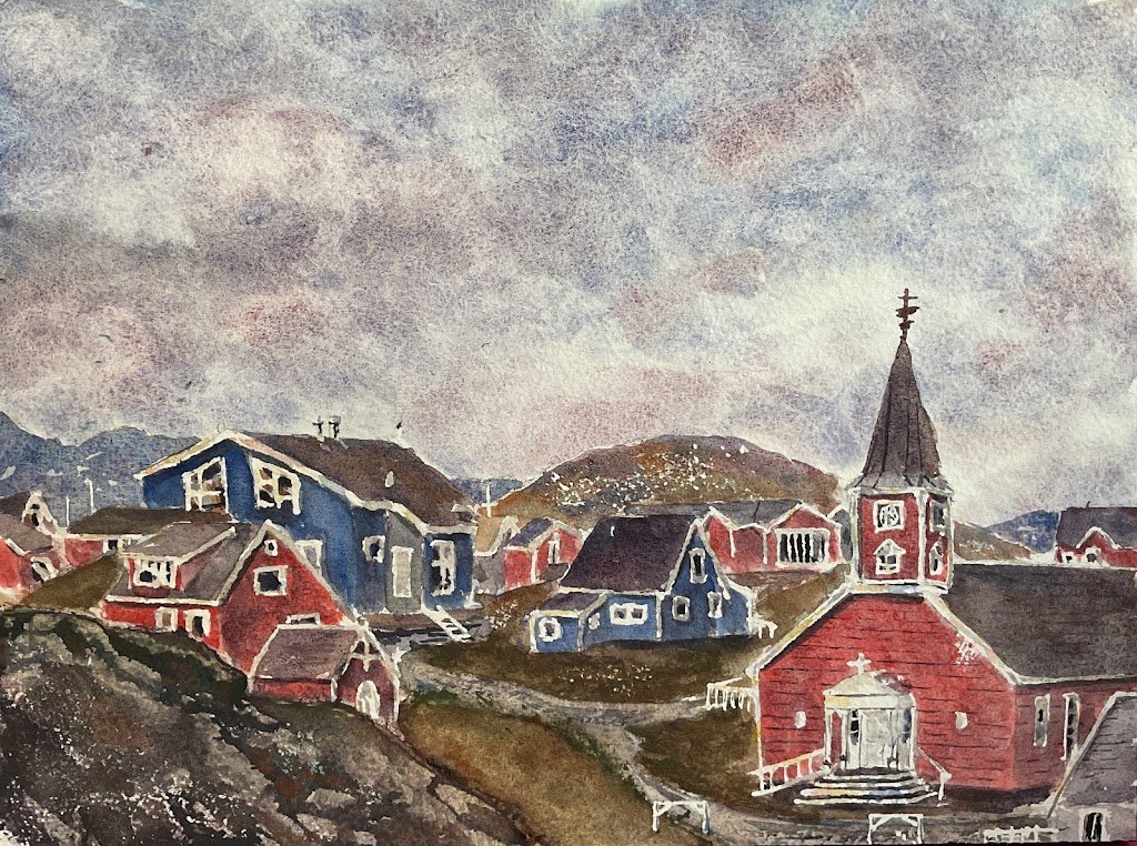
Day two of my three watercolour landscapes in three days challenge and today it’s buildings day. I picked out a scene in Nuuk that had a church in the bottom right. Because churches and Greenland landscapes tend to turn out well for me. During one of my breaks in painting, I googled around and was shocked to find that the church in the bottom right is Nuuk Cathedral. Well, well, well.
Being a Greenland scene, it was a no brainer for me to use the tundra colours. They were supplemented today by French ultramarine, rose dore, titanium white and cadmium yellow.
I started by putting down pencil outlines, sling all the white bits and rubbing a candle over the bottom hill and over the hill in the middle. After that I just worked from back to right. The sky, then the blue background hills, then the closer background hills, then the buildings/roads/grassy areas (all separately) and finally the bottom left hill. Then I removed the making fluid and added some finishing touches.
The sky went down in a couple of layers. The first layer was looking quite dark so I dabbed at it with kitchen paper, only for it to come out too light, so I added a second layer. And maybe dabbed at it a bit more.
The blue background hills are in tundra blue with a bit of tundra pink and violet dropped in. I like how I’ve been a bit loose and let some sky holes shine through.
The middle hill and the grassy areas use all fine tundra colours, with different colours being dropped in wherever felt right. The hill has more of the blue and pink in the grey, rocky areas. The grassy areas have much more of the orange and green than of the other three colours.
The road has all five colours and at one point I lightened it a bit by putting on watery titanium white and dabbing it off.
For the houses to appear bright enough I had to bring in extra, more saturated colours. So the buildings have a couple of layers of rose dore in there as well as the tundra colours. The blue houses started with tundra colours but looked a bit dull so I glazed over some French ultramarine. The French ultramarine doesn’t really count as an extra colour as it’s already one of the ingredients in three of the five tundra colours. The rooves and any grey houses were just made from the tundra colors.
The hill in the bottom left gave me the most trouble. I made a few attempts but wasn’t happy, so dabbed off a lot of paint. Doing this tends to leave me with a horrible looking light shape with a thick dark border around it, which is pig ugly. I ended up putting on very dry versions of all five tundra colours and then lightening it in places with titanium white. It seemed to work and there’s just enough of the tundra green visible in there for it to fit in with the rest of the painting.
Once this was all done I removed the masking fluid and made a few small changes. I added detail to some of the big white masked areas like the doors to the cathedral and whatever building that is in the bottom left and the clock on the steeple. Then I deed some tile lines and cladding lines to some of the buildings. And the white window and roof frames were standing out a bit, so I did some more work on them. First I added a grey glaze to any shadowed areas but this wasn’t enough so I added watery French ultramarine, rose dore and cadmium yellow to all the sunlit white areas and dabbed at them with a kitchen towel to leave behind only a hint of colour. And that was me done.
I’m feeling reasonably happy with this one. Good sky and hills. And the buildings are managing to be colourful enough to reflect their reality while still harmonising with the rest of the painting, which isn’t easy. I guess it’s obvious looking at this that I’ve used masking fluid and that I’ve been quite loose with it but I’m coming to the conclusion that that’s just my style and I have to get used to it.


Leave a Reply