


Here we go then. Back on the watercolours and it's a gentle return because I'm…
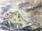
Nuuk Art Museum
It was always going to be another supergranulating day today. But tundra or shire? I went for tundra. The shire set is one that I might be able to use locally on site, so I’m going to save it up for a weekday when I can venture out. Once I’d decided on a tundra painting, I had to decide what to paint. After struggling last time to make best use of tundra green and tundra orange for the natural world last time, I was drawn to this view of the art museum in Nuuk, the capital city of Greenland. I found two great photos of the museum: one with buildings painted yellow and green and with no snow in sight and one with them all painted yellow and loads of snow. So I combined the two into something that I thought would let my tundra colours shine.
Nuuk, by the way has a population of about 18,900, making it roughly the size of Faversham, Leek or Ely. If those names mean nothing to you, head to http://lovemytown.co.uk/populations/townstable1.asp and you’ll hopefully find somewhere that you know that’s comparable in size to Nuuk.
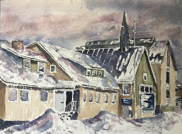
I started off with a pencil drawing and then lots of masking fluid. I resisted the temptation to put down huge white areas. Instead, for the bigger white shapes, I put down a masking fluid outline and put a big X in the middle to remind me not to paint over it.
So, on to the painting. The sky was made up of tundra blue and tundra pink with a little bit of tundra violet in places for cloud shadows. Then I moved on to the buildings. I started with the windows, dropping in tundra blue, violet and pink with one eye on my source photo. Then I painted the green and yellow buildings. I painted both with just single colours. I used two different values of tundra orange, with a darker value on the shadowy side of the buildings.
Then I moved on to the darker bits of the buildings, mainly using tundra blue and violet but also some interesting greys that I got from mixing these colours with the tundra green. Then I added some shadows under the eaves, under straps and on some of the shadow sides. My main shadow colour was the tundra violet but others may have sneaked in. I also added grey edges along the bottom and down the right hand side of windows.
Finally I got to the fun part. All the masking fluid came off and I painted in the snow. I started with tundra pink (the colour I was always planning to use) but later added some tundra blue and violet. The painting was a mixture of solid washes on shadow sides and dry brush technique wherever I felt like it. There’s a strange yellow patch on one of the roofs. I have no idea where this came from. One minute it wasn’t there, the next minute it was. I looked and couldn’t see any yellow paint on my hands. Maybe it wasn’t paint at all and was just something dropped on by a passing bird? It’s a mystery.
And then there was a little bit of tinkering, applying some very light greys over the white in places like the flagpole and a door to make things clearer. And the addition of a door handle. And then I was done.
This one’s another success and is going up for sale. It’s hard to go wrong with these colours. They work as a team, all complementing each other and putting across a cold atmosphere: in this respect, having buildings painted in tundra green and tundra orange makes for a much better painting than one that attempts to replicate the actual colours.

Leave a Reply