


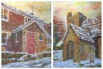
And here are those two paintings together. Number Two and Hartlip Church In The…
Number Two
Remember Hartlip Church In The Snow from a month or so ago? I gave it to Barbara next door as an 80th birthday present. Well, her daughter Michelle pulled me to one side at the party and told me that the painting was now up on the wall, on one side of a bigger painting, and that she thought it would be good to have another painting on the other side, maybe of their house…? So I’ve picked up a commission.
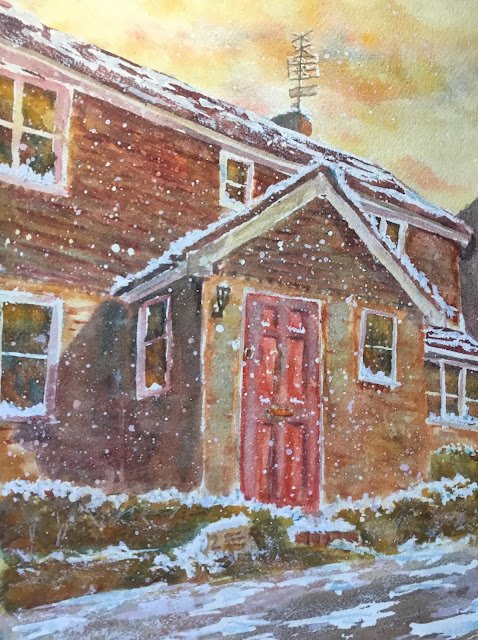
There was one constraint though. This painting of the house needed to be in portrait format. That ruled out any painting of the whole house. So I homed in on the front door and took some photos laying down on the drive to get some three point perspective going on. But then I realised the bit sticking out the front of the house looked just like the porch of the church. Which gave me an idea. Why not make these two paintings really go together by using the same set of colours and (let’s really go for it) make it a snow painting?
So the colours, as for the church painting were cerulean blue, rose dore, raw sienna and Indian yellow: a mix of warm green and cool orange colour keys. Winsor red also came in later on but, being another warm red like rose dore, leaves the keys unchanged. And obviously, there’s titanium white there too.
So, after putting down a pencil drawing, I masked out all the white door frames, window frames and trimmings. I also masked out some white snowy bits on upward facing surfaces and put down a load of spatters for falling snow.
Then came the sky and some underpainting. The underpainting included the big shadow on the house, the shadow of a car on the drive and some initial shadows and Indian yellow highlights on the plants in the garden. The house I covered fairly randomly in all sorts of yellows, reds and blues. It looked terrible but underpaintings always do and my confidence never slipped. I spattered on more masking fluid after the underpainting to get some different coloured snowflakes.
Then it was just a matter of putting two or three coats of colour over all the shapes, gradually creeping towards the colours that I wanted. In the later coats, I was starting to get some 3D effects going on in the door and a tiny bit of detail/texture in the brickwork and the upstairs tiles. The rose dore was being a bit of a pain with the red door, either looking too orange or too garish or both, so I found myself reaching for the Winsor red. The two reds together got me to an acceptable door colour. I also found that the Winsor red could get me to a better roof colour and to a nice dark for the TV aerial and the outdoor light. The rose dore was good for the brickworks, though, so I think I needed both reds.
Then came the fun bit. Off with the masking fluid, leaving lots of bright white. To tone down the whites, I put cerulean blue on the most shadowy bits of snow and some watery variegated blues/reds/yellows on all the white bits of the house.
Did I say that was the fun bit? No. There was even more fun to come. The painting looked good at this stage and worth framing but I knew from experience with the church painting how to make it better. I squeezed out a blob of titanium white. With this, I first spattered on lots more falling snow. Then I want over the top of all my existing snow. Where there were cerulean blue shadows in the snow, these mixed well with the white. And, yes I know I’ve said before that white isn’t for mixing. This is different. Finally, I dry brushed more white onto the roof and drive using the edge of the brush. And maybe added more snow in places too.
I think this looks great. Michelle’s happy with it so Barbara will be getting it for Christmas. I think she’s expecting a painting but has no idea what this is going to look like.
And I think that’s me done with watercolour until the Spring. It’s just too cold out there. It’s back to markers and inktense pencils until then.


Leave a Reply