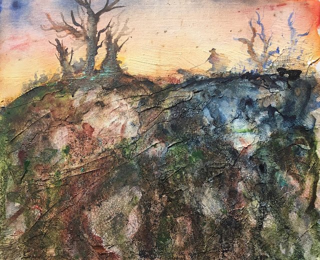
And here’s my latest Jane Betteridge inspired painting on an unusual surface. It’s my first go using crackle paste. I bought an acrylic canvas board from The Works (dead cheap, was it three for £3?). I painted on some crackle paste (golden medium crackle paste to be exact) over the bottom two thirds or so, although I left gaps). Then I painted on watercolour ground in all the bits without crackle paste. It takes a couple of days to dry. Jean says that you don’t need to flatten the paste out and that it does it itself as it dries. She’s wrong. I ended up with a landscaped surface but I’m game for anything. I could see lots of crackles on the surface but quite small ones. I need to experiment with laying the paste on more thickly.
Today’s triad of primaries were rose dore, Indian yellow and French ultramarine (brought to you in the key of orange warm). They made up the sky, which came out really well – something to do with painting on watercolour ground rather than my skills with the brush. In the rockface they were joined by burnt sienna, which worked well with the French ultramarine in the previous painting. And then I laid on the acrylic inks and granulation medium. I used all seven of my colours (but shouldn’t have used the waterfall green, which doesn’t really belong here) and they’ve pretty well taken over the bottom of the painting. I should have learned from a previous failure with inks on gesso – inks and granulation medium only really work well on plain watercolour paper. Because the inks weren’t doing what I wanted them to, I used too much of them (and dabbed some off, then added more) and the bottom of the painting is no longer really a watercolour but hey ho. I added the trees, initially using sepia and indigo inktense sticks but dropping in a little bit of burnt sienna inktense stick later. And some waterfall green ink in an attempt to distract from the bits of waterfall green still sitting around in the painting. I added in the dog walker (I’ve found people like to see dog walkers in my paintings) using a grey mixed from my three primaries and dropped in some wet into wet primaries for a bit of interest. And finally, because the trees on the left were looking sinister and because the dog was showing such an interest in them, I added in some shadowy grey figures. Maybe they’re rabbits or hares. Maybe something more sinister. Don’t ask me – I’m only the artist. And I didn’t add any spatters for once, although I did add some salt, which doesn’t seem to work on inks.
Overall, I think it works but (as usual) it isn’t perfect. The cracks came out really well and the paint enjoyed running into them. So much so that I didn’t need to use inks and should have stuck to watercolour. The rockface could be accused of being too muddy, but I expect there are lots of hidden accidental images in there that people could spot if they stared long enough. The spots of waterfall green are a bit distracting. On the other hand, the addition of figures and the naming of the painting take the interest away from the rockface and onto the top third of the painting which I think is pretty good. Gold ink never shows up in these paintings as anything more than glittery spots, but these add to the magical mood, suggesting that the dog could be barking at absolutely anything. This one’s up for sale.
To see the price, click here.


Leave a Reply