


So I had another go at Amy, this time without a head. I started from…
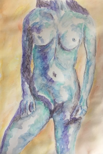
Nicole Vaunt
It’s still too cold to be painting outside so I’m on the inktense pencils again. Today’s model is Nicole, making her debut.
Because it’s so cold today, I wanted to make this a cold photo by using a lot of blue. I started with purple in the darkest areas, then got gradually lighter with sea blue, then iris blue. I thought the painting was missing something and was determined not to add my usual reds and leaf green, so instead added bark into the darkest areas. Then, because the background worked so well last time round, I added a background in tangerine, sherbert lemon and baked earth, these being roughly complementary colours to the violet and blues in the figure. And, just to have something different in there, I added teal green in places – this felt OK as it’s a very cool, turquoisey green. Here’s what I ended up with before adding water:

And then I added the water and finished up with the final painting. I’m always careful watering the figure, getting the edges right and trying to get the colours to mix without contamination by working from the lighter colours into the darker ones and keeping the brush clean. For the background, though, it was the messier the better, waving the brush from side to side like I was drying plates.
Let’s talk about what went wrong with this one. First, I chose the source photo because there was so much shadow in it. This was a bad mistake. Because while shadow works well with the markers, where I’m pretty good at the chiaroscuro style, I’m better off with minimal shadow with the inktense pencils. Big shadow areas don’t look good but big white areas do. Second, why did I paint in the whole background? If I wanted some background, wouldn’t just a shadow have been OK? Warm colours in shadows can make the painting look cooler. Two important lessons for next time.
And what went right? Teal green, blue and violet make up a good colour scheme. The teal has been underused and needs to come out more often. Maybe I could experiment with teal and reds – there would be some jarring contrasts there. And there’s a welcome return for hidden edges on Nicole’s left shoulder, although it could be argued that including a coloured background negates the impact.
Overall, I think this is a success and worthy of a place in the shop window. To see the price, click here.

Leave a Reply