I bumped into the local vicar yesterday. He conformed that I'm invited to have a…

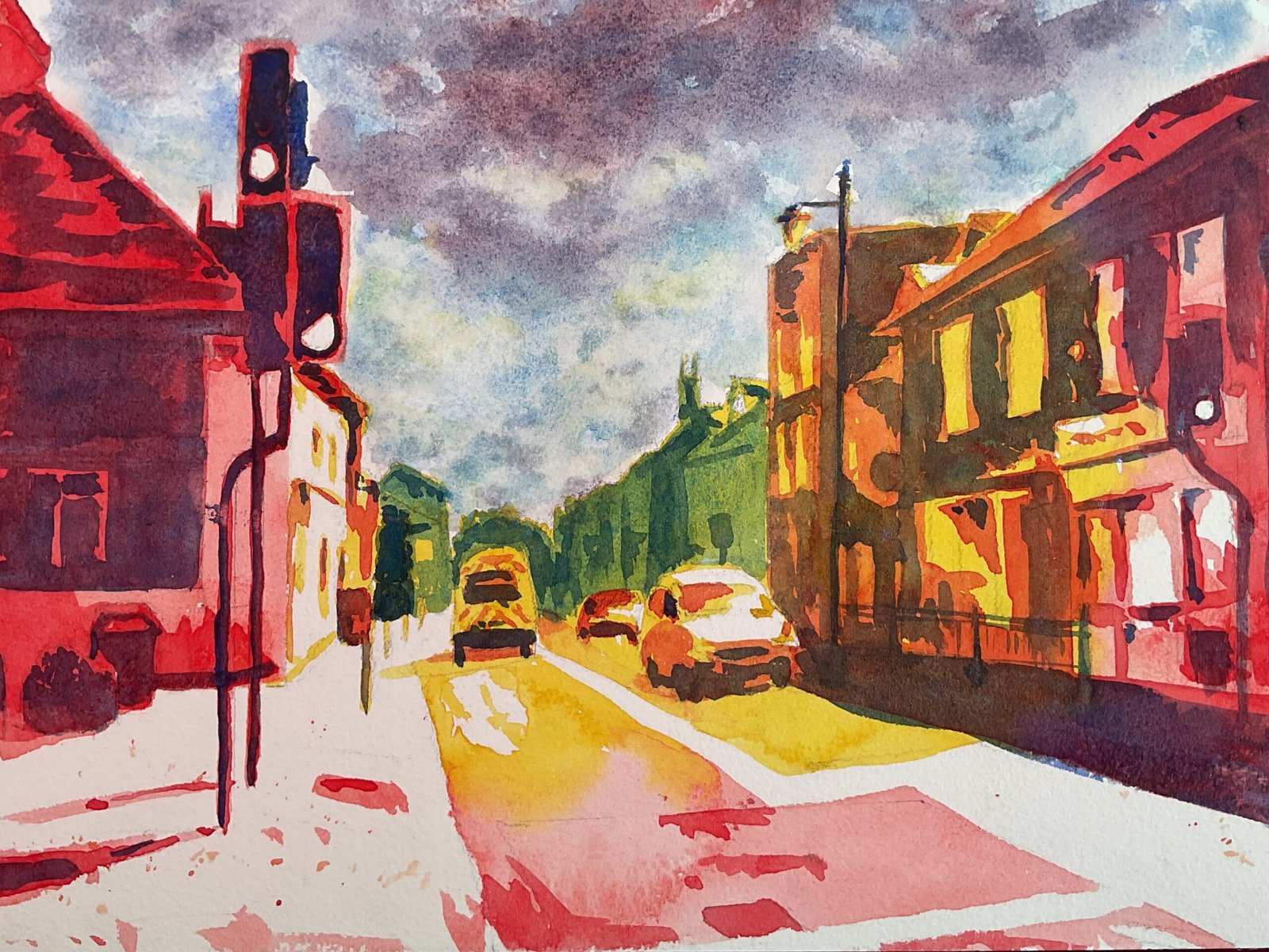
Newington Pelican Crossing
Back to the real business today and it’s the eighth of my nine posterised. Newington landscapes. I’m now on to the two colour schemes that are the most fun, starting with the traffic light scheme which just had to be used for the pelican crossing. As you probably already know, the traffic light scheme is a mix of the red, amber and green colour schemes. So the first layer is rose dore closest to the viewer and transparent yellow further away. The second layer is cerulean blue in the distance and Winsor red everywhere else. And the third layer is French ultramarine.
The work for this one started last night, planning exactly where the red, amber and green schemes would be used. The plan was always to use green in the distance and red closest to the viewer but I still explored plenty of options in a photo editing app before settling in what you see here. Then today I put down a pencil outline and then the three layers of paint. Once again I didn’t bother with masking fluid: unless I’m spattering, I think landscapes look better without it. The sky was added at the end, wet into wet with cerulean blue near the bottom and French ultramarine near the top. I put in some rose dore near the top and some of the yellow near the bottom to harmonise wit/ the rest of the painting. I tried hard to make my yellows yellow and not allow them to mix with the blues to make green. And that was me done.
And this one doesn’t disappoint. It took a day’s experimentation months ago for me to discover these three colour schemes and a bit of common sense to use the red at the front and the green at the back but most people don’t know that and will look at this and be shocked at what I can come up with using seemingly random colours. This makes me look like a genius. A good day at the office today. This one didn’t sell at the Newington garden party so is now in the shop window and up for sale.


Leave a Reply