


I saw a great stock photo on LinkedIn the other day. There was a sky…
New Court In Colour
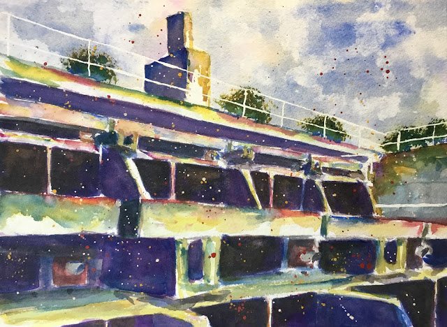
Bearable temperature outside today? With worse to come, I thought it best to get out there with the watercolours while it was still possible. The subject matter is New Court, Christ’s College, Cambridge. I think this is my fourth attempt at painting this concrete monstrosity and looking for beauty in a deep dirty hole. This time, though, it’s in response to a request from a Christ’s old boy to paint New Court in the same style as my painting of Murray Edwards College a few weeks ago.
So the main three colours are again transparent yellow, French ultramarine and quinacridone magenta (so this is in the key of purple cool). You can see, though, that cadmium red, cadmium yellow and titanium white made appearances as spatters at the end.
I followed the same methodology as for the Murray Edwards painting as long as I could. A pencil drawing using a ruler. Then a bit of masking fluid for some safety rails. Then the sky, with all three primaries and some kitchen paper dabbing. Then it was on to the darkest darks: the windows, these started off as a dark purple and I was expecting to need to apply several coats. Next came the darker shadows, where I started introducing some yellow to the mix to get a more neutral colour. Then I added the impressionistic sunny colours to the concrete in unmixed form wherever I fancied and allowed it to mix on the paper. And added some hard edges in places where some of the shapes needed them. If I’d then just darkened my darkest and next darkest darks and maybe added some light darks, I might have been done and left holding something similar to the Murray Edwards painting.
But somehow I lost the way at this point. I wanted to add a bit of three dimensionality by adding a light shadow to all the left facing surfaces. But this meant that the sun was coming in from the right and the colourful wall of concrete on the right of the where I’d left some dazzling whites would now have to be put into shadow. And once I’d added these extra shadows, I ended up with the feeling that my darker tones weren’t all working together. So I started adding glazes (most of them blue but at least one purple) over all of my different shadowy areas in an attempt to unify them. What I ended up with was just about acceptable.
There are a number of things I could have done differently, like:
– starting with a value plan
– maybe having all shadows a similar colour (but different values)
– or maybe mixing a black for the windows and using purple shadows everywhere – purple shadows make for a sunny scene
Anyway, what’s done’s done.
Once I reached the point at which I was convinced that any more painting of the building would make things worse, I stabbed in the greenery at the top with a Terry Harrison Merlin brush. Blue at the bottom, yellow at the top and both in the middle. Simple. I added spatters of opaque paint because I thought the painting needed it: there wasn’t enough variety in the colours of the windows. And then I rubbed off the masking fluid and I was done.
I think this one’s a decent enough effort despite my misgivings. The impressionist colours in the concrete are what make it. It’s up for sale. To see the price, click here.
Leave a Reply