


I've still not given up hope of being invited into Sky Landscape Artist Of The…
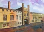
New Court, Christ’s College, Cambridge
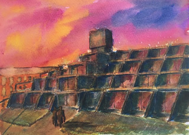
I saw a great stock photo on LinkedIn the other day. There was a sky in it that was yellow and pink on the left and blue, pink and purple on the right. I had to have a go at incorporating a sky with those colours into a painting.
So, in terms of planning, the first decision was the colour scheme. I want to have a go at painting with all four of the primary triads that I identified as winners a couple of weeks ago. With purple being such an important colour, that ruled out orange cool and triadic right. And my last painting used triadic left. That left me with purple cool, so I was using French ultramarine, transparent yellow and quinacridone magenta.
The second planning decision was the foreground. I didn’t want to take the easy route again with a random landscape (which we know normally means a symmetric composition with a path between two hills). But I did want something that wasn’t going to distract from the sky. I wanted the sky to be the star of the show. So I picked the ugliest price of architecture I could think of that was worth painting: New Court at Christ’s College Cambridge (the finest educational establishment in the country). New court is a brutalist Dennis Lasdun design that is known around the place as “The typewriter”.
So anyway, I did this with three colours. At one point I added some titanium white highlights but they didn’t work and have long since been painted over. I tried not to make the values in the sky too dark. 8 wasn’t entirely successful there but at least I managed to make the buildings darker. New Court was done in countless lathers, starting with some random red, yellow and blue underpainting and later adding blue to the darkest bits and shadows, yellow to the brightest bits and generally just tinkering around.
I added some salt at the initial underpainting stage that leaked into the sky and created what look like some disturbed birds taking flight. That was a happy accident. Some of the later glazes also had salt applied.
As a finishing touch I added a couple of people coming back from shopping and some people and railing shadows. They’re not the best carrot people I’ve ever done though. And it was difficult to contrast them against the background – I really should have placed them somewhere else rather than in front of the shadows. It might also have looked a bit more inviting if I’d left the doors open rather than closed. Oh well.
The building in the background on the left was added as an afterthought. I really should have added it earlier. I may have just about managed to achieve a value for it that’s somewhere between the sky and the foreground. Maybe I should have thought some more about perspective on that building, though, and on making sure the top and bottom of its rook didn’t line up with any horizontal lines on New Court.
Overall I guess it’s OK. I was hoping that either the colour scheme made New Court amazing or that it just looked ugly against an amazing sky. In the end it’s somewhere between the two. In the end it’s a decent effort but not one that will break into my top 20.
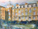
It’s been sold to that same Christ’s old boy as my painting of the front of the college.
Leave a Reply