


So, yeah, the local vicar asked me a few weeks go whether I'd be interesting…
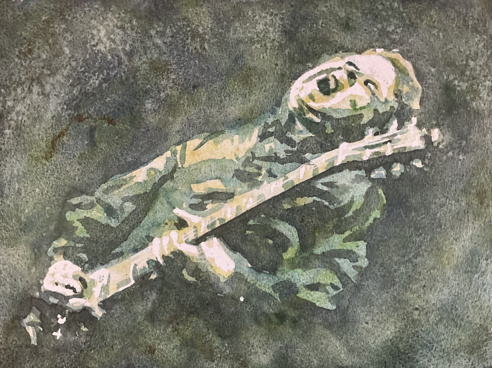
My Approach To Posterised Paintings
This article is one that’s been bubbling away in my head for a while. It came to the boil last night when I asked an AI app to critique one of my articles. It told me that I used too many technical terms and one of those was posterised paintings. And that I should explain what these are. So that’s what I’m doing today.
According to Wikipedia, the posterisation of an image is the conversion of a continuous gradation of tone to several regions of fewer tones, causing abrupt changes from one tone to another. My approach to posterisation is to use four tones within each image and to restrict each tone to a single colour or to slight variations of that colour. I end up with something that looks remarkably realistic while also impressionistic and moody. It’s hard to do wrong painting like this.
Let me take you through my process.
Planning
I plan these painting using the Notanizer app. After loading up my source photo, I get a screen looking like this:
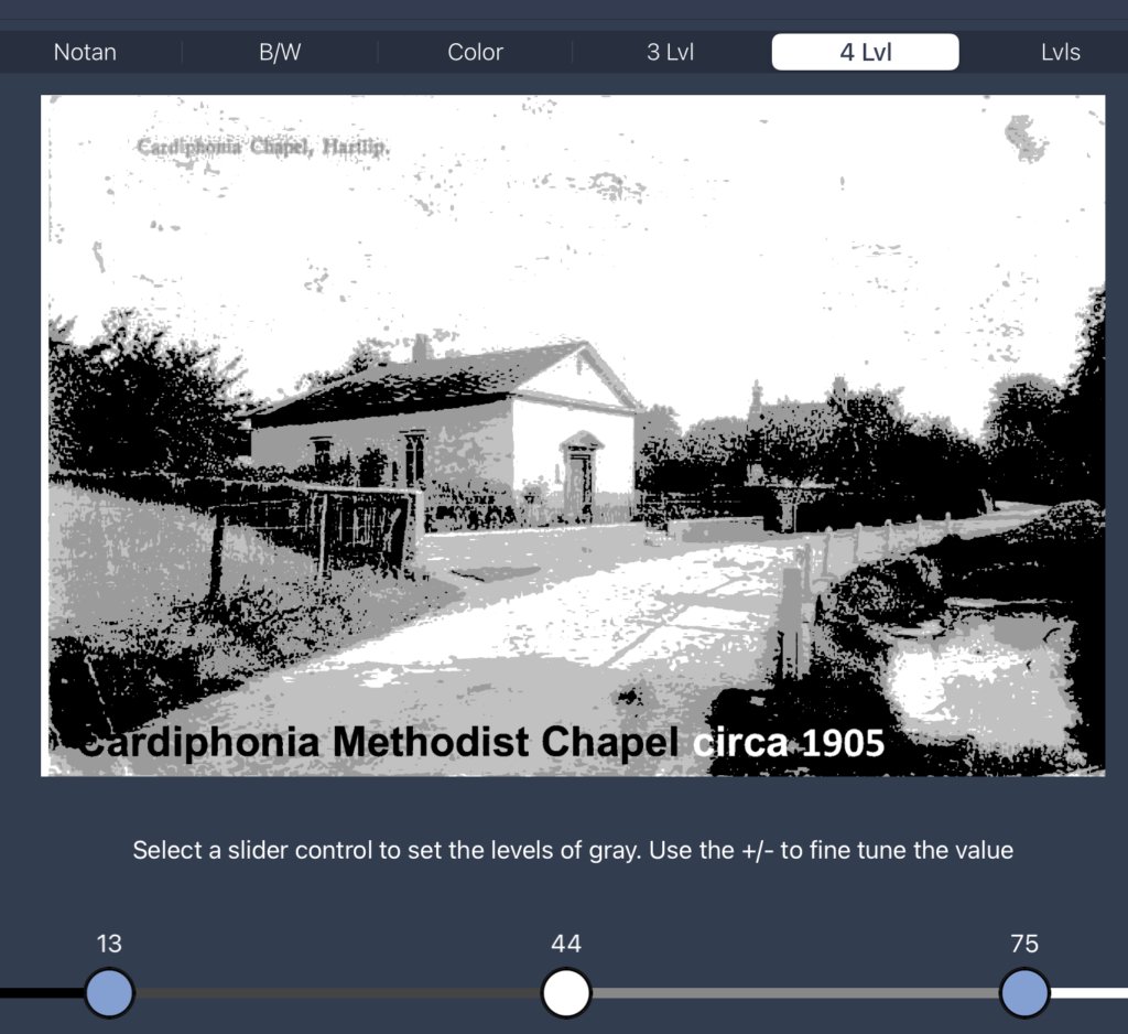
I can move the sliders at the bottom of the screen to vary the points at which the plan switches between values. I start by moving the slider on the right to the point where I’m happy with the amount of white highlights in the image. Then I move the left slider to the point where I’m happy with the amount of black. That leaves the middle slider that I move around until I’m happy with the complete image; more often than not that slider ends up halfway between the other two. I make a note of the slider positions (13, 44, 75) that I ended up with.
And that’s the planning completed. I’ll refer to the four values in this plan as highlights (whites), lights, mediums and darks.
Painting
I start by drawing the image onto the paper in pencil, sometimes using a grid, sometimes using the NeoLucida XL. In this drawing, I’m working more from my value plan than from the original photo, making out all the four different shades of grey that the Notanizer app is showing me.
Then I think about all the white highlighted areas. I can use the Notanizer app to show me these by getting it to show me a two value plan with the slider set at the third point in my four value plan:
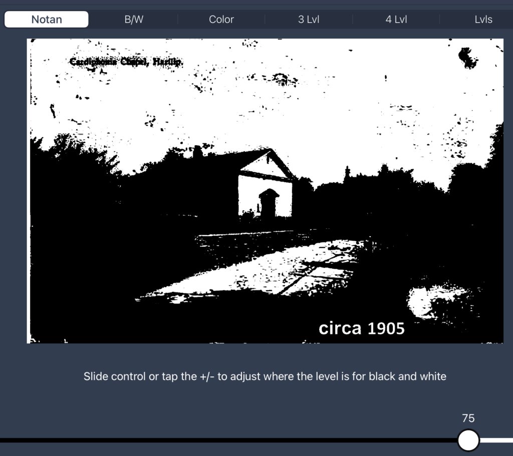
I want all the white areas in the plan to stay white. So for all the smaller white shapes I’ll mask these by painting on masking fluid. Sometimes I’ll also mask out the larger white areas; other times I’ll mask out their outlines and put a masking fluid X in the middle to remind me not to paint inside them. It depends on how complicated the plan is: too complicated a plan and there’s too big a danger that I’ll paint in one of the reserved areas, so best to mask out all the whites completely. Recently, I’ve also been leaving the skies unpainted in posterised landscapes so that I can fill them in later, wet into wet, rather than having sharp edges between values in the sky. If the background of a portrait is going to be dark, I’ll often spatter making fluid over it to create a starry background. I have to remember to remove any rogue spatters from the face before painting if I do this.
Once the masking fluid is dry, the first layer of paint goes on. It will be a light colour and will go over all the light, medium and dark areas. so that’s everywhere that isn’t being reserved as a highlight. This is an important part of my style. That light colour will shine through within the darks, mediums and lights and harmonise the painting. If I just used different individual colours for the lights, mediums and darks, I’d end up with something that looked like painting by numbers and that didn’t hang together well.
Once the first layer is dry, I reach for a darker colour and paint over all the medium and dark areas, leaving the lights and highlights as they are. To help me do this, I’ll get the Notanizer app to show me a three value plan, with the sliders set at the second and third points in my four value plan:
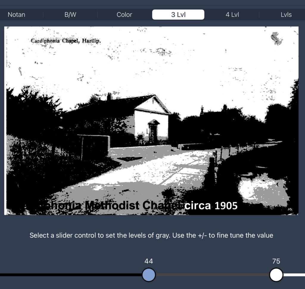
I need to paint over all the areas shown as black in this image, leaving the whites white and the greys with the single layer of paint that’s already there. After this second layer of paint, the painting starts to become recognisable.
Once the second layer of paint is dry, I put on a third layer, using the darkest colour of all and only going over the dark areas in my four colour plan. So my dark, medium, light and highlighted areas end up with three, two, one and zero layers of paint on them, yes?
If I’ve left the sky white, the next step after the third layer is dry is to fill it in. I wet the whole sky with water, then drop in bits of all my three colours either individually or after mixing some of them together. I completely ignore my source photo at this stage, adding light or dark colours to the sky wherever it’s necessary to make the painting balance as a whole: this is the benefit of leaving the sky until the end.
Once everything’s dry, I have the satisfaction of removing all the masking fluid. Sometimes that will be the end of the painting, sometimes I’ll tinker a little, adding more of the third colour over the second or the second over the first in an attempt to improve the likeness. Often I’ll jiggle the sliders in the Notanizer app to give me ideas about which tiny details could be darkened. But after tinkering, that’s me done.
Colour Schemes
The one thing I’ve missed out from the process description is the choice of colours. After a lot of experimentation, I’ve narrowed myself down to nine colour schemes to choose between. My choice of colour scheme is very rarely about the colours that I see but normally around the mood and temperature that I want to convey and sometimes about the nationality of a portrait subject.
In a perfect world:
- the first two colours would be staining colours. If they’re not stainers, then I need to be gentle when putting other colours on top of them, so as not to disturb lower layers.
- the second and third colours would be transparent. If I’m putting on a non-transparent second or third layer, I have to keep the paint thin enough to allow the colours underneath it to shine through.
- it’s also good if the first layer is transparent, so that light can get through all the layers of paint and reflect back off the white of the paper
But beggars can’t be choosers and it’s not always possible to meet all these criteria.
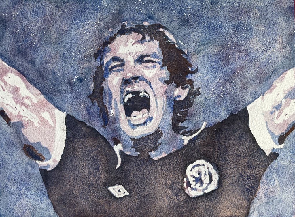
Still, enough of this. Let’s move on to my nine colour schemes, starting with the blue colour scheme:
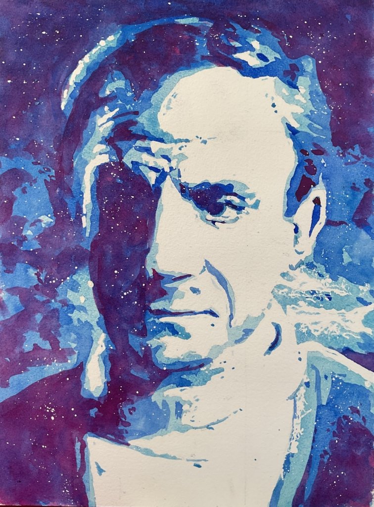
The three layers here are cerulean blue, French ultramarine and quinacridone magenta. The first layer is semi-opaque and none of the colours are staining, so take care out there. The first layer needs to be thin and the second and third gentle. The colours seem to work well together and, unsurprisingly, there’s a definite chill in the air.
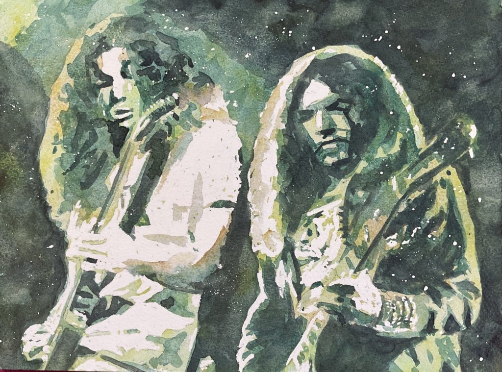
Then there’s the green colour scheme:
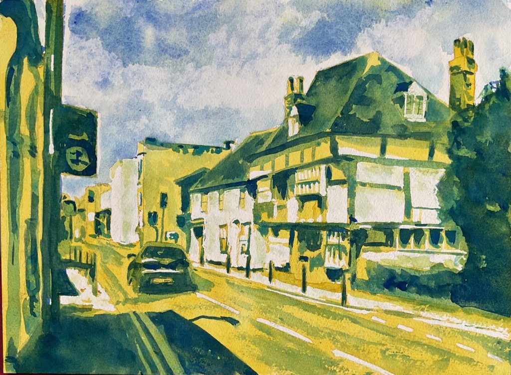
The three layers are transparent yellow, cerulean blue and French ultramarine. The cerulean blue is semi-opaque and non staining, so the second layer needs to be thin and the third gentle. With so much green and blue in there, it’s slightly surprising to see this colour scheme looking so sunny, but I think it’s still cool. Not t-shirt weather.
Next up is the amber colour scheme:
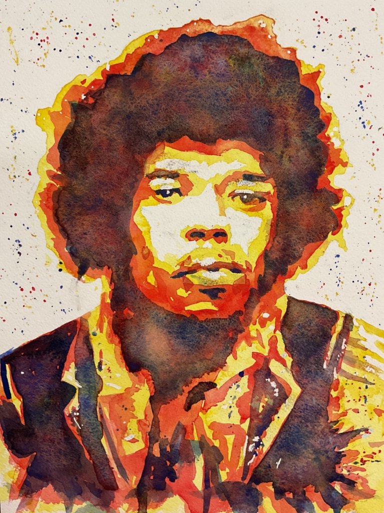
Here we have transparent yellow, Winsor red and French ultramarine. The Winsor red is semi-transparent, so can’t be applied too thickly but that’s the only imperfection with this triad. This is the sunniest and most hallucinogenic of all my posterised colour schemes, but when that’s the mood you want it delivers big time.
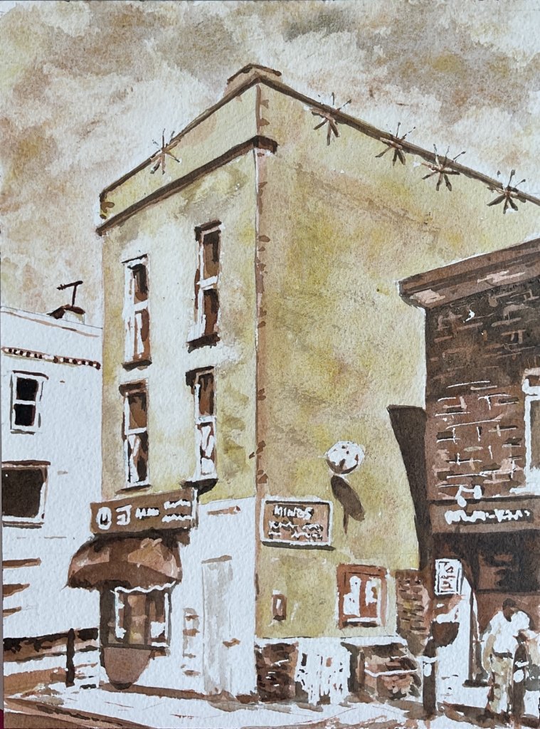
After green and amber, it must be the red colour scheme next:
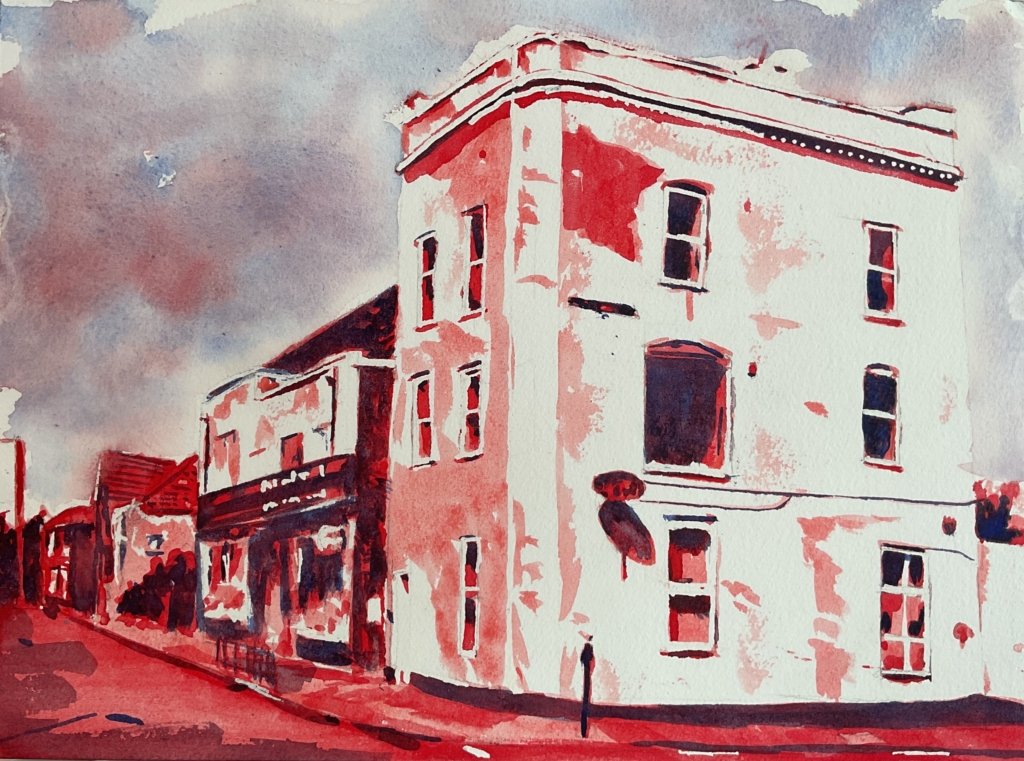
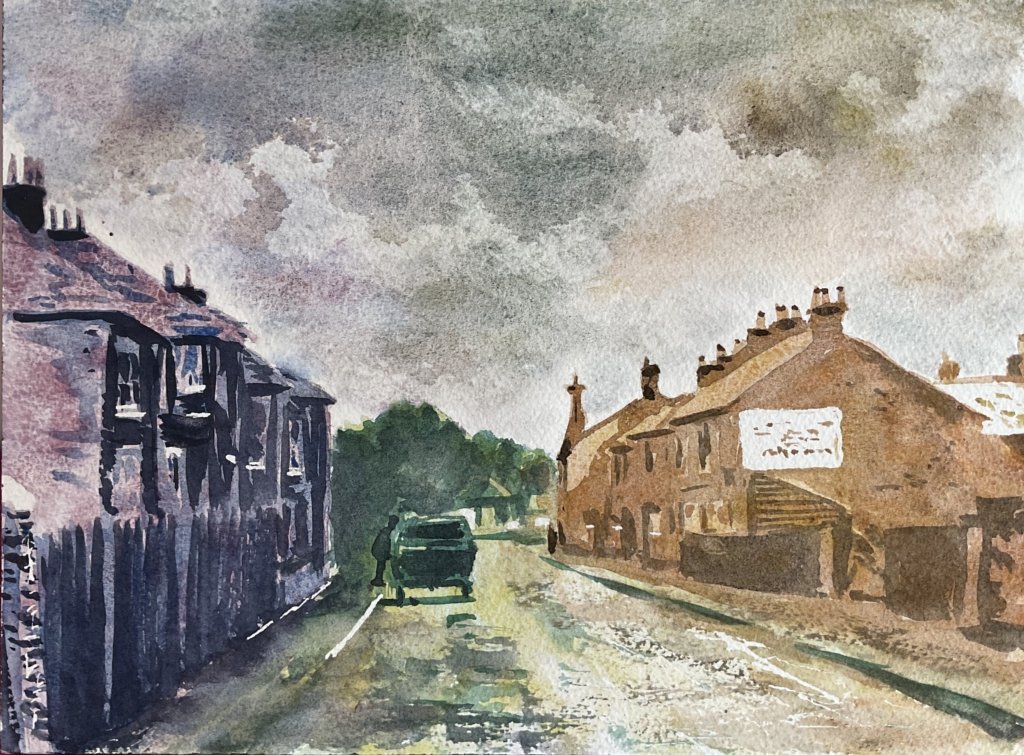
The colours in this one are rose dore, Winsor red and French ultramarine. The Winsor red’s semitransparency is again the only issue to be aware of, so the second layer mustn’t be too thick. This is a colour scheme I’ve not completely gotten my head around yet. It screams out red to me, while not screaming heat. Maybe it will make more sense after I’ve tried it a few more times. Check out the sky in this one, by the way. It’s painted using that same blue and those same two reds and the wet into wet approach makes the hard edged approach to the buildings stand out against it.
And then we have the traffic light scheme:
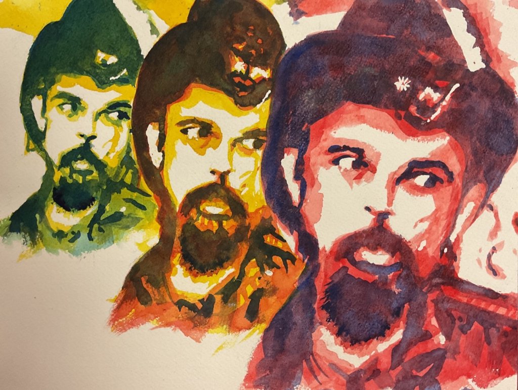
This is a combination of the green, amber and red schemes, used in different places on the paper. I like to use it for triple portraits like this one. Because warm colours advance and cool colours recede, the red is used for the closest portrait and the green for the furthest away. I’ve tried using this in landscapes too, with the green scheme used in the distance, amber in the middleground and red in the foreground but that doesn’t work so well.
Then we’re on to the Schmincke supergranulators, starting with the tundra colour scheme:
The three layers are normally tundra pink, tundra blue and tundra violet. On one occasion I included tundra green in the first layer, separate to the pink but blended into it where they met. And tundra green and orange can both be dropped into the final tundra violet later to create some variation. The violet is semi-transparent, so shouldn’t be mixed too thick and the pink and blue are only semi-stinging, so the second and third layers need to be applied gently. These colours work brilliantly for both portraits and landscapes, looking even colder than the blue colour scheme. I like to use them for any Scottish subject matter.
The next supergranulating colour scheme is Shire:
Shire green, Shire yellow and Shire olive are all light enough to work in the first layer and I generally use all three, not mixed together but applied in different places and allowed to mix where they meet. The second layer is always Shire blue. And for the third layer, after experimenting with green apatite genuine and forest brown, I’ve finally settled on Shire grey. Whereas for non-posterised paintings I feel the need to throw in some burnt sienna to hold back the green overload, I’m happy to just stick with the five Shire colours in posterised paintings. Because the colours in posterised paintings aren’t there to replicate reality: they’re there to set the mood. The blue is opaque and the grey semi-opaque, so these shouldn’t be mixed up too thickly. And the yellow and olive are only semi-staining, so the second and third layers need to be quite gentle. This is another colour scheme that I like a lot. It seems to work best with dark backgrounds, producing paintings that crackle with energy.
Next up is the desert colour scheme:
The first layer can be desert orange or desert yellow, or a combination, allowed to blend together on the paper rather than being mixed together. The second layer is desert brown and the third desert grey. Desert green is another third layer candidate but one that I rarely use for posterised paintings. All the colours are either semi-opaque or semi-transparent so shouldn’t be mixed too thickly. And with the brown and orange being only semi-staining and the yellow non-staining, the second and third layers need to be applied gently. This colour scheme works exactly as you’d imagine, sending out a dry heat. I like to use it for portraits of historical characters from the Wild West, often at a jaunty angle within a white frame against an abstract deserty background using all five desert colours and with dark spots looking like bullet holes.
And there’s the climate change colour scheme:
It’s a combination of the tundra, Shire and desert colour schemes, applied to different bits of the painting. It works, like the traffic light scheme, for triple portraits with the desert portrait being closest and the tundra portrait further away. And it also works for landscapes like this one. Whereas with the traffic light scheme I divide the painting into background, middleground and foreground, with the climate change scheme I can divide the paper into three vertical slices and work from tundra on one side or desert in the middle with Shire in between. I end up with a painting that sends out subliminal climate change messages.
Actually, there’s one more colour scheme. I’m adding this on 16 January 2025 after using it a second time. This is the trippy scheme:
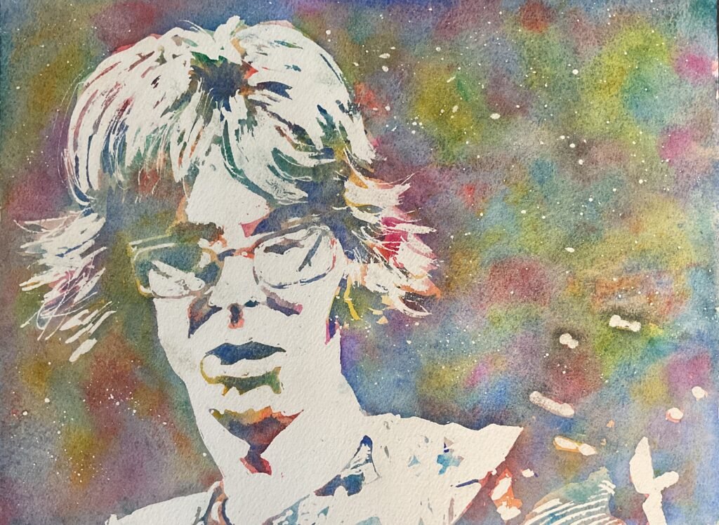
This one is an exception to the rule, only having two layers. The first consists of random marks of Indian yellow, transparent yellow, quinacridone magenta, rose dore, Winsor red, Winsor blue (green shade), cerulean blue and viridian, all allowed to run into each other. The second layer is French ultramarine laid over the darker shapes. Because the blue difference between the two paint layers is so small, the separation of the highlights from the painted ares does almost all the work and it’s really important to go slowly and get those highlights exactly right. It does look good though. I tend to save this one for when I find a source photo whose painting would work just as well with three values as with four.
And, with that, the time is gone, the song is over, thought I’d something more to say.

Leave a Reply