


I saw a great stock photo on LinkedIn the other day. There was a sky…
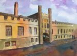
Murray Edwards College, Cambridge
After all that fun with whitewashed buildings in my last painting, I wanted to have another go at something similar. After googling for white buildings in Kent, white churches and white buildings in Cambridge, I settled for this view of Murray Edwards college in Cambridge. I really liked the source photo: the shapes and values within it looked great for painting and, being in black and white, it didn’t tempt me to reproduce any colours within it.
Back in my day, Murray Edwards was known as New Hall. It was an all female college and still is. If you’re at a single sex college, you and a group of mates really need to adopt a co-ed college. To do this, you need an engineer or a natsci within the group as afternoon practicals are the best way to meet people from other colleges. Anyway, there was a group of women at New Hall that adopted a group of us at Christ’s, so I had more friends at New Hall than I did at any other college. Murray Edwards remains my fourth favourite College behind Christ’s, Clare and Trinity Hall but could go back up to third if my youngest screws up his A levels.
Anyway, the painting. The plan all along while looking for a white building was to paint it in the key of purple cool using French ultramarine, quinacridone magenta and transparent yellow, just like I did with. the Red Lion. And these were the only three colours I used today: I didn’t add any opaque colours at the end.
I started out with a pencil drawing. Because of the sharp perspective involved, I used a ruler for all the longest straight lines. I then masked out all the white areas. Some of these were huge: in these cases I only masked out around the edges of the shapes.
The first paint to do down was the sky, as usual. I thoroughly wet the whole area, then dropped in the three primaries fairly randomly while trying to vaguely follow the one point perspective and to not create any greens. I then dabbed at all the colour with a scrunched up bit of kitchen paper, which I finds adds an interesting texture while ensuring that the value of the sky isn’t too dark.
Then, rather than working from back to front as is my usual style, I worked from dark to light, dabbing in the trees, painting in the foreground and adding all the shadowy bits on the building. For the shadowy bits, I ended up with some interesting purple and green neutrals, but a number of coats were needed to get these dark enough.
Then I removed the masking fluid and got to work on the white areas. I started with blue at the top of each shape, then added random yellows and reds underneath, looking to create oranges, purples and greens as well as yellows and reds. I added extra water to these colours, then dabbed at them with a kitchen towel to keep them suitably understated.
As finishing touches, I added the purple tree shadows, then some colour at the bottom of white areas that were looking a bit too big and lifted out some paint in the windows to create some posters on the other side of the glass.
I’m going to go out on a limb here and call this one a big success. If I’m ever on Landscape Artist Of The Year and needing to paint a white building, I’m laughing because with this triad of colours now I have a pretty straightforward process that I can follow to produce an acceptable painting. Particular highlights today include
– the colours in the background trees
– the sky. I’m throwing in those three primaries expecting to come up with something outrageous, but just look at it. It’s as if I’ve tried to make the colours as realistic as possible.
– the value pattern, for which I can thank the photographer
– the green and purple neutrals in the dark areas
– and the sunny feeling created by the shadows and the colours on the white areas
This one’s up for sale. A no brainier. To see the price, click here.
Leave a Reply