Yesterday's High Noon painting was a bit lacking in colour for one of my creations,…

Moose On The Phoenix Trail
Reading that George Blacklock book during the week I started to think about how artists like Dali, Mageitte and Blacklock himself have common theme shapes that they like to keep coming back to. I’ve been thinking this week about what sort of shape I could simplify and start incorporating into a series of abstracts. I had quite a few ideas. There’s the iconic shot from Once Upon A Time In The West that I’ve already painted. Maybe there are other Western shots I could use. Or there’s the world of music. A nice Jimi Hendrix pose. Or the cover of Aladdin Sane by David Bowie. The word iconic keeps coming bit mind.
In the end I went for this moose (photo credit: Cathy Stone):
So what attracted me to this moose? Well…
– It’s an interesting shape
– It has a childlike simplicity to it, like one of those prehistoric men sculpted out on the side of chalky hills
– I like how most of it is a single line, with just the small unconnected triangle for contrast
– I like how the edge of the plinth looks like it could be an exaggerated round bottom
– It’s easy to draw freehand
– It has the potential to be iconic
The moose itself is a sculpture on top of a telegraph pole somewhere in Buckinghamshire next to the Phoenix Trail, a national cycle path. There are other sculpted mooses in different poses that I may turn to at some point in the future but this feels like one to keep using again and again.
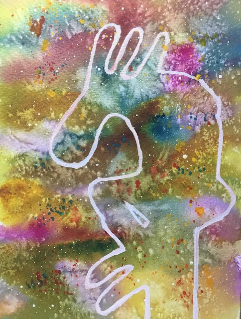
Anyway, on to the painting. I started by spattering on masking fluid. Once this was dry, I wet the paper and put on a fairly random underpainting using Prussian blue, quinacridone magenta and transparent yellow – the classic triadic left colour key. I tried to put in some complementary contrasts with red adjacent to green, yellow to violet and blue to orange. But of course, these tended to blur together into neutrals rather than standing next door to each other and not mixing. Duh!
As the underpainting dried, I sprinkled on salt. I was really careful with this today, adding salt just as the paint was losing its shine. And, because the paint was drying at different rates, I was adding the salt to different places at different times rather than throwing it all on at once. The result is that the salt has worked all over the painting. After a long wait, I rubbed off all the masking fluid to reveal the starry background. Interestingly, there was hardly any salt to rub off – maybe that’s another indicator that I was using the salt properly.
Next I spattered on some opaques: cadmium red, cadmium yellow and cerulean blue. Maybe the cerulean was a mistake – it’s not come through as brightly as the red and the yellow.
And then finally I painted on the moose. I tried drawing on a rough pencil outline but this was too hard to see, so I painted it freehand instead, in titanium white. It was four or five coats of white that I applied in the end. In one of the earlier coats, I dropped in the three opaque primaries in different places but this didn’t really work – white’s not a great mixer. But after the last couple of white coats, there’s a tiny hint of blue or pink to the line which I quite like.
And what I’ve ended up with is a decent painting. The underpainting, the salt, the spattering and the moose all seem to complement each other. And there’s a happy accident in there in how the salt marks on the face look like eyes. Although I’m left with a slight feeling of guilt about this all being too easy. Anyway, the moose is up for sale. To see the price, click here.


Leave a Reply