Today was going to be about bright colours. I was still in my orange fixation…

Moon, Turn The Tides…Gently Gently Away
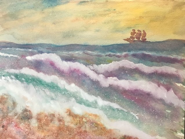
I’m currently reading How To Make A Watercolour Paint Itself by Nita Engle and thought I’d try out some of her ideas today with a stormy sea scene.
The three primaries today are Indian yellow, cerulean blue and quinacridone magenta. I wanted to use non-staining colours as I was planning to get a bit of white in there by removing paint with a kitchen towel. Quinacridone magenta is my only transparent, non-staining red, so was an automatic choice. Indian yellow made it in ahead of raw sienna because I wanted a little bit of sun in there. That left a choice between cerulean blue and French ultramarine. I chose cerulean so that I could have a triadic colour scheme (triadic left): in English, I didn’t want the in-your-face purples that French ultramarine would have made with the quinacridone magenta, I also used raw sienna for a bit of earthiness in the rocks, viridian for some green in the sea and titanium white for wave crests at the end.
I started by wetting the middle horizontal third of the paper, them painting on some wavy blue lines. I tipped the paper in all sorts of different directions and kept adding more water and paint (in green and all three primaries) whenever needed until I ended up with most of the foreground covered. While everything was still wet, I squirted on water in an attempt to create all sorts of textures. I added the sky using all the colours and some rocks in bottom left mainly in raw sienna but with all the primaries dropped in in places. I scraped all over the rock with a palette knife to give it a different texture to the sea and sprinkled in a bit of salt. I kept doing similar things again and again – there are a number of separate glazes in places.
This was all happening very fast, with barely enough time for the paint to dry, let alone think. I just kept throwing on more paint and keeping everything wet, enjoying all the textures that were appearing. I wanted to have a wave crashing over the rocks and had tried squirting on water and dabbing off the paint with a kitchen towel but this wasn’t producing the results I’d seen in the book, so I reached for the titanium white. I added several coats of the white to create waves and foam, spattering it on as well as painting with it. On later coats of white, I hardened the edges along the tops of the waves.
All of this was great fun. It was a bit random and unplanned but I’d planned to be random and unplanned, which was probably why things came out OK. I’m already struggling to remember exactly what I did and in what order.
What I do remember, though, is that when I looked at the painting at the end, the final steps that I thought were necessary were to add even more white to the waves and to add some sort of ship or boat. After trying out some different ideas on scrap paper, I decided that an old fashioned ship with sails would look best. I painted this in using a mixture of colours, dropping on some yellow and blue for a bit of variety and letting some of the neutral colours leak downwards into the sea. And then I was done.
I think this is looking pretty good for something that I didn’t spend too much time thinking about. It’s up for sale. To see the price, click here.


Leave a Reply