


I thought it was about time I did another Western silhouette painting as they're always…
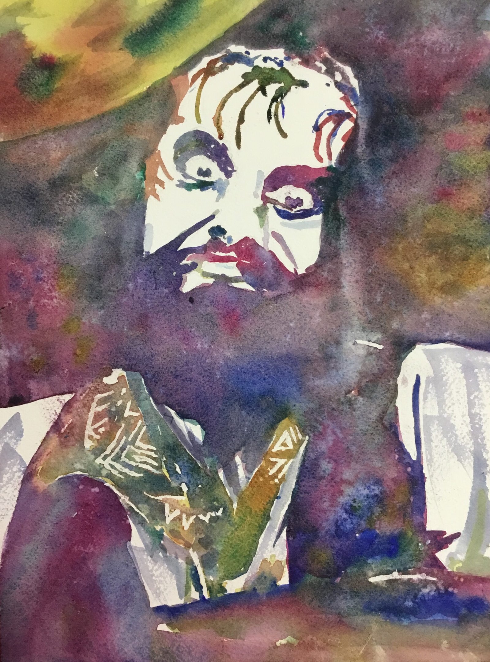
Mick Fleetwood
You know what? I did end up finding a photo of Mick Fleetwood that would make a great portrait. It was a pretty monochrome photo and was close to being a chiaroscuro photo, with just white and a dark colour everywhere. Add in the expression on his face and it was just asking to be painted in watercolours with all the focus on the values and the colours just allowed to do their thing.
For colours I picked French ultramarine and quinacridone magenta straight away. They’re not just my favourite single pigment colours, they also mix to a great purple. The yellow was a close call between transparent and Indian yellows. I went for transparent after looking at the greens and oranges that the yellows could coax out of my blue and red respectively. I also thought I’d give the viridian a workout. If I call the viridian a second cool yellow (pushing it, I know), I can claim this was painted in the key of purple cool.
As usual I started with a pencil outline, using a grid as a guide. 5×7 square grids work for me in all my media. Once the outlines were down and the grid lines erased, I masked out a few white areas that were small or important enough that I couldn’t risk trusting myself to leave white when painting over the wash of colour. This most notably included the whites of the eyes, highlights on the pupils and the pattern on the scarf, although I also reserved the odd highlight.
I wanted this to be mainly in white and a dark value but I wanted more middling values on the top left cymbal, on the scarf and in a few other places. I guess I could, and probably should, have put a light wash over all the middle and dark values and then come back afterwards to darken the dark areas. But I didn’t want to use too many layers in the dark areas (but read on) and was worried about whether I’d be able to remember where the boundaries were between middle and dark values if I just painted over them. So instead I started by putting a layer of yellow over the middle values so that I would always be aware of where they were. I added some other colour wet into wet into the cymbal to give it some life.
For the dark areas I just painted on whichever of my four colours felt right at the time, although I restricted my use of yellow to orange and green mixes with my other colours. That’s one huge dark area to paint and I found at times that I was leaving hard edges to my painted areas before reaching the boundaries of the shape. Whenever this happened I found myself trying to rescue things with water or more paint. The end result was that I did end up with more layers of paint on the dark areas than I’d originally planned. It meant that the dark areas were less saturated than expected, so more neutral rather than rainbowy. Was that a good thing or a bad thing? I’m not sure. Liz Chaderton would probably say bad and Liron Yankonsky good!
I was determined to keep Mick’s scarf in middle values, so painted over the yellow with a mix of thin blue and red glazes, allowing the yellow to shine through. And there was a bit too much white on Mick’s sleeves so I drybrushed in a neutral mix of colours to break them up. I sprinkled on a little bit of salt in places, not expecting much action. And, after letting it all dry and rubbing off all the masking fluid, that was me done.
And what I’ve ended up with isn’t too bad. While the likeness isn’t perfect, it’s unmistakeably Mick. I expected the eye to be drawn towards Mick’s eyes but instead I find my attention getting dragged back to the scarf every time. Which is a good thing because the scarf is the best thing about this painting for me. And somehow that scarf screams Mick Fleetwood and increases the likeness. The dark values didn’t end up as colourful as I’d intended but I do like how it’s come out and there’s some interesting granulation in there and a few cauliflowers. Mick’s going in the shop window. To see the price, click here.
Leave a Reply