It's a watercolour landscape day today. I've been saving up some photos with amazing looking…

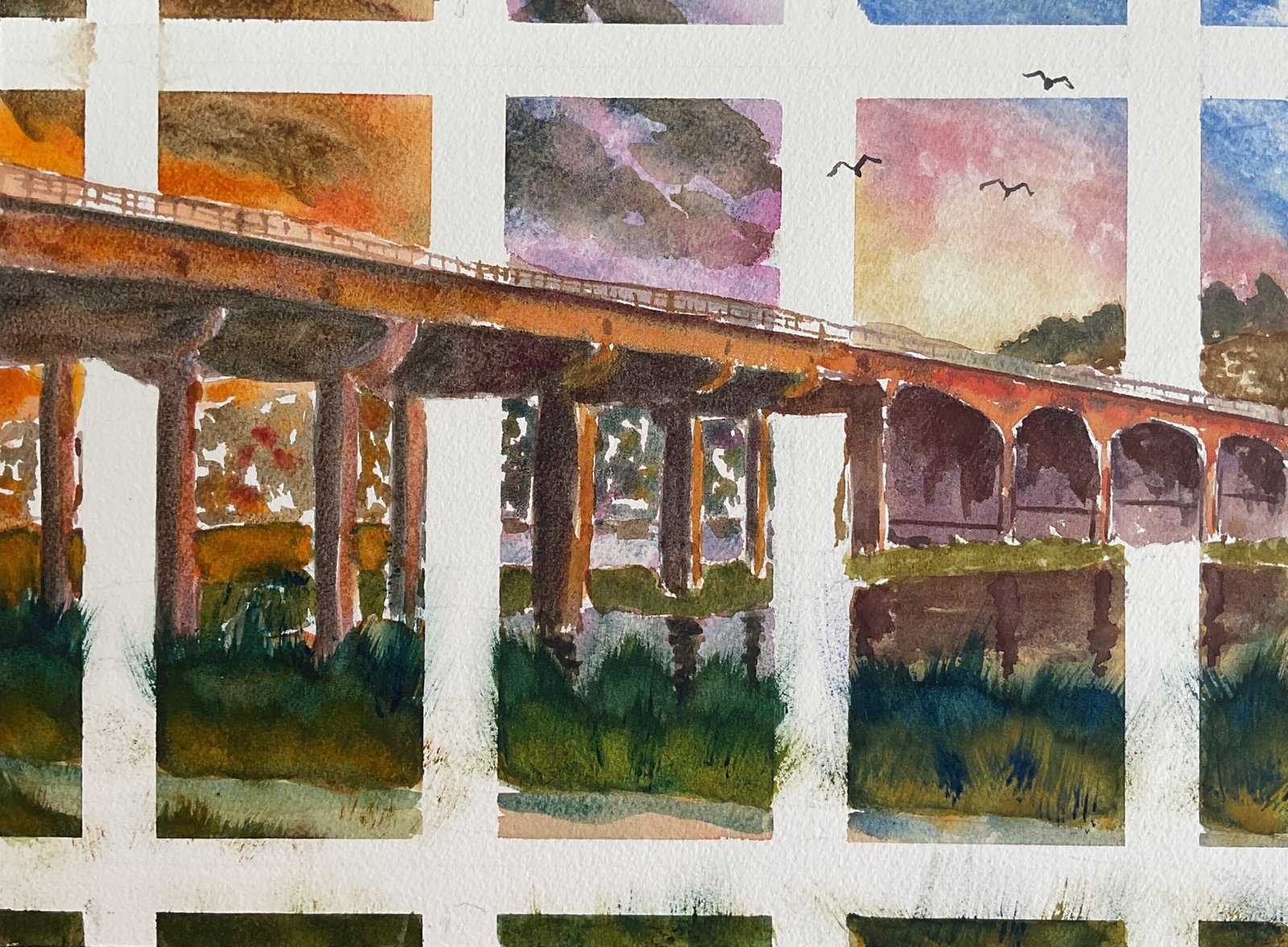
M2 Medway Crossing Under Three Different Skies
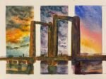
So here’s the thing. I need to put my Landscape Artist Of The Year entry together by around the end of April. My best landscape over the last twelve months, Kingsferry Bridge Under Three Different Skies, would have been the main submission in my entry butches been sold and currently sits proudly on the wall of a dentist’s waiting room on the Isle Of Sheppey.
So I thought I’d have a go at coming up with something similar. The subject has to be a bridge and today it’s the bridge where the M2 crosses the River Medway. Just as before, I used masking tape to divide things up before doing any painting. I was careful in composing this one not to have any vertical struts under the bridge overlapping the white bands.
The colour scheme is the same as before, with skies inspired by photos taken by old friends Howard and Cathy. So:
– the left panel is in the key of orange cool, with cerulean blue, Winsor blue (green shade), rose dore and Indian yellow
– the middle panel is in the key of green cool, with Mayan blue genuine, quinacridone magenta and transparent yellow
– the panel in the right is in the key of triadic right, with French ultramarine, Winsor red and raw sienna
I started by going through one panel at a time, putting in the skies, the background Rochester and Borstal cityscape, the water and banks and the foreground road and grasses. My plan at this early stage was for the bridge to be the only element in the painting to be allowed to break out of panels, so the tape stayed down. I decided to let the paintings overflow, though into the otherwise wasted areas outside the main rectangle of tape, and I think this worked. At this point I removed the tape and then stopped for the day, having made a late start.
Today’s main job was to paint in the bridge. This took three layers of paint because I wanted the shadows everywhere to be really dark. I also glazed over all the grassy bits because they weren’t green enough in my eyes. For the closest green areas, I put in some really dry blue paint in places (making sure it was the right blue in each panel) and swept it upwards and outwards to create grassy shapes. I let the grasses grow into the white bands because (seriously) grass is nature and nature doesn’t respect artificial boundaries like white bands. And for similar reasons, I put some birds in the sky that also ignored the white bands.
I fiddled around a bit with the water in the left panel, eventually settling for something vaguely mirroring the sky but with a dirty hint of green to it. It still doesn’t look quite right to me, probably because the paint is too thick, making it clash a bit against the purple water in the adjacent panel.
Otherwise, though, I’m liking this one. The sun and birds in the sky in the right panel look good. And I have to keep reminding myself the looseness and lack of detail in Rochester and Strood in the background is exactly what’s needed for a painting like this. This one’s going up for sale but I may well hold it back until after I know I definitely won’t need it for LAOTY. To see the price, click here.


Leave a Reply