


Today I was honoured to have my work critiqued on YouTube by Liron Yanconsky, an…
M Graham Landscape Set Swatching
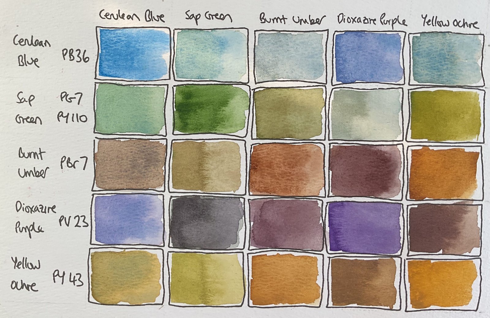
I had just the right amount of time to spare today to do some swatching, and it’s the turn of the M Graham landscape watercolour set. It’s an odd looking set of colours. Just five colours in there and there’s no red, the yellow is quite earthy and they’ve found room for a purple. Someone thought it would be a good idea to throw this set together and I’m intrigued.
Before doing the swatches, I thought it was worth taking a look at the pigment numbers of these paints. What I found was that:
- The cerulean blue is PB36, whereas most ceruleans are PB35. This is effectively a new colour to me.
- The sap green is PG7 and PY110, the same yellow pigment but a different green pigment to the Winsor & Newton sap green
- The burnt umber is PBr7. This pigment is an ingredient in a lot of Earth colours. The W&N burnt umber has a red and a yellow pigment with the PBr7 but the W&N burnt sienna is PBr7 on its own
- Dioxazine purple is PV19, the same as Winsor violet
- And the yellow ochre is PY43, the same pigment as W&N
And then I went into the swatches. I put pure colours down the main diagonal and mixtures of two colours everywhere else. In those mixed cells, there’s more of the row colour than the column colour in each cell, so I have two different mixes of each pairing.
Looking down the diagonal first:
- The cerulean isn’t the cerulean I’m used to but still looks good. And it granulates, just like my W&N cerulean
- The sap green reminds me of the Daniel Smith green apatite genuine that I use to supplement my Shire supergranulators. A great colour. For an off the peg green anyway.
- The burnt umber seems to lie somewhere between the burnt umber and burnt sienna that I’m used to. No complaints there.
- The dioxazine purple looks exactly as I expected.
- The yellow ochre looks as expected but is very opaque. On the other hand, I’ve seen enough <redacted> videos on YouTube to know how this colour can warm up the sky and atmosphere in a painting.
And then there are the off diagonal cells. As expected with a purple, a brown and an earthy yellow, these colours score low on saturation: they’re all neutral and understated. My colours will look like those of Liron Yankonsky (who’s channel I’m happy to plug here) when I paint with this palette. There are some interesting mixes in there though. I particularly like how the purple warms up the blue to a colour that would look great in skies. And the purple and green neutralise each other into quite a dark black. The blue and the brown might also make an interesting granulating grey if I can get the proportions right. And there are lots of ways the sap green can be pushed in interesting directions by adding other colours.
These should be interesting. Just that set of twenty five cells looks pleasing to the eye. Whisper it but I’m not missing red that much. I’m looking forward to giving these a go in the next few days and seeing what sort of mood they create.

Leave a Reply